but this will involve some (maybe a lot) coding + some knowledge of
mpl internals.
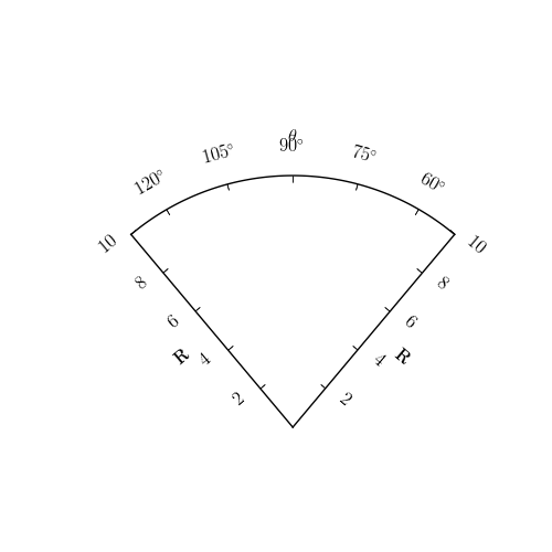
With the experimental curvelinear coordinate support in axes_grid
toolkit (and with yet-to-be-committed patch), one can draw very basic
cone plot (see the attached). However, the current support is far from
complete. I'm willing to make it better, but I'm afraid that this may
not happen in a near future (likely not in this year).
Of course, you can try to plot everything (axes boundary, ticks,
ticklabels etc.) manually if you want, and maybe this is the best way
currently available.
------------------------------------------------------------------------------
Come build with us! The BlackBerry(R) Developer Conference in SF, CA
is the only developer event you need to attend this year. Jumpstart your
developing skills, take BlackBerry mobile applications to market and stay
ahead of the curve. Join us from November 9 - 12, 2009. Register now! http://p.sf.net/sfu/devconference
_______________________________________________
Matplotlib-users mailing list [email protected] matplotlib-users List Signup and Options
Hi,
Thanks, I think the attached sample is good enough for me, In fact I got
something similar except for the ticks I didn't know how to make them
slanted, so If I can get the code for you plot this will be really great.
I can then fine tune it to my needs.
Thanks Ihab
Jae-Joon Lee wrote:
···
Unfortunately, I don't think something like cone plots can be easily
done with current matplotlib.
I guess you can define custom projection and such, as in the example below
but this will involve some (maybe a lot) coding + some knowledge of
mpl internals.
With the experimental curvelinear coordinate support in axes_grid
toolkit (and with yet-to-be-committed patch), one can draw very basic
cone plot (see the attached). However, the current support is far from
complete. I'm willing to make it better, but I'm afraid that this may
not happen in a near future (likely not in this year).
Of course, you can try to plot everything (axes boundary, ticks,
ticklabels etc.) manually if you want, and maybe this is the best way
currently available.
Regards,
-JJ
On Sat, Oct 31, 2009 at 4:15 AM, ifriad <[email protected]...> wrote:
Hi,
Does any one knows how to do those cone plots,
------------------------------------------------------------------------------
Come build with us! The BlackBerry(R) Developer Conference in SF, CA
is the only developer event you need to attend this year. Jumpstart your
developing skills, take BlackBerry mobile applications to market and stay
ahead of the curve. Join us from November 9 - 12, 2009. Register now! http://p.sf.net/sfu/devconference
_______________________________________________
Matplotlib-users mailing list [email protected] matplotlib-users List Signup and Options
Are you running svn version of mpl?
Also, as I said, the example is based on the patch yet to be submitted.
So, I can send you the example, but it will take me sometime to commit
the patch.
I'll give you a notice when this happen.
As far as rotating the ticks, if you're using markers, than I guess
you need a custom artist class.
So, I recommend you to just use simple lines.
Whatever path you take (even with my example), it will not be easy.
So, again, finding other plotting tool that support cone plots may be
more practical (unless someone comes up with a working example).
Regards,
-JJ
···
On Wed, Nov 4, 2009 at 2:44 AM, ifriad <[email protected]...> wrote:
Hi,
Thanks, I think the attached sample is good enough for me, In fact I got
something similar except for the ticks I didn't know how to make them
slanted, so If I can get the code for you plot this will be really great.
I can then fine tune it to my needs.
Thanks Ihab
Jae-Joon Lee wrote:
Unfortunately, I don't think something like cone plots can be easily
done with current matplotlib.
I guess you can define custom projection and such, as in the example below
but this will involve some (maybe a lot) coding + some knowledge of
mpl internals.
With the experimental curvelinear coordinate support in axes_grid
toolkit (and with yet-to-be-committed patch), one can draw very basic
cone plot (see the attached). However, the current support is far from
complete. I'm willing to make it better, but I'm afraid that this may
not happen in a near future (likely not in this year).
Of course, you can try to plot everything (axes boundary, ticks,
ticklabels etc.) manually if you want, and maybe this is the best way
currently available.
Regards,
-JJ
On Sat, Oct 31, 2009 at 4:15 AM, ifriad <[email protected]...> wrote:
Hi,
Does any one knows how to do those cone plots,
------------------------------------------------------------------------------
Come build with us! The BlackBerry(R) Developer Conference in SF, CA
is the only developer event you need to attend this year. Jumpstart your
developing skills, take BlackBerry mobile applications to market and stay
ahead of the curve. Join us from November 9 - 12, 2009. Register now! http://p.sf.net/sfu/devconference
_______________________________________________
Matplotlib-users mailing list [email protected] matplotlib-users List Signup and Options
------------------------------------------------------------------------------
Come build with us! The BlackBerry(R) Developer Conference in SF, CA
is the only developer event you need to attend this year. Jumpstart your
developing skills, take BlackBerry mobile applications to market and stay
ahead of the curve. Join us from November 9 - 12, 2009. Register now! http://p.sf.net/sfu/devconference
_______________________________________________
Matplotlib-users mailing list [email protected] matplotlib-users List Signup and Options
------------------------------------------------------------------------------
Let Crystal Reports handle the reporting - Free Crystal Reports 2008 30-Day
trial. Simplify your report design, integration and deployment - and focus on
what you do best, core application coding. Discover what's new with
Crystal Reports now. http://p.sf.net/sfu/bobj-july
_______________________________________________
Matplotlib-users mailing list [email protected] matplotlib-users List Signup and Options
On Wed, Nov 4, 2009 at 9:19 AM, Jae-Joon Lee <[email protected]...> wrote:
Are you running svn version of mpl?
Also, as I said, the example is based on the patch yet to be submitted.
So, I can send you the example, but it will take me sometime to commit
the patch.
I'll give you a notice when this happen.
As far as rotating the ticks, if you're using markers, than I guess
you need a custom artist class.
So, I recommend you to just use simple lines.
Whatever path you take (even with my example), it will not be easy.
So, again, finding other plotting tool that support cone plots may be
more practical (unless someone comes up with a working example).
Regards,
-JJ
On Wed, Nov 4, 2009 at 2:44 AM, ifriad <[email protected]...> wrote:
Hi,
Thanks, I think the attached sample is good enough for me, In fact I got
something similar except for the ticks I didn't know how to make them
slanted, so If I can get the code for you plot this will be really great.
I can then fine tune it to my needs.
Thanks Ihab
Jae-Joon Lee wrote:
Unfortunately, I don't think something like cone plots can be easily
done with current matplotlib.
I guess you can define custom projection and such, as in the example below
but this will involve some (maybe a lot) coding + some knowledge of
mpl internals.
With the experimental curvelinear coordinate support in axes_grid
toolkit (and with yet-to-be-committed patch), one can draw very basic
cone plot (see the attached). However, the current support is far from
complete. I'm willing to make it better, but I'm afraid that this may
not happen in a near future (likely not in this year).
Of course, you can try to plot everything (axes boundary, ticks,
ticklabels etc.) manually if you want, and maybe this is the best way
currently available.
Regards,
-JJ
On Sat, Oct 31, 2009 at 4:15 AM, ifriad <[email protected]...> wrote:
Hi,
Does any one knows how to do those cone plots,
------------------------------------------------------------------------------
Come build with us! The BlackBerry(R) Developer Conference in SF, CA
is the only developer event you need to attend this year. Jumpstart your
developing skills, take BlackBerry mobile applications to market and stay
ahead of the curve. Join us from November 9 - 12, 2009. Register now! http://p.sf.net/sfu/devconference
_______________________________________________
Matplotlib-users mailing list [email protected] matplotlib-users List Signup and Options
------------------------------------------------------------------------------
Come build with us! The BlackBerry(R) Developer Conference in SF, CA
is the only developer event you need to attend this year. Jumpstart your
developing skills, take BlackBerry mobile applications to market and stay
ahead of the curve. Join us from November 9 - 12, 2009. Register now! http://p.sf.net/sfu/devconference
_______________________________________________
Matplotlib-users mailing list [email protected] matplotlib-users List Signup and Options
------------------------------------------------------------------------------
Let Crystal Reports handle the reporting - Free Crystal Reports 2008 30-Day
trial. Simplify your report design, integration and deployment - and focus on
what you do best, core application coding. Discover what's new with
Crystal Reports now. http://p.sf.net/sfu/bobj-july
_______________________________________________
Matplotlib-users mailing list [email protected] matplotlib-users List Signup and Options
Note that you have to install matplotlib from the svn. And the example
is also available in the svn.
Regards,
-JJ
···
On Tue, Dec 8, 2009 at 4:28 AM, ihab riad <[email protected]...> wrote:
Hu Jae-Joon,
Yes this is very useful, I thinks many people here will love this.
I tried to access the code, but I could not get there.
Can u pass me the link.
Cheers Ihab
On Mon, Dec 7, 2009 at 9:25 PM, Jae-Joon Lee <[email protected]...> wrote:
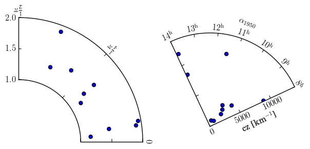
I updated the axes_grid toolkit in the svn, and I hope it is more useful.
Check the example
examples/axes_grid/demo_floating_axes.py
The output is attached.
-JJ
On Wed, Nov 4, 2009 at 9:19 AM, Jae-Joon Lee <[email protected]...> wrote:
> Are you running svn version of mpl?
> Also, as I said, the example is based on the patch yet to be submitted.
> So, I can send you the example, but it will take me sometime to commit
> the patch.
> I'll give you a notice when this happen.
>
> As far as rotating the ticks, if you're using markers, than I guess
> you need a custom artist class.
> So, I recommend you to just use simple lines.
>
> Whatever path you take (even with my example), it will not be easy.
> So, again, finding other plotting tool that support cone plots may be
> more practical (unless someone comes up with a working example).
>
> Regards,
>
> -JJ
>
>
>
> On Wed, Nov 4, 2009 at 2:44 AM, ifriad <[email protected]...> wrote:
>>
>> Hi,
>> Thanks, I think the attached sample is good enough for me, In fact I
>> got
>> something similar except for the ticks I didn't know how to make them
>> slanted, so If I can get the code for you plot this will be really
>> great.
>>
>> I can then fine tune it to my needs.
>>
>> Thanks Ihab
>>
>> Jae-Joon Lee wrote:
>>>
>>> Unfortunately, I don't think something like cone plots can be easily
>>> done with current matplotlib.
>>>
>>> I guess you can define custom projection and such, as in the example
>>> below
>>>
>>>
>>> http://matplotlib.sourceforge.net/examples/api/custom_projection_example.html
>>>
>>> but this will involve some (maybe a lot) coding + some knowledge of
>>> mpl internals.
>>>
>>> With the experimental curvelinear coordinate support in axes_grid
>>> toolkit (and with yet-to-be-committed patch), one can draw very basic
>>> cone plot (see the attached). However, the current support is far from
>>> complete. I'm willing to make it better, but I'm afraid that this may
>>> not happen in a near future (likely not in this year).
>>>
>>> Of course, you can try to plot everything (axes boundary, ticks,
>>> ticklabels etc.) manually if you want, and maybe this is the best way
>>> currently available.
>>>
>>> Regards,
>>>
>>> -JJ
>>>
>>> On Sat, Oct 31, 2009 at 4:15 AM, ifriad <[email protected]...> wrote:
>>>>
>>>> Hi,
>>>> Does any one knows how to do those cone plots,
>>>>
>>>> I am attaching a sample plot.
>>>>
>>>> Thanks Ihab
>>>> http://old.nabble.com/file/p26140834/cone.png cone.png
>>>> --
>>>> View this message in context:
>>>> http://old.nabble.com/cone-plots-tp26140834p26140834.html
>>>> Sent from the matplotlib - users mailing list archive at Nabble.com.
>>>>
>>>>
>>>>
>>>> ------------------------------------------------------------------------------
>>>> Come build with us! The BlackBerry(R) Developer Conference in SF, CA
>>>> is the only developer event you need to attend this year. Jumpstart
>>>> your
>>>> developing skills, take BlackBerry mobile applications to market and
>>>> stay
>>>> ahead of the curve. Join us from November 9 - 12, 2009. Register now!
>>>> http://p.sf.net/sfu/devconference
>>>> _______________________________________________
>>>> Matplotlib-users mailing list
>>>> [email protected]
>>>> matplotlib-users List Signup and Options
>>>>
>>>
>>>
>>>
>>> ------------------------------------------------------------------------------
>>> Come build with us! The BlackBerry(R) Developer Conference in SF, CA
>>> is the only developer event you need to attend this year. Jumpstart
>>> your
>>> developing skills, take BlackBerry mobile applications to market and
>>> stay
>>> ahead of the curve. Join us from November 9 - 12, 2009. Register now!
>>> http://p.sf.net/sfu/devconference
>>> _______________________________________________
>>> Matplotlib-users mailing list
>>> [email protected]
>>> matplotlib-users List Signup and Options
>>>
>>>
>>
>> --
>> View this message in context:
>> http://old.nabble.com/cone-plots-tp26140834p26192193.html
>> Sent from the matplotlib - users mailing list archive at Nabble.com.
>>
>>
>>
>> ------------------------------------------------------------------------------
>> Let Crystal Reports handle the reporting - Free Crystal Reports 2008
>> 30-Day
>> trial. Simplify your report design, integration and deployment - and
>> focus on
>> what you do best, core application coding. Discover what's new with
>> Crystal Reports now. http://p.sf.net/sfu/bobj-july
>> _______________________________________________
>> Matplotlib-users mailing list
>> [email protected]
>> matplotlib-users List Signup and Options
>>
>