Yo,
1) multiple y-scales on the left and right. mpl supports a left and
right scale (see examples/two_scale.py) but nothing like an
arbitrary number of scales with arbitrary positioning as you see
in the plot you attached. This has long been on the wish list
(and is on the goals web page) but has not yet been implemented.
This is something chaco does quite well because it is very common
to make these plots in geophysics. For me it is one of the few
remaining must-have features for matplotlib 1.0. You could hack
your own scales using matplotlib lines and text instances. Indeed
it wouldn't be too hard and if I get some time I'll do a demo
which may serve as a prototype for refactoring the mpl axis code.
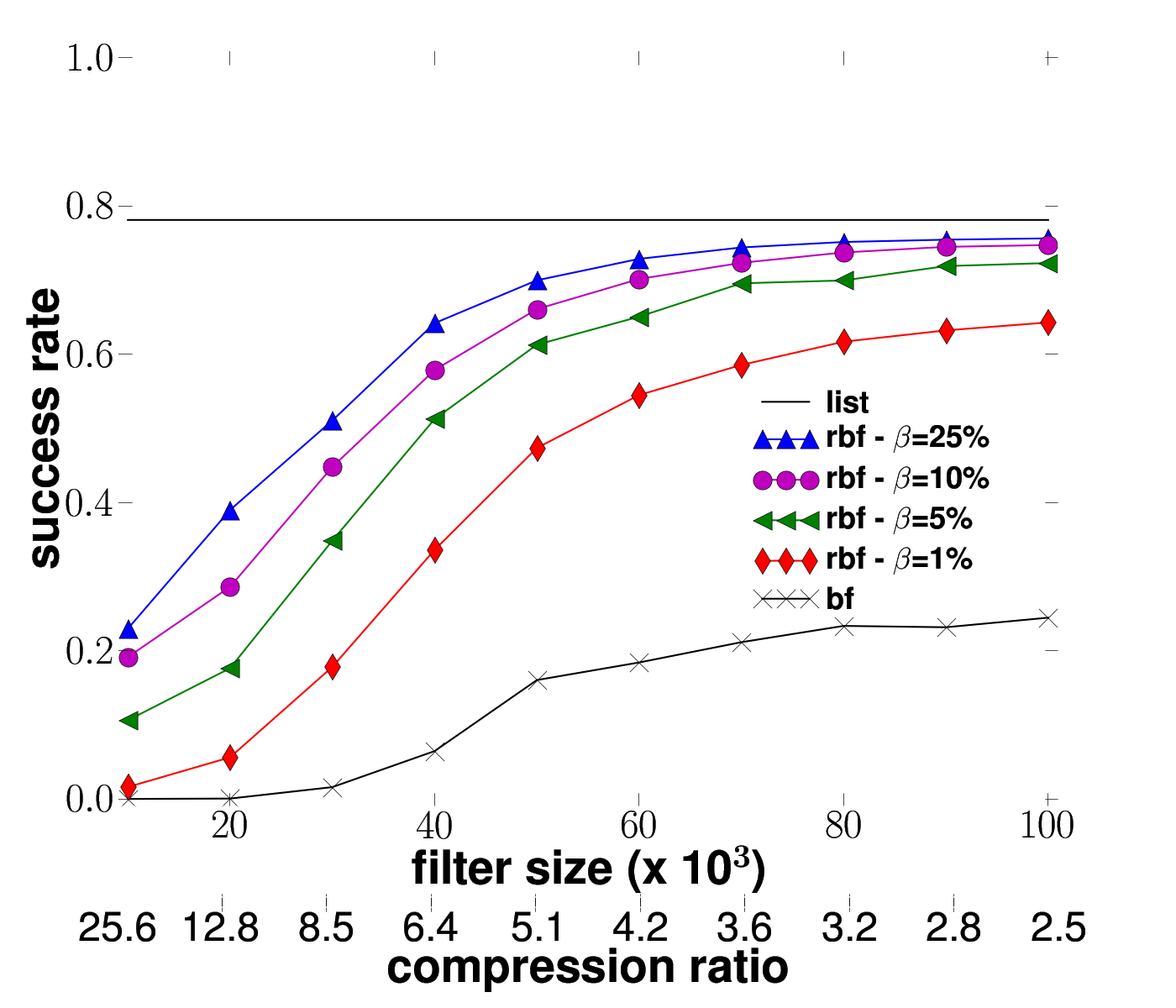
I remember that, for a paper, I succeeded to plot two horizontal axis, on the bottom of the plot (see the image in attachment)
The difference with my previous mail is that the second axis (labeled 'compression ratio') is not used for plotting. It is, actually, the same than the other axis (labeled 'filter size') but it gives another scale/kind of information.
Here is my (very ugly) code:
from pylab import *
from matplotlib.font_manager import *
list = [0.78125356, 0.78125356, 0.78125356, 0.78125356, 0.78125356, 0.78125356, 0.78125356, 0.78125356, 0.78125356, 0.78125356]
yprops = dict(rotation=0, horizontalalignment='right',verticalalignment='center',x=-0.01)
axprops = dict(yticks=)
rc('text', usetex=True)
rc('lines', markersize=16)
rc('legend', numpoints=3)
#getting data from different source files
tabBF = load('Data/Compact/BFCompact.dat')
tabRBF1 = load('Data/Compact/RBFCompact0.01.dat')
tabRBF2 = load('Data/Compact/RBFCompact0.25.dat')
tabRBF3 = load('Data/Compact/RBFCompact0.05.dat')
tabRBF4 = load('Data/Compact/RBFCompact0.1.dat')
xAxis = tabBF[:,0]
succBF = tabBF[:,1]
succRBF1 = tabRBF1[:,1]
succRBF2 = tabRBF2[:,1]
succRBF3 = tabRBF3[:,1]
succRBF4 = tabRBF4[:,1]
fig = figure(1)
#plot the figure
ax1 = fig.add_axes([0.1,0.2,0.8,0.75])
llist = ax1.plot(xAxis, list, 'k-', linewidth=1.5)
bf = ax1.plot(xAxis, succBF, 'k-x', linewidth=1.5)
rbf1 = ax1.plot(xAxis, succRBF1, 'r-d', linewidth=1.5)
rbf2 = ax1.plot(xAxis, succRBF2, 'b-^', linewidth=1.5)
rbf3 = ax1.plot(xAxis, succRBF3, 'g-<', linewidth=1.5)
rbf4 = ax1.plot(xAxis, succRBF4, 'm-o', linewidth=1.5)
axis([9, 101, -0.01, 1.01], font)
ax1.set_xlabel(r'\textbf{filter size (x 10}^\\mathbf\{3\}\textbf{)}', font)
ax1.set_ylabel(r'\textbf{success rate}', font)
#ugly way of drawing the legend legend
leg = legend((llist[0], rbf2[0],rbf4[0], rbf3[0], rbf1[0], bf[0]),(r'\textbf{list}', r'\textbf{rbf -} \\beta\textbf{=25\%}', r'\textbf{rbf -} \\beta\textbf{=10\%}',r'\textbf{rbf - }\\beta\textbf{=5\%}', r'\textbf{rbf - }\\beta\textbf{=1\%}', r'\textbf{bf}'), loc=(0.65,0.23), prop=FontProperties(size='26', weight='bold'))#leg = legend((llist[0], bf[0]), (r'\textbf{list}', r'\textbf{bf}'), loc=(0.65,0.23), prop=FontProperties(size='26', weight='bold'))
leg.draw_frame(False)
#draw the second x-axis
ax2 = fig.add_axes([0.1,0.1,0.8,0.01], **axprops)
ax2.set_xlabel(r'\textbf{compression ratio}', font)
toto = ['25.6', '12.8', '8.5', '6.4', '5.1', '4.2', '3.6', '3.2', '2.8', '2.5']
ax2.get_xaxis().set_ticks(arange(10))
ax2.get_xaxis().set_ticklabels(toto)
savefig('Success3')
This is clearly a hack (and I'm not very proud of it  ).
).
Benoit