Hello,
I would like to show a colorbar for my plot (see attachment) but I can't
figure out how it works.
In the examples on the website I only found the call to pylab.colorbar(),
which doesn't work with my subplots. My code is as follows (with the bar
graph-part snipped, for brevity). I also tried the ColorBar class and
assigning "cmap=cm.jet" but it didn't work. Could anybody give me a hint
please? I searched the tutorial, cookbook, api reference and google, but I
can't really find anything.
Thanks,
Felix
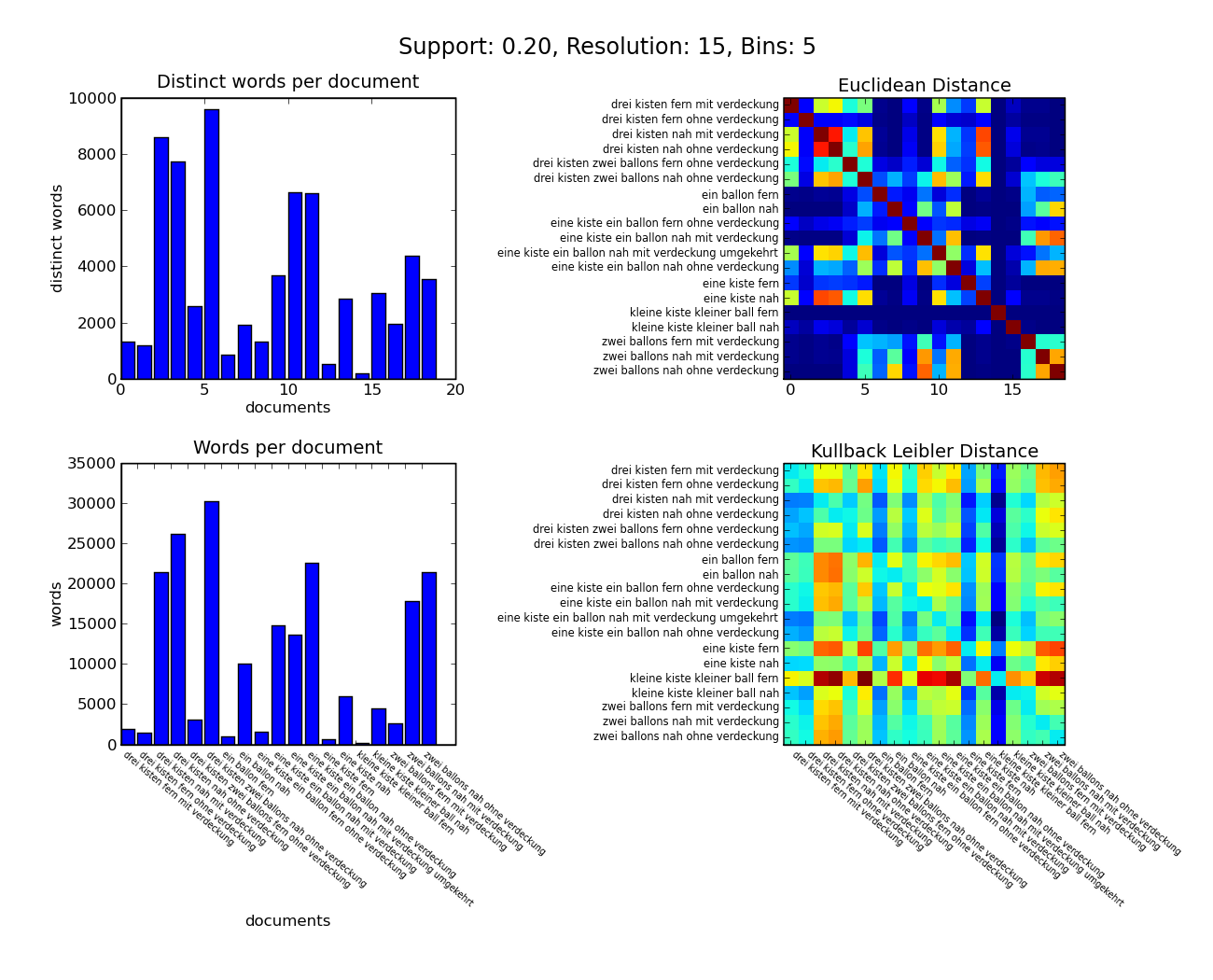
fig = p.figure()
fig.text(0.5, 0.94, main_title, fontsize="x-large", ha="center")
(...bar graph part snipped...)
ax = fig.add_subplot(222)
ax.set_title('Euclidean Distance')
matrix = n.zeros([numof_dicts, numof_dicts])
for i1, d1 in enumerate(dictionaries):
for i2, d2 in enumerate(dictionaries):
for k in d1.keys():
if d2.has_key(k):
prob1 = (d1[k] / vectorlengths[i1])
prob2 = (d2[k] / vectorlengths[i2])
matrix[i1, i2] += prob1 * prob2
ax.imshow(matrix, interpolation="nearest", cmap=p.cm.jet)
if documentnames != None:
ax.set_yticklabels(documentnames, va="center", fontsize='x-small')
ax.set_yticks(range(numof_dicts))
#p.colorbar()
ax = fig.add_subplot(224)
ax.set_title('Kullback Leibler Distance')
ax.imshow(matrix, interpolation="nearest")
if documentnames != None:
ax.set_yticklabels(documentnames, va="center", fontsize='x-small')
ax.set_yticks(range(numof_dicts))
ax.set_xticklabels(documentnames, rotation=320, va="top", ha="left",
fontsize='xx-small')
ax.set_xticks(range(numof_dicts))
fig.subplots_adjust(left=0.10, right=0.90, top=0.90, bottom=0.24,
hspace=0.3,wspace=0.9)
fig.set_size_inches(13, 10.5)
fig.savefig(sys.argv[1] + "_statistics.png")
#p.show()