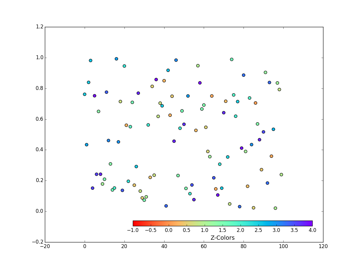
Hi John,
I got this off stack exchange, apologies to the original contributor…
Cheers, Jody
import numpy as np
import matplotlib.pyplot as plt
from matplotlib.colors import LinearSegmentedColormap
x = np.arange(100)
y = np.random.rand(100)
z = 4 * np.random.rand(100)
cmap = plt.get_cmap('rainbow_r’)
start=0.2
stop = 1.
colors = cmap(np.linspace(start, stop, cmap.N))
Create a new colormap from those colors
color_map = LinearSegmentedColormap.from_list(‘Upper Half’, colors)
fig = plt.figure(figsize=(12,9))
ax1 = plt.subplot(111)
sc = ax1.scatter(x, y, c=z, s=50, cmap=color_map, vmin=0, vmax=4)
position=fig.add_axes([0.37, 0.16, 0.5, 0.02])
cb = fig.colorbar(sc, cax=position, orientation=‘horizontal’, drawedges=False)
cb.set_label(‘Z-Colors’, fontsize=14)
I tried this after talking with Ben Root, but it
results in some odd behavior
cb.ax.set_xlim(0,4)
plt.show()
···
On 2 Apr 2015, at 5:47 AM, John Leeman <kd5wxb@…287…> wrote:
Hi all,
I’m plotting some scatter points colored by a third variable, but want to use a limited subset of a colormap. In the example below, the color axis data ranges from 0-4, but I want to not use the red portion of the bar. Doing the first part is just accomplished by setting the vmin/vmax. But when I plot a color bar I don’t want to show the colors and values for anything below zero. Other than just white-boxing that part of the bar I’m not sure how to do it. I tried a suggestion of setting the limit properties of the bar axis attribute, but that results in the bar getting shrunk and shifted (a very weird behavior). Any ideas?
Thank you,
John Leeman
import numpy as np
import matplotlib.pyplot as plt
x = np.arange(100)
y = np.random.rand(100)
z = 4 * np.random.rand(100)
color_map = plt.get_cmap(‘rainbow_r’)
fig = plt.figure(figsize=(12,9))
ax1 = plt.subplot(111)
sc = ax1.scatter(x, y, c=z, s=50, cmap=color_map, vmin=-1, vmax=4)
position=fig.add_axes([0.37, 0.16, 0.5, 0.02])
cb = fig.colorbar(sc, cax=position, orientation=‘horizontal’, drawedges=False)
cb.set_label('Z-Colors’, fontsize=14)
I tried this after talking with Ben Root, but it
results in some odd behavior
cb.ax.set_xlim(0,4)
plt.show()
<Color_Bar.png>
Dive into the World of Parallel Programming The Go Parallel Website, sponsored
by Intel and developed in partnership with Slashdot Media, is your hub for all
things parallel software development, from weekly thought leadership blogs to
news, videos, case studies, tutorials and more. Take a look and join the
conversation now. http://goparallel.sourceforge.net/_______________________________________________
Matplotlib-users mailing list
[email protected]
matplotlib-users List Signup and Options
–
Jody Klymak
http://web.uvic.ca/~jklymak/