Greetings,
I am new to matplotlib.
I have to plot a cross section of a cylinder and I want apply the stress in
the section to be a contour plot. Similar to what you get from a Finite
Element Analysis data. I have the data organized such that I can use
fill_between to create the basic plot and I use the a uniform color (red)
for now to fill between the lines. The data organized is organized (see
attached 'data.txt' file) such that the fill_between is used as follows:
http://old.nabble.com/file/p32023678/data.txt data.txt
plt.fill_between(X, Y1, Y2,facecolor='red',alpha=alpha,linewidth=2)
plt.fill_between(X, Y3, Y4,facecolor='red',alpha=alpha,linewidth=2)
This produces a figure in this format:
http://old.nabble.com/file/p32023678/Uniform_Color.png
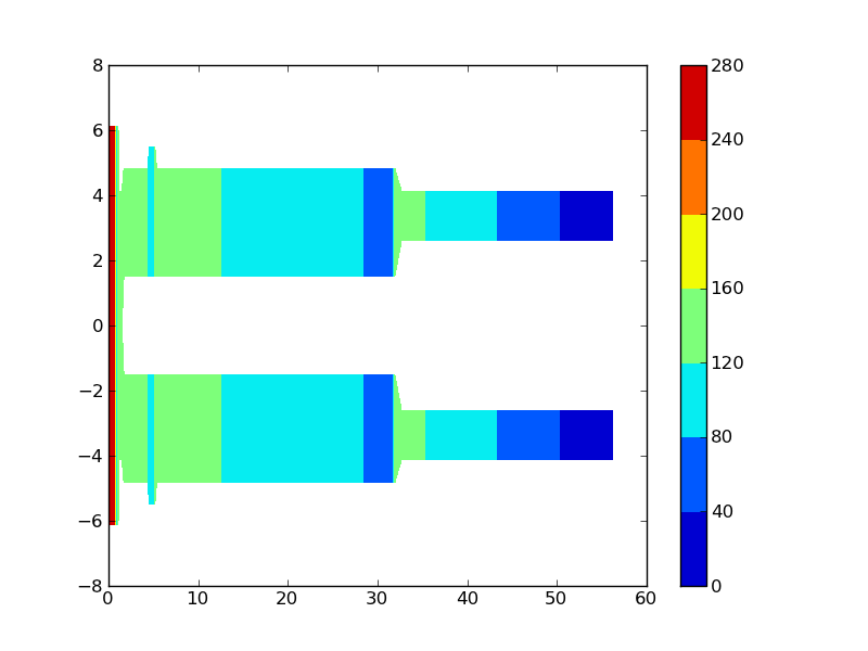
What I want to do is instead of filling the color in red, i want to the
color to be a contour plot of the stress. The stress values are shown in
the last column of the 'data.txt' file. So, based on the stress values,
the fill in color should vary (say from blue for min(stress) values and red
for max(stress) values.
I was able to do a color extract for regions, but the colors are not
gradient and smooth as should be in stress contour plot.
The example I was able to do is as follow:
http://old.nabble.com/file/p32023678/Contour.png
I appreciate any help on this matter.
Thanks,
···
--
View this message in context: http://old.nabble.com/Change-color-for-fill_between-to-contour-plot-tp32023678p32023678.html
Sent from the matplotlib - users mailing list archive at Nabble.com.