Hi,
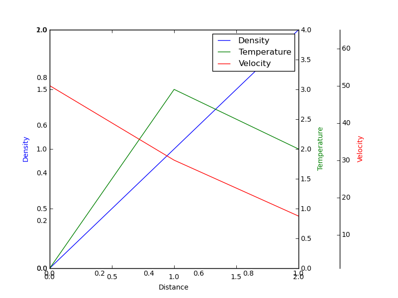
I've been playing around with the parasite_axes toolkit. It's very nice but I discovered from the example that I always get an extra set of x and y axis labels. See attached png. I've got around this by simply turning the first axis off. Is this a bug in the code or the example? Also there appears to be an additional set of axis label commands in the example.
From demo_parasite_axes2.py
···
----------------------------------------------------------------------
from mpl_toolkits.axes_grid.parasite_axes import SubplotHost
import matplotlib.pyplot as plt
if 1:
fig = plt.figure(1)
plt.axis('off') # Extra line to remove unwanted axis labels
host = SubplotHost(fig, 111)
host.set_ylabel("Density")
host.set_xlabel("Distance")
par1 = host.twinx()
par2 = host.twinx()
par1.set_ylabel("Temperature")
par2.axis["right"].set_visible(False)
offset = 60, 0
new_axisline = par2.get_grid_helper().new_fixed_axis
par2.axis["right2"] = new_axisline(loc="right",
axes=par2,
offset=offset)
par2.axis["right2"].label.set_visible(True)
par2.axis["right2"].set_label("Velocity")
fig.add_axes(host)
plt.subplots_adjust(right=0.75)
host.set_xlim(0, 2)
host.set_ylim(0, 2)
host.set_xlabel("Distance") # Why reset these three labels..
host.set_ylabel("Density")
par1.set_ylabel("Temperature")
p1, = host.plot([0, 1, 2], [0, 1, 2], label="Density")
p2, = par1.plot([0, 1, 2], [0, 3, 2], label="Temperature")
p3, = par2.plot([0, 1, 2], [50, 30, 15], label="Velocity")
par1.set_ylim(0, 4)
par2.set_ylim(1, 65)
host.legend()
host.axis["left"].label.set_color(p1.get_color())
par1.axis["right"].label.set_color(p2.get_color())
par2.axis["right2"].label.set_color(p3.get_color())
plt.draw()
plt.show()