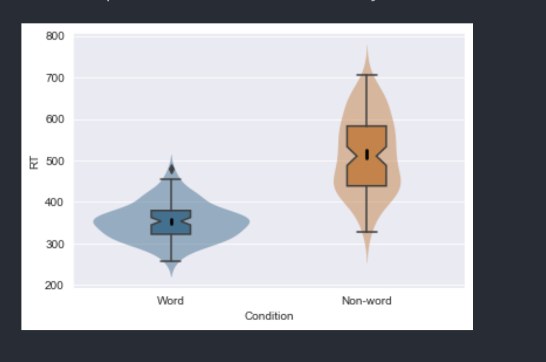
I would like to recreate the “violin boxplots” presented here:
I can do it for two variables and it looks nice:
But when I add a hue variable I cannot get them to align because I cannot adjust the width and dodge of the boxplots individually.
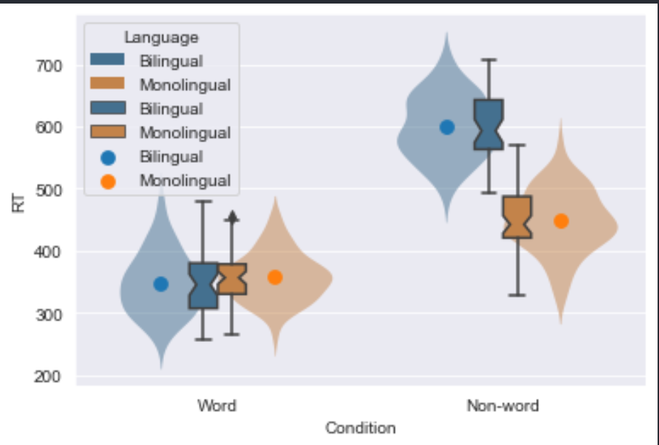
If I put the width to 1, they align, but the boxplots are too wide.
It would be great if boxplot could support a numerical dodge argument like pointplot, but wondered if there is any other way to acheive it.
I also struggled with the absense of legend=False options for some of the plots. Is there any other way to remove duplicate legend entries?
ax = sns.violinplot(data=dat_long, x='Condition', y='RT', hue='Language',
                    inner=None, linewidth=0, saturation=0.5,legend=False)
plt.setp(ax.collections, alpha=.5)
sns.boxplot(data=dat_long, x='Condition', y='RT', hue='Language',
            saturation=0.5, width=0.2,
            boxprops={'zorder': 2}, ax=ax, notch=True, medianprops={'linewidth': 0})
sns.pointplot(data=dat_long, x='Condition', y='RT', hue='Language', ci=68,
              join=False, dodge=0.4)
I also struggled with split violin + boxplots (but again a numerical dodge argument with boxplot would enable this).