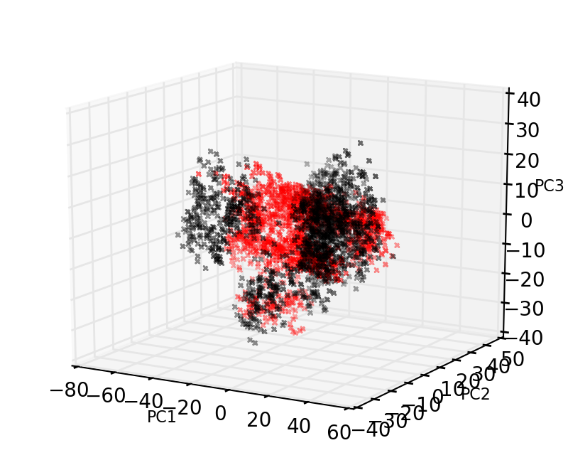
Dear Friends, i used the following code to create a 3D plot (attached figure). I manipulate the appearance of the graph. Someone please enlighten me on the same. I dnt get what functions should i use to do the following manipulations.
- How to remove the blue shading in the grid
- How to change the distance between the axis label and axis tick labels
- How to set the interval of the axis ticks. For example the xlim varies from -80 to 60. I want to set xticks at an interval of 30 rather than 20 as in the plot.
My code.
import numpy as np
import matplotlib as mpl
from mpl_toolkits.mplot3d import Axes3D
import matplotlib.pyplot as plt
FIG=plt.figure(figsize=(4.,3.27),dpi=200)
ax = Axes3D(FIG,azim=-60,elev=15)
x=np.reshape(np.loadtxt(data[0]),15000)
y=np.reshape(np.loadtxt(data[1]),15000)
z=np.reshape(np.loadtxt(data[2]),15000)
ax.scatter3D(x[::10],y[::10],z[::10],edgecolors=col[i],facecolors=‘white’,marker=mar[i],s=5,alpha=0.7)
ax.set_xlabel(‘PC1’,size=8)
ax.set_ylabel(‘PC2’,size=8)
ax.set_zlabel(‘PC3’,size=8)
ax.set_xlim3d(-80,60,30)
ax.set_ylim3d(-40,50,30)
ax.set_zlim3d(-40,40,30)