I would like to have the x-axis showing the timestamps of the samples of audio files. Here is a minimal example:
import numpy as np
from matplotlib import pyplot as plt
from matplotlib import dates as mdates
from scipy.io import wavfile

# Open the WAV files
audio_1 = wavfile.read("audio1.wav")
freq_audio_1 = audio_1[0]
samples_1 = audio_1[1][:, 0]  # Turn to mono

audio_2 = wavfile.read("audio2.wav")
freq_audio_2 = audio_2[0]
samples_2 = audio_2[1][:, 0]  # Turn to mono

# Create the timestamps
t_audio_1 = np.arange(0, len(samples_1)) / freq_audio_1
t_audio_2 = np.arange(0, len(samples_2)) / freq_audio_2

# We turn them into datetime
t_audio_1 = np.array(t_audio_1*1000, dtype="datetime64[ms]")
t_audio_2 = np.array(t_audio_2*1000, dtype="datetime64[ms]")

# Create the figure
fig, ax = plt.subplots(1, 2, constrained_layout=True)

# If the audio files are more than 1 hour, we format as HH:MM:SS, else just MM:SS
if len(samples_1) / freq_audio_1 >= 3600 and len(samples_2) / freq_audio_2 >= 3600 :
   formatter = mdates.AutoDateFormatter(mdates.AutoDateLocator(), defaultfmt='%H:%M:%S')
else:
   formatter = mdates.AutoDateFormatter(mdates.AutoDateLocator(), defaultfmt='%M:%S')

plt.gcf().axes[0].xaxis.set_major_formatter(formatter)
plt.gcf().axes[1].xaxis.set_major_formatter(formatter)

ax[0].plot(t_audio_1, samples_1)
ax[1].plot(t_audio_2, samples_2)
plt.show()
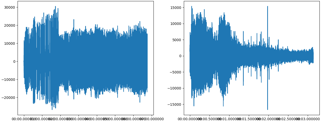
Here is the output: https://i.sstatic.net/ZLvLT2Rm.png
As you can see, the microsecond precision makes so that the ticks on the x axis are shown on top of each other. Is it possible to automatically trim the time to seconds, with milli and then micro seconds appearing only when zooming in the figures?
Thank you ![]()