Hi all,
I am having great difficulty understanding how to change the size of my basemap colorbar, altering its position and moving the text label all at the same time. I would like to:
Shrink the size of the colorbar (there doesn’t seem to be a shrink property in the basemap.colorbar() method (only plt.colorbar() or fig.colorbar())
Move the bar so it is not centered but instead so its right edge is aligned vertically with the right end of the basemap.
Move the colorbar W/m^2 text label so it is not below the colorbar but is instead directly to its left.
I looked up several other responses online that mentioned doing things such as adding a second axes, or using the shrink command from plt.colorbar(), and changing some other properties such as padding, but in the end, most of these alterations
seem to introduce another problem when I try them. Even after viewing their documentation, I still do not fully understand their proper usage. Also, I tried a few properties listed in the matplotlib documentation such as anchor and panchor in my the fig.colorbar()
method in attempt to move the bar around but when I tried to run it, the keyword was not recognized by the interpreter and produced an error (it seems strange that some of the keywords listed in the docs aren’t being recognized; and I’m pretty sure I have
the most current matplotlib version too). You can see some of the commented commands I tried in the code below (not all at once, of course, but just in various conjunctions with one another). Here is an example of my code and an attached example of what the
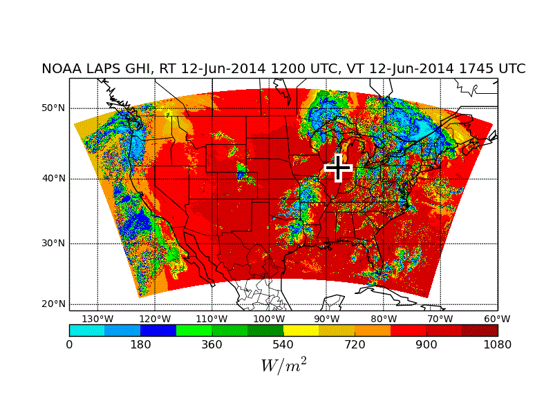
plot currently looks like after running said code. Any helpful advice would be greatly appreciated. So confused right now and I feel like I’ve read the docs over and over to little avail (P.S. Getting down to the nitty gritty of working with matplotlib objects
and understanding its inner workings to customize my plots better is really confusing, even with the docs, (sigh)):
swi = swi.reshape(1059, 1799)
lat = lat.reshape(1059, 1799)
lon = lon.reshape(1059, 1799)
def plot_conus():
m = mpl_toolkits.basemap.Basemap(
llcrnrlon=-135.0,
llcrnrlat=19.0,
urcrnrlon=-60.0,
urcrnrlat=54.0,
projection=‘mill’,
resolution=‘c’)
m.drawcoastlines()
m.drawcountries()
m.drawstates()
draw parallels
parallels = np.arange(0.,90,10.)
m.drawparallels(parallels,labels=[1,0,0,0],fontsize=10)
draw meridians
meridians = np.arange(180.,360.,10.)
m.drawmeridians(meridians,labels=[0,0,0,1],fontsize=10)
return m
find hex color values at
swi_colors = [
#"#f800fd", # light purple
#"#9854c6", # dark purple
“#04e9e7”,
“#019ff4”,
“#0300f4”,
“#02fd02”,
“#01c501”,
“#008e00”,
“#fdf802”,
“#e5bc00”,
“#fd9500”,
“#fd0000”,
“#d40000”,
“#bc0000”,
“#A10505” # brick
]
swi_colormap = matplotlib.colors.ListedColormap(swi_colors)
m = plot_conus()
levels = []
for i in range(13):
levels.append(i*90.0)
create black and white cross at observatory location on map
site_lon = -87.99495
site_lat = 41.70121
x_site, y_site = m(site_lon, site_lat)
m.plot(x_site, y_site, ‘w+’, markersize=30, markeredgewidth=8) # white cross
m.plot(x_site, y_site, ‘k+’, markersize=25, markeredgewidth=3) # black cross
norm = matplotlib.colors.BoundaryNorm(levels, 13)
cax = m.pcolormesh(lon, lat, swi, latlon=True, norm=norm,
cmap=swi_colormap)
#cbar = m.colorbar(cax)
fig = plt.gcf()
#ax = plt.gca()
#cbar = fig.colorbar(cax, orientation=‘horizontal’, shrink=0.75)
#cbaxes = fig.add_axes([0.8, 0.1, 0.03, 0.8])
#cb = fig.colorbar(cax)
cbar = m.colorbar(cax, location=‘bottom’, pad=‘6%’)
cbar.set_label(’$W/m^2$’, fontsize=18)
plt.title('NOAA LAPS GHI, RT ’ + modelrun_time_label + ', VT ’ + fcst_time_label)
plt.show()