Adding circle to a plot results in a 2nd scale on the axis and nothing being displayed on the plot

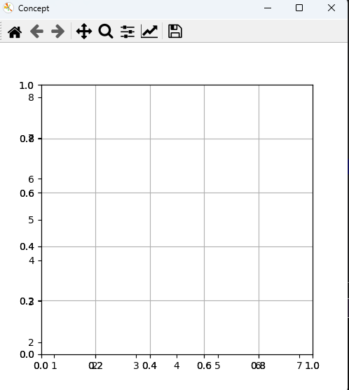
Once I attempt to add circles to the plot, nothing displays on the plot. Without the circle code, the x and y axis scale has major grid lines 2,3,4,5,6,7,8, and the data displays.

Once I add the circle code it appears the 2nd scale of 0 to 1.0 is added to both axis. I believe this is why the plot is blank. No data has a value between 0 and 1.

Not sure why the 2nd axis scale is being added.

Also tried in line in a jupyter notebook with no success.

import matplotlib.pyplot as plt
import matplotlib.path
from matplotlib.patches import Circle

sample = (5, 5)
circles = [(2, 8), (4, 6), (5, 7)]
squares = [(4, 2), (6, 2), (6, 4)]

plt.figure("Concept", (5, 5))
plt.set_cmap('gray')

# plt.axis((0, 10, 0, 10), option='equal')
plt.axis('equal')
plt.scatter(*sample, marker="D", label="??", color='0.0')
plt.scatter([x for x, y in circles], [y for x, y in circles], marker="o", color='.20')
plt.scatter([x for x, y in squares], [y for x, y in squares], marker="s", color='.33')

# k = 3 nearest neighbors
circle3 = Circle((5, 5), 2, facecolor='none',
                edgecolor='black', linestyle='--', alpha=0.8)
plt.axes().add_patch(circle3)

# k = 5 nearest neighbors
circle5 = Circle((5, 5), 3.2, facecolor='none',
                edgecolor='black', linestyle=':', alpha=1.0)
plt.axes().add_patch(circle5)


plt.grid(True)
plt.show()

There are a couple of things going on here.

  1. plt.axes() is making a new Axes every time you call it so there are actually 3 axes layered on top of each other here. This is why you see a bunch of extra tick labels and some of them look extra bold
  2. you are correct that add_patch() does not auto scale, you will need to set the data limits “by hand”

I would do this as


import matplotlib.pyplot as plt
import matplotlib.path
from matplotlib.patches import Circle

sample = (5, 5)
circles = [(2, 8), (4, 6), (5, 7)]
squares = [(4, 2), (6, 2), (6, 4)]

fig = plt.figure("Concept", (5, 5))
ax = fig.subplots()

ax.axis('equal')
ax.scatter(*sample, marker="D", label="??", color='0.0')
ax.scatter([x for x, y in circles], [y for x, y in circles], marker="o", color='.20')
ax.scatter([x for x, y in squares], [y for x, y in squares], marker="s", color='.33')

# k = 3 nearest neighbors
circle3 = Circle((5, 5), 2, facecolor='none',
                edgecolor='black', linestyle='--', alpha=0.8)
ax.add_patch(circle3)

# k = 5 nearest neighbors
circle5 = Circle((5, 5), 3.2, facecolor='none',
                edgecolor='black', linestyle=':', alpha=1.0)
ax.add_patch(circle5)


ax.grid(True)
plt.show()

The answer is precisely what I needed.

I had an idea that I needed to use a figure and subplots, so I am glad I at least was thinking along the correct lines. But, I had no idea if I was right or how to proceed.

Your answer provides a learning opportunity for me.

Thanks