Eric Firing, on 2011-01-22 17:49, wrote:
>> Paul Ivanov, on 2011-01-22 18:28, wrote:
Paul,
Your example below is nice, and this question comes up quite often. If
we don't already have a gallery example of this, you might want to add
one. (Probably better to use deterministic fake data rather than random.)
>>
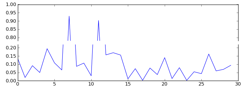
>> import numpy as np
>> import matplotlib.pylab as plt
>> pts = np.random.rand(30)*.2
>> pts[[7,11]] += .8
>> f,(ax,ax2) = plt.subplots(2,1,sharex=True)
>>
>> ax.plot(pts)
>> ax2.plot(pts)
>> ax.set_ylim(.78,1.)
>> ax2.set_ylim(0,.22)
>>
>> ax.xaxis.tick_top()
>> ax.spines['bottom'].set_visible(False)
>> ax.tick_params(labeltop='off')
>> ax2.xaxis.tick_bottom()
>> ax2.spines['top'].set_visible(False)
Done in r8935, see examples/pylab_examples/broken_axis.py
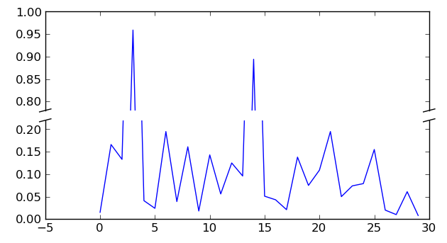
I documented the above, used deterministic fake data, as Eric
suggested, and added the diagonal cut lines that usually
accompany a broken axis. Here's the tail end of the script which
creates that effect (see updated attached image).
# This looks pretty good, and was fairly painless, but you can
# get that cut-out diagonal lines look with just a bit more
# work. The important thing to know here is that in axes
# coordinates, which are always between 0-1, spine endpoints
# are at these locations (0,0), (0,1), (1,0), and (1,1). Thus,
# we just need to put the diagonals in the appropriate corners
# of each of our axes, and so long as we use the right
# transform and disable clipping.
d = .015 # how big to make the diagonal lines in axes coordinates
# arguments to pass plot, just so we don't keep repeating them
kwargs = dict(transform=ax.transAxes, color='k', clip_on=False)
ax.plot((-d,+d),(-d,+d), **kwargs) # top-left diagonal
ax.plot((1-d,1+d),(-d,+d), **kwargs) # top-right diagonal
kwargs.update(transform=ax2.transAxes) # switch to the bottom axes
ax2.plot((-d,+d),(1-d,1+d), **kwargs) # bottom-left diagonal
ax2.plot((1-d,1+d),(1-d,1+d), **kwargs) # bottom-right diagonal
# What's cool about this is that now if we vary the distance
# between ax and ax2 via f.subplots_adjust(hspace=...) or
# plt.subplot_tool(), the diagonal lines will move accordingly,
# and stay right at the tips of the spines they are 'breaking'
best,
···
--
Paul Ivanov
314 address only used for lists, off-list direct email at:
http://pirsquared.org | GPG/PGP key id: 0x0F3E28F7