Jeff Sadino wrote:
I am trying to map the surface of Saturn's largest moon, Titan for a summer research project. As a rough draft, I would like to plot the temperature (colored red) at the longitude(x) and latitude(y) coordinates. My data file is tab delimited in three columns (x,y,T). I am also missing some x,y locations, which I would like to leave blank.
As a final report, I would like the data point to be able to take on different geometries (circle, hexagon, arbitrary shape, etc) and different sizes as well as be able to overlap with neighboring data points. Finally, I would like to be able to plot this not on a rectangular cartesion coordinate system, but on a planetographic (global projection) coordinate system.
I've spent two days trying everything from gnuplot, matlab, matplotlib and others trying to do this, but to no avail. Any suggestions would be very welcomed.
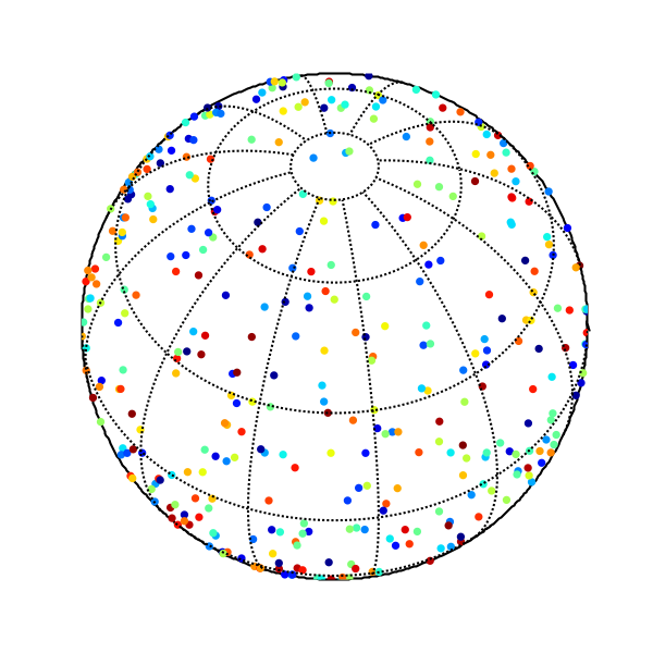
Jeff: The Basemap toolkit can plot data on may different map projections. Here's an example that plots some random data on an orthographic projection:
from matplotlib.toolkits.basemap import Basemap
import pylab as p
from matplotlib.numerix.random_array import uniform
# set up orthographic map projection with
# perspective of satellite looking down at 50N, 100W.
# use resolution = None, since you don't want earth geography.
map = Basemap(projection='ortho',lat_0=50,lon_0=-100,resolution=None)
# draw the edge of the map projection region (the projection limb)
map.drawmapboundary()
# draw lat/lon grid lines every 30 degrees.
map.drawmeridians(p.arange(0,360,30))
map.drawparallels(p.arange(-90,90,30))
# number of points to plot.
npts = 750
# generate random points on a sphere,
# so that every small area on the sphere is expected
# to have the same number of points.
# http://mathworld.wolfram.com/SpherePointPicking.html
u = uniform(0.,1.,size=npts) # this is for numpy, for Numeric use shape=npts
v = uniform(0.,1.,size=npts)
lons = 360.*u
lats = (180./p.pi)*p.arccos(2*v-1) - 90.
# transform lons and lats to map coordinates.
x,y = map(lons,lats)
# random intensities between 0 and 1
z = uniform(0.,1.,size=npts)
# plot filled circles at the locations of the points
# with size=202 points, with intensities colored using jet colormap.
# you can change the shape of the marker with the 'marker' keyword
# faceted=False makes the edge colors the same as the fill colors
# see http://matplotlib.sourceforge.net/matplotlib.pylab.html#-scatter
map.scatter(x,y,20,z,cmap=p.cm.jet,marker='o',faceted=False)
p.show()
-Jeff
···
--
Jeffrey S. Whitaker Phone : (303)497-6313
Meteorologist FAX : (303)497-6449
NOAA/OAR/PSD R/PSD1 Email : [email protected]...
325 Broadway Office : Skaggs Research Cntr 1D-124
Boulder, CO, USA 80303-3328 Web : http://tinyurl.com/5telg