Hello all,
I have this graph but the scale is wrong. See my images. In the image my_graph the xscale an yscale is wrong. I need to let the scale of x and
y my_graph as correct_graph. Can you help me??
Thanks
Hello all,
I have this graph but the scale is wrong. See my images. In the image my_graph the xscale an yscale is wrong. I need to let the scale of x and
y my_graph as correct_graph. Can you help me??
Thanks
Have you tried ax.set_yscale(‘log’)? I don’t see anything wrong with the scale of the xaxis. While the range of values are different, that has nothing to do with the “scale” but the limits and the axis tickers.
Ben Root
On Mon, Feb 21, 2011 at 10:07 AM, Waléria Antunes David <waleriantunes@…287…> wrote:
Hello all,
I have this graph but the scale is wrong. See my images. In the image my_graph the xscale an yscale is wrong. I need to let the scale of x and
y my_graph as correct_graph. Can you help me??Thanks
See my code: http://pastebin.com/xtgKteuW
I need that tn the x-axis should have a scale like this: 0 - 2 - 4 - 6 - 8 - 10 - 12 - 14 and in the y-axis a scale: 1 - 10 - 100 -1000 . See my images, the image correct_graph is correct.
Thanks,

On Mon, Feb 21, 2011 at 1:15 PM, Benjamin Root <ben.root@…1304…> wrote:
On Mon, Feb 21, 2011 at 10:07 AM, Waléria Antunes David <waleriantunes@…120…287…> wrote:
Hello all,
I have this graph but the scale is wrong. See my images. In the image my_graph the xscale an yscale is wrong. I need to let the scale of x and
y my_graph as correct_graph. Can you help me??Thanks
Have you tried ax.set_yscale(‘log’)? I don’t see anything wrong with the scale of the xaxis. While the range of values are different, that has nothing to do with the “scale” but the limits and the axis tickers.
Ben Root
One problem at a time. You are doing an errorbar plot and then creating a subplot. The subplot axes will not be the same thing as the axes you just made the errorbar plot on.
See the correction here: http://pastebin.com/aZEJuGs2
Note, this does not address your tick label problem yet, just your plotting problem.
Ben Root
On Mon, Feb 21, 2011 at 10:23 AM, Waléria Antunes David <waleriantunes@…287…> wrote:
See my code: http://pastebin.com/xtgKteuW
I need that tn the x-axis should have a scale like this: 0 - 2 - 4 - 6 - 8 - 10 - 12 - 14 and in the y-axis a scale: 1 - 10 - 100 -1000 . See my images, the image correct_graph is correct.
Thanks,
So…now my xscale is correct but the yscale …i need that in the yscale should have a scale like this: 1 - 10 - 100 - 1000 … without using power rating . Can you help me??
See my image attached…
Thanks,
On Mon, Feb 21, 2011 at 1:32 PM, Benjamin Root <ben.root@…3146…4…> wrote:
On Mon, Feb 21, 2011 at 10:23 AM, Waléria Antunes David <waleriantunes@…287…> wrote:
See my code: http://pastebin.com/xtgKteuW
I need that tn the x-axis should have a scale like this: 0 - 2 - 4 - 6 - 8 - 10 - 12 - 14 and in the y-axis a scale: 1 - 10 - 100 -1000 . See my images, the image correct_graph is correct.
Thanks,
One problem at a time. You are doing an errorbar plot and then creating a subplot. The subplot axes will not be the same thing as the axes you just made the errorbar plot on.
See the correction here: http://pastebin.com/aZEJuGs2
Note, this does not address your tick label problem yet, just your plotting problem.
Ben Root
I need the yscale so: 1 - 10 - 100 - 1000 . See my image attached. Can you help me, please.
Thanks,
On Mon, Feb 21, 2011 at 1:51 PM, Waléria Antunes David <waleriantunes@…287…> wrote:
So…now my xscale is correct but the yscale …i need that in the yscale should have a scale like this: 1 - 10 - 100 - 1000 … without using power rating . Can you help me??
See my image attached…
Thanks,
On Mon, Feb 21, 2011 at 1:32 PM, Benjamin Root <ben.root@…1304…> wrote:
On Mon, Feb 21, 2011 at 10:23 AM, Waléria Antunes David <waleriantunes@…287…> wrote:
See my code: http://pastebin.com/xtgKteuW
I need that tn the x-axis should have a scale like this: 0 - 2 - 4 - 6 - 8 - 10 - 12 - 14 and in the y-axis a scale: 1 - 10 - 100 -1000 . See my images, the image correct_graph is correct.
Thanks,
One problem at a time. You are doing an errorbar plot and then creating a subplot. The subplot axes will not be the same thing as the axes you just made the errorbar plot on.
See the correction here: http://pastebin.com/aZEJuGs2
Note, this does not address your tick label problem yet, just your plotting problem.
Ben Root
Waleria,
The data you are plotting contains points that have y-values as low as 10^-17. Plotting so that the y-axis has ticks of 1 - 10 - 100 - 1000 would result in those points to be missing from the plot. Is that what you want?
To address the specific formatting of your tick labels, you can change the formatter being used for that axis:
http://matplotlib.sourceforge.net/api/ticker_api.html?highlight=tick%20formatter
By default, using ax.set_yscale(‘log’) will automatically set the LogFormatter object for formatting the y-axis. If you don’t want this formatter, you can replace it with another formatter object.
Ben Root
On Mon, Feb 21, 2011 at 12:24 PM, Waléria Antunes David <waleriantunes@…287…> wrote:
I need the yscale so: 1 - 10 - 100 - 1000 . See my image attached. Can you help me, please.
Thanks,
On Mon, Feb 21, 2011 at 1:51 PM, Waléria Antunes David <waleriantunes@…287…> wrote:
So…now my xscale is correct but the yscale …i need that in the yscale should have a scale like this: 1 - 10 - 100 - 1000 … without using power rating . Can you help me??
See my image attached…
Thanks,
I don’t know how to do this. Can you help me?
On Mon, Feb 21, 2011 at 3:32 PM, Benjamin Root <ben.root@…1304…> wrote:
On Mon, Feb 21, 2011 at 12:24 PM, Waléria Antunes David <waleriantunes@…287…> wrote:
I need the yscale so: 1 - 10 - 100 - 1000 . See my image attached. Can you help me, please.
Thanks,
On Mon, Feb 21, 2011 at 1:51 PM, Waléria Antunes David <waleriantunes@…287…> wrote:
So…now my xscale is correct but the yscale …i need that in the yscale should have a scale like this: 1 - 10 - 100 - 1000 … without using power rating . Can you help me??
See my image attached…
Thanks,
Waleria,
The data you are plotting contains points that have y-values as low as 10^-17. Plotting so that the y-axis has ticks of 1 - 10 - 100 - 1000 would result in those points to be missing from the plot. Is that what you want?
To address the specific formatting of your tick labels, you can change the formatter being used for that axis:
http://matplotlib.sourceforge.net/api/ticker_api.html?highlight=tick%20formatter
By default, using ax.set_yscale(‘log’) will automatically set the LogFormatter object for formatting the y-axis. If you don’t want this formatter, you can replace it with another formatter object.
Ben Root
I don’t know how to do this. Can you help me?
In your case, I would do something like this:
import matplotlib.ticker as mtick
fig = plt.figure()
ax = fig.add_subplot(111)
ax.set_yscale(‘log’)
ax.yaxis.set_major_formatter(mtick.FormatStrFormatter(‘%d’))
Ben Root
On Mon, Feb 21, 2011 at 12:37 PM, Waléria Antunes David <waleriantunes@…287…> wrote:
On Mon, Feb 21, 2011 at 3:32 PM, Benjamin Root <ben.root@…1304…> wrote:
On Mon, Feb 21, 2011 at 12:24 PM, Waléria Antunes David <waleriantunes@…985…> wrote:
I need the yscale so: 1 - 10 - 100 - 1000 . See my image attached. Can you help me, please.
Thanks,
On Mon, Feb 21, 2011 at 1:51 PM, Waléria Antunes David <waleriantunes@…287…> wrote:
So…now my xscale is correct but the yscale …i need that in the yscale should have a scale like this: 1 - 10 - 100 - 1000 … without using power rating . Can you help me??
See my image attached…
Thanks,
Waleria,
The data you are plotting contains points that have y-values as low as 10^-17. Plotting so that the y-axis has ticks of 1 - 10 - 100 - 1000 would result in those points to be missing from the plot. Is that what you want?
To address the specific formatting of your tick labels, you can change the formatter being used for that axis:
http://matplotlib.sourceforge.net/api/ticker_api.html?highlight=tick%20formatter
By default, using ax.set_yscale(‘log’) will automatically set the LogFormatter object for formatting the y-axis. If you don’t want this formatter, you can replace it with another formatter object.
Ben Root
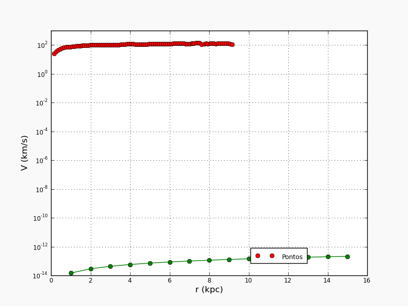
I did what you sai but the yscale was: 0, 0, 0, 0, 0, 0, 0, 1, 100 . Would be the correct way: 1, 10, 100, 1000.
See the wrong image attached. And the correct image - correct_graph attached.
Thanks,
On Mon, Feb 21, 2011 at 3:43 PM, Benjamin Root <ben.root@…1304…> wrote:
On Mon, Feb 21, 2011 at 12:37 PM, Waléria Antunes David <waleriantunes@…287…> wrote:
I don’t know how to do this. Can you help me?
In your case, I would do something like this:
import matplotlib.ticker as mtick
Other code here
Now getting ready to plot
fig = plt.figure()
ax = fig.add_subplot(111)ax.set_yscale(‘log’)
ax.yaxis.set_major_formatter(mtick.FormatStrFormatter(‘%d’))Then plot as usual, be sure to set the y-limits.
Ben Root
On Mon, Feb 21, 2011 at 3:32 PM, Benjamin Root <ben.root@…1304…> wrote:
On Mon, Feb 21, 2011 at 12:24 PM, Waléria Antunes David <waleriantunes@…287…> wrote:
I need the yscale so: 1 - 10 - 100 - 1000 . See my image attached. Can you help me, please.
Thanks,
On Mon, Feb 21, 2011 at 1:51 PM, Waléria Antunes David <waleriantunes@…287…> wrote:
So…now my xscale is correct but the yscale …i need that in the yscale should have a scale like this: 1 - 10 - 100 - 1000 … without using power rating . Can you help me??
See my image attached…
Thanks,
Waleria,
The data you are plotting contains points that have y-values as low as 10^-17. Plotting so that the y-axis has ticks of 1 - 10 - 100 - 1000 would result in those points to be missing from the plot. Is that what you want?
To address the specific formatting of your tick labels, you can change the formatter being used for that axis:
http://matplotlib.sourceforge.net/api/ticker_api.html?highlight=tick%20formatter
By default, using ax.set_yscale(‘log’) will automatically set the LogFormatter object for formatting the y-axis. If you don’t want this formatter, you can replace it with another formatter object.
Ben Root
The graph isn’t wrong.
You are plotting really small values. If you don’t want those values plotted, then don’t plot them, or set the lower limits.
Ben Root
On Mon, Feb 21, 2011 at 12:54 PM, Waléria Antunes David <waleriantunes@…287…> wrote:
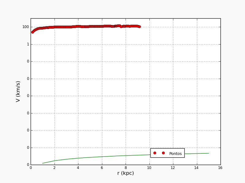
I did what you sai but the yscale was: 0, 0, 0, 0, 0, 0, 0, 1, 100 . Would be the correct way: 1, 10, 100, 1000.
See the wrong image attached. And the correct image - correct_graph attached.
Thanks,
I don’t understand…i need that the yscale has these values: 1,10,100,1000 …But i don’t know how…
Thanks,
On Mon, Feb 21, 2011 at 3:58 PM, Benjamin Root <ben.root@…1304…> wrote:
On Mon, Feb 21, 2011 at 12:54 PM, Waléria Antunes David <waleriantunes@…287…> wrote:
I did what you sai but the yscale was: 0, 0, 0, 0, 0, 0, 0, 1, 100 . Would be the correct way: 1, 10, 100, 1000.
See the wrong image attached. And the correct image - correct_graph attached.
Thanks,
The graph isn’t wrong.
You are plotting really small values. If you don’t want those values plotted, then don’t plot them, or set the lower limits.
Ben Root
Can you help me…please.
On Mon, Feb 21, 2011 at 4:02 PM, Waléria Antunes David <waleriantunes@…287…> wrote:
I don’t understand…i need that the yscale has these values: 1,10,100,1000 …But i don’t know how…
Thanks,
On Mon, Feb 21, 2011 at 3:58 PM, Benjamin Root <ben.root@…1304…> wrote:
On Mon, Feb 21, 2011 at 12:54 PM, Waléria Antunes David <waleriantunes@…287…> wrote:
I did what you sai but the yscale was: 0, 0, 0, 0, 0, 0, 0, 1, 100 . Would be the correct way: 1, 10, 100, 1000.
See the wrong image attached. And the correct image - correct_graph attached.
Thanks,
The graph isn’t wrong.
You are plotting really small values. If you don’t want those values plotted, then don’t plot them, or set the lower limits.
Ben Root
Let me make it clearer. Your green line has values on the order of 10^-17. There is nothing that can be done to meet your request if you are plotting data this small. Either this data is wrong, or you don’t want to plot it at all.
To exclude anything less than 1, use the following:
ax.set_ylim(bottom=1)
Note that this will exclude the green line in your plot!
Ben Root
On Mon, Feb 21, 2011 at 1:32 PM, Waléria Antunes David <waleriantunes@…287…> wrote:
Can you help me…please.
On Mon, Feb 21, 2011 at 4:02 PM, Waléria Antunes David <waleriantunes@…287…> wrote:
I don’t understand…i need that the yscale has these values: 1,10,100,1000 …But i don’t know how…
Thanks,
See this pdf attached…the yscale has these values: 1, 10, 100, 1000 …I need this. My code: http://pastebin.com/HKCGQWez
Can you help me, please??
Thanks,
v_graph.pdf (22 KB)
On Mon, Feb 21, 2011 at 4:41 PM, Benjamin Root <ben.root@…1304…> wrote:
On Mon, Feb 21, 2011 at 1:32 PM, Waléria Antunes David <waleriantunes@…287…> wrote:
Can you help me…please.
On Mon, Feb 21, 2011 at 4:02 PM, Waléria Antunes David <waleriantunes@…287…> wrote:
I don’t understand…i need that the yscale has these values: 1,10,100,1000 …But i don’t know how…
Thanks,
Let me make it clearer. Your green line has values on the order of 10^-17. There is nothing that can be done to meet your request if you are plotting data this small. Either this data is wrong, or you don’t want to plot it at all.
To exclude anything less than 1, use the following:
ax.set_ylim(bottom=1)
Note that this will exclude the green line in your plot!
Ben Root