Hi All,
Intro:
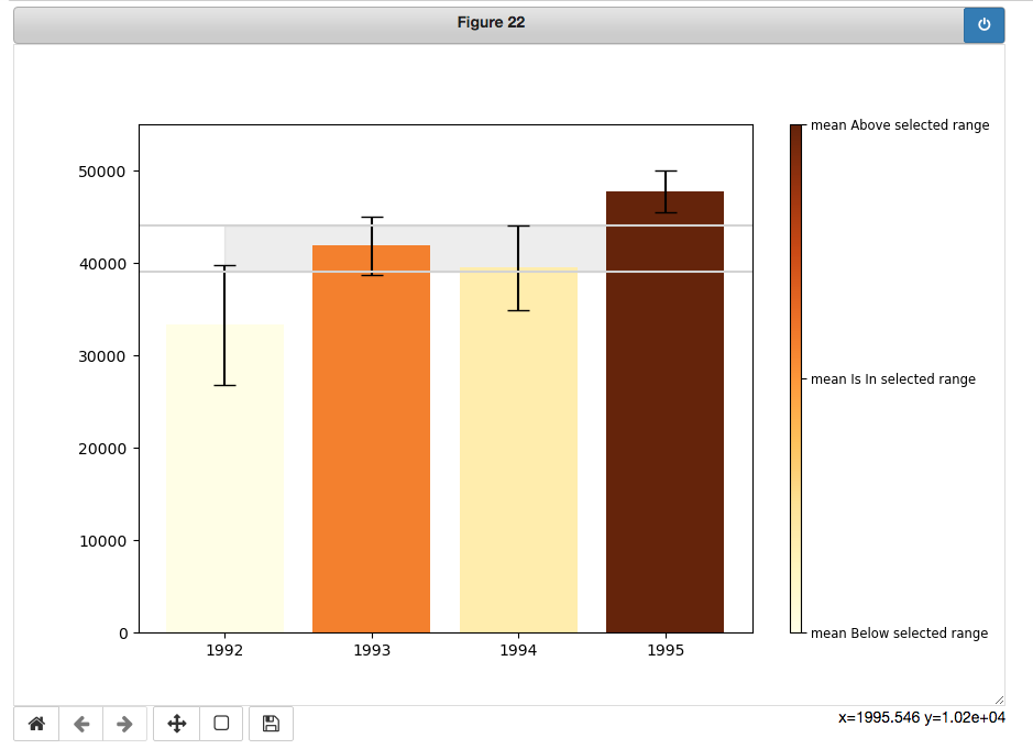
The code below is intended to produce an interactive figure which is plotting bars representing the mean value of each row in the DF and tracking the mouse click [y_value = event.ydata], when a click happened it draws an interval of [upper = y_value + 2500] and [lower = y_value - 2500] as shown in the photo.
It is required that the colors of the bars are depending on "if the mean value represented by the bar is within the interval described above.
Current SItuation
The current code is changing the color of the bars based on "if the mean value represented by the bar is BELOW, ABOVE or AT the exact location of the mouse click, i.e. the value of the y_value = event.ydata.
Accordingly, by calculating the probability of the mean to be AT the y_value, I will get a percentage that can be used to change the color according to the color settings in the code.
My Try
To be able to change the color of the bar when its value is within the interval between upper and lower, I will set a list named intervals = [lower, upper] then will find if the bar value (i.e. the mean value of the row in DF) is between lower and upper, then set the clr_code to 0.5 which mean within the interval.
this requires using an IF statement in the function on_click2() as shown in the code.
The Problem
1- when the IF statement is activated the plot is damaged and takes a long time to respond.
Questions
1- for the color bar and setting the color interval I’m quite understanding how it works under the hood, how one function prepares the output to the other? any help would be appreciated.
2- It is noticeable that the interval drawing is showing a Gray fill_between() which is not presented among the x-axis similar to the plt.axhline() so how to make this gray fill be end to end.
3- as per Q1, if I want to make the color bar be Orange_r Yellow Orange_r what do I need to change.
thanks for the help in advance.
code-----
np.random.seed(12345)

df = pd.DataFrame([np.random.normal(32000,200000,3650),
               np.random.normal(43000,100000,3650),
               np.random.normal(43500,140000,3650),
               np.random.normal(48000,70000,3650)],
              index=[1992,1993,1994,1995])

ci = []
ci2= []
for _,row in df.iterrows():

    # Set mean value
    row_mean = np.mean(row)

    # Get the 95% upper limit and lower limit using stata lib, and norm.interval function
    bounds = stats.norm.interval(0.95, loc=np.mean(row),
                             scale=np.std(row)/np.sqrt(len(row)))
    # Get Error stick length
    err = (bounds[1] - bounds[0])/2
    ci.append(err)

    # Calculate the SE of the sample interval
    se = np.std(row)/np.sqrt(len(row))

    # Get the 95% upper limit and lower limit manually
    bounds2 = [row_mean - se*1.96, row_mean + se*1.96]

    err2 = (bounds2[1] - bounds2[0])/2
    ci2.append(err2)
# ci and ci2 are both the same thing, just two ways to do the samething.


color_range = cm.get_cmap('YlOrBr', 128)
color_set = np.vstack(color_range(np.linspace(0, 1, 128)))

gradient_level = colors.LinearSegmentedColormap.from_list("BrOrYl",color_set)
color_tix2 = cm.ScalarMappable(colors.Normalize(0, 1), gradient_level)
color_tix2.set_array([])


# Creat the main canvas of the plot.
fig2 = plt.figure(figsize=(9,6), dpi=100)

# Creat the Axis of the plot i.e. the figure itself.
ax1 = fig2.add_subplot()

color_bar = fig2.colorbar(color_tix2, ticks=[0,0.5,1],  aspect=50)
color_bar.set_ticklabels(['mean Below selected range',
                      'mean Is In selected range',
                      'mean Above selected range'])
color_bar.ax.tick_params(labelsize='small')


x = df.index.values
ax1.bar(x, df.mean(axis=1),
        yerr=ci2, capsize=7, align='center',
       color=color_tix2.to_rgba([0.5]*len(df))
       )
ax1.set_xticks(x)
plt.ylim(top=55000, bottom=0)


def on_click2(event):
    plt.cla()

    y_value = event.ydata

    intervals = [y_value-2500,y_value+2500]

    plt.axhline(y_value-2500, c='lightgray')
    plt.axhline(y_value+2500, c='lightgray')
    ax1.fill_between(x, intervals[1], intervals[0], color='black', alpha=.07)
    clr_val = []
    means = []
    for i, row in df.iterrows():
        row_mean = np.mean(row)
        row_std = np.std(row)/np.sqrt(len(row))
        clr_code = 1 - stats.norm.cdf(y_value, loc=row_mean, scale=row_std)

        #if row_mean >= intervals[0] and row_mena <= intervals[1]:
        #    clr_code = 0.5

        clr_val.append(clr_code)


    ax1.bar(x, df.mean(axis=1),
            yerr=ci2, capsize=7, align='center',
            color=color_tix2.to_rgba(clr_val)
           )
    ax1.set_xticks(x)
    plt.ylim(top=55000, bottom=0)
    plt.gca().set_title('Y Line = {}\n{}\n{}\n{}'.format(clr_val, intervals,y_value)) # round(y_value,2)))

cid2 = fig2.canvas.mpl_connect('button_release_event', on_click2)