import pandas as pd
import matplotlib.pyplot as plt
import numpy as np
import os
data = pd.read_excel('./image.xlsx', engine='openpyxl', dtype=float)
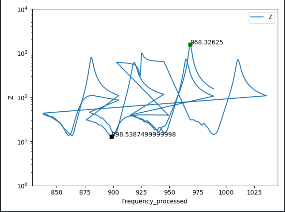
x = data['Frequency_processed']
y = data['Z']
y_min = np.argmin(y)
y_max = np.argmax(y)
fig = plt.figure()
ax = fig.add_subplot(1, 1, 1)
ax.plot(x, y)
ax.plot(x[y_min], y[y_min], 'ks')
ax.plot(x[y_max], y[y_max], 'gs')
plt.xlabel('Frequency_processed')
plt.ylabel('Z')
show_max = x[y_max]
plt.annotate(show_max, xytext=(x[y_max], y[y_max]), xy=(x[y_max], y[y_max]))
show_mix = x[y_min]
plt.annotate(show_mix, xytext=(x[y_min], y[y_min]), xy=(x[y_min], y[y_min]))
plt.ylim(1, 10000)
ax.set_yscale('log')
plt.legend(['Z'])
plt.show()
python 3.9.0 pandas 1.1.4 matplotlib 3.3.3 numpy 1.19.4