Hi all,
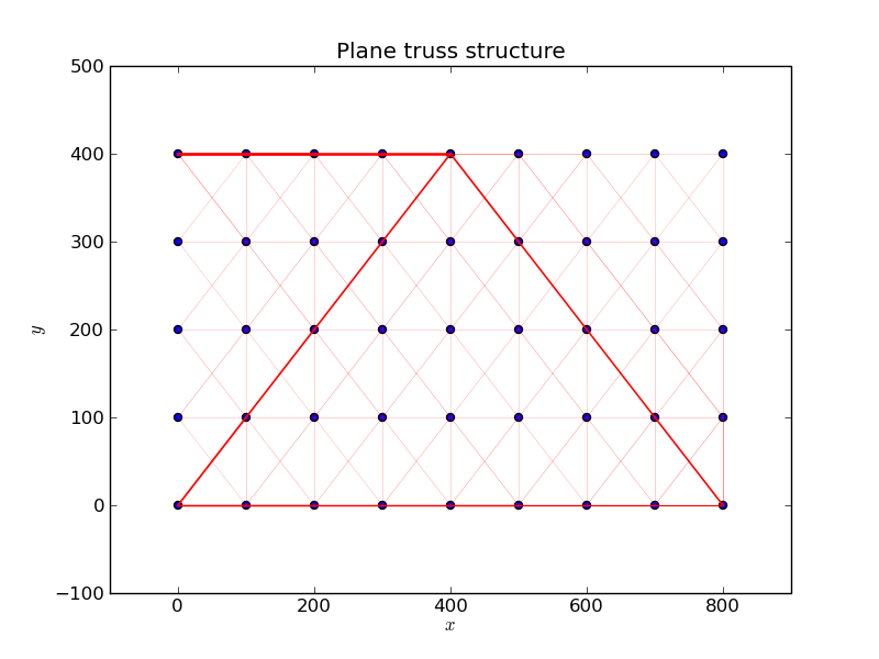
I have written a small program for optimization of truss structures. The design variables are the cross sectional
areas of the truss elements (attached figure).
One way to visualize the results is to use the linewidth
as a parameter.
Is it also possible to use different ("continuous") colors corresponding to the values of the design variables ?
Any pointer would be appreciated.
Thanks in advance.
Nils
Postprocessing
from scipy import io, set_printoptions
from numpy import zeros, arange, outer, identity, loadtxt, ones, shape, dot, r_, where, min, max
set_printoptions(precision=4,linewidth=150)
from pylab import spy, show, plot, subplot, figure, imshow, scatter, title, text, annotate, xlabel, ylabel, savefig
from scipy.linalg import eigh, norm, solve
···
#
# Visualization of the
# results of a sizing optimization problem
#
N = 45 # Number of nodes
nele = 136 # Number of elements
coord = loadtxt('coord.inp',comments='#',usecols=(1,2)).astype(float)
inz = loadtxt('connect.inp',comments='#',usecols=(1,2)).astype(int)
cross = loadtxt('crossopt.dat')
cross_max = max(cross)
cross_min = min(cross)
a = 1.9/(cross_max-cross_min)
b = 2.-a*cross_max
def model(cross):
""" Model plot """
scatter(coord[:,0],coord[:,1])
title('Plane truss structure')
for iele in arange(0,nele):
p_j = coord[inz[iele,1]-1]
p_i = coord[inz[iele,0]-1]
linewidth = a*cross[iele]+b
print iele, linewidth
plot (r_[p_i[0],p_j[0]],r_[p_i[1],p_j[1]],'r-',lw=linewidth)
xlabel('$x$')
ylabel('$y$')
model(cross)
savefig('truss')
show()