Hi
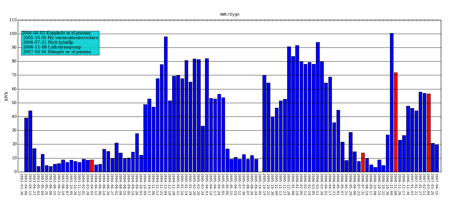
I'm using matplotlib for producing a bar-chart displaying my
electricity consumption. One thing that really annoys me is
that generally python code is quite visually appealing, the
same goes for the code in the matplotlib-examples.
The code I have produced here is frankly quite ugly
when it comes to setting all the properties I want.
Is there a smarter way of doing this, perhaps using dictionaries etc?
(I have attached the genereated png-file)
cheers
//Fredrik
···
--
from parser_el import *
from pylab import *
# Override some matplotlibrc defaults
# to get some nicer plots
rc('figure', figsize=(18,8))
rc('figure.subplot', bottom=0.14)
rc('figure.subplot', left=0.04)
rc('figure.subplot', right=0.98)
p = parser_el()
N = len(p.dates)
ind = arange(N)
p1 = bar(ind, p.kwh_avg, color='b', align='center')
# change color of important bars...
for i in p.info:
if type(i)==datetime:
index = p.dates.index(i)
if index:
p1[index].set_facecolor('r')
# Set axis, grid properties & use dates as xticks
title('kWh/Dygn')
ylabel('kWh')
axis([-1,N,0,110])
locs, labels = xticks(ind, p.dates_string)
setp(labels, 'rotation', '270', 'ha', 'center', fontsize=10,
family='monospace')
xgridlines = getp(gca(), 'xgridlines')
ygridlines = getp(gca(), 'ygridlines')
setp(ygridlines, 'linestyle', '-')
setp(xgridlines, 'linestyle', 'None')
ax = subplot(111)
ax.yaxis.set_major_locator(MultipleLocator(10)) # Set y-gridlines
multiples of 10
grid(True)
text(0,85, p.info_string, bbox=dict(facecolor='darkturquoise', alpha=0.9))
# Store graph as image
savefig('el', dpi=80, orientation='landscape', format='png')
show()
=
--
Powered by Outblaze