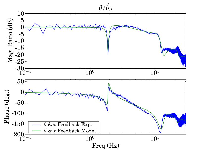
My love of large fonts is causing a problem. If you look at the
attached figure, I typically have x and y tick marks that nearly
collide in the lower left hand corner of each subplot. I typically
end up setting the yticks by hand, but this isn't super convienent for
each plot. I am about to right a function to drop the lowest ytick
label, but is there a better approach?
Thanks,
Ryan