@Zahra I haven’t fully followed what you are trying to do. Again, a standalone simple example is always appreciated. However, I think you are trying to put a “tick” and a label at events in time. I wouldn’t necessarily do that with a second axes. I would just iterate through the events and add a marker and text at the appropriate time. If you want them at the top of the axes, and you want to be able to zoom and have them stay there, you can do something like:
import matplotlib.transforms as mtransforms
trans = mtransforms.blended_transform_factory(ax.transData, ax.transAxes)
for n in range(len(data)):
    ax.plot(time[n], 1.0, 'd', transform=trans)
    ax.text(time[n], 1.0, label[n], transform=trans)
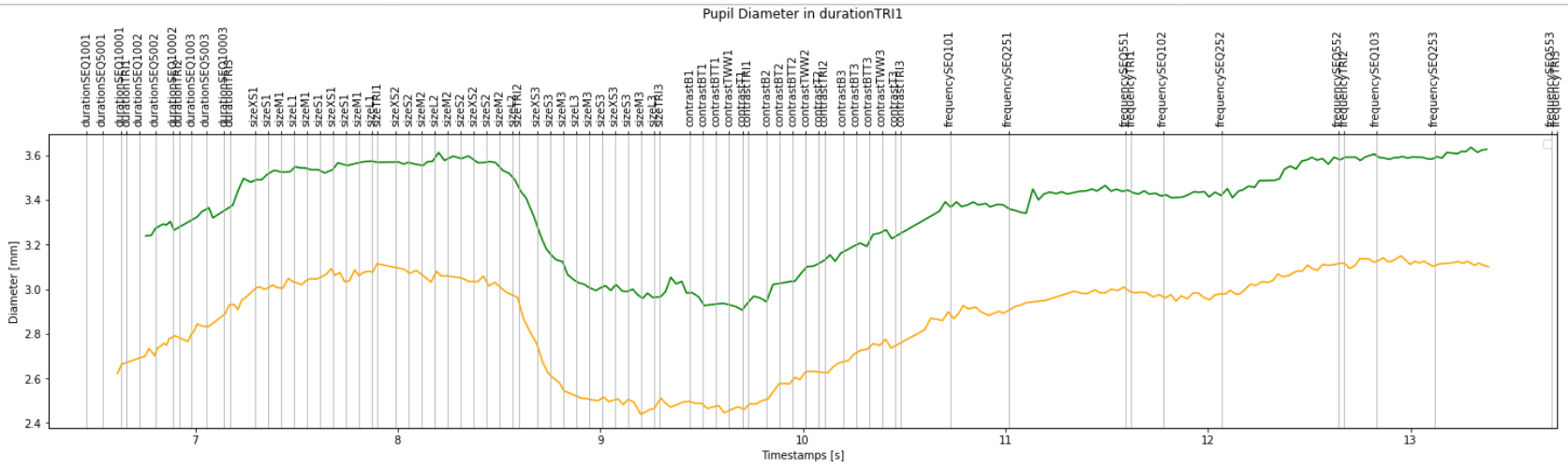
The order is correct, but these are all the sequences and trials, plotted on the data of only the first trial.
That’s why I think my boolean masks do not work as to correctly slice trial data.
Each trial name containing ‘TRI’ should only contain the 'SEQ’s before it.
because the second axis is balanced/scaled against the dataset plotted against it. For example plotting the exact same temperature in kelvin and celsius on different ys works cause they have a shared x to join the two different ys.
instead, what about drawing vertical lines at the timestamps and labeling them like Jody suggested? This code is still in the loop and
for (t, l) in zip(ticks, labels):
    ax1.axvline(t, color='black', linestyle='--')
    trans = mtransforms.blended_transform_factory(ax1.transData, ax1.transAxes)
    ax1.text(t, 1.05, l, ha='center', transform=trans)
where mtransforms.blended_transform_factory(ax1.transData, ax1.transAxes) is saying treat the x as if it’s in data coordinates and the y as if its in axis coordinates. This code yeilds
Now I’m trying to plot the data of the sequences of each trial (i.e. only the ones that have ‘SEQ’ in their label), in one plot for each trial. So it would be three plots (three sequences) in each figure. And I want them to be plotted on top of each other (like holding the plot as we do in Matlab).
Is it possible to get the data in the same loop?
for (t, l) in zip(ticks, labels):
    ax1.axvline(t, color='black', linestyle='--')
    trans = mtransforms.blended_transform_factory(ax1.transData, ax1.transAxes)
    ax1.text(t, 1.05, l, ha='center', transform=trans)
which, you’re gonna need to change all_labels to be lists of list where you group your labels the way you want. Or use a pandas groupby to maybe due this more efficiently, but in the matplotlib equivalent of a hold is basically not making a new object, which is what’s happening at the beginning of each loop:
I just found out that before all these plottings, I have to reject blinks from my data (which is eye tracking data).
I have detected the blinks in my data. I added the blinks.csv file to the gist:
I need to get each blink’s start_timestamp and end_timestamp from blinks.csv and remove the concerning data rows in pupil_positions.csv whose pupil_timestamp is between starts and ends of the blinks.
Should I create boolean masks for this purpose, or a simple drop function will work?
So pandas help is outside the scope of this forum, but my best guess is that you’ll need to do that mask since you’re going to have to apply it to the other data frame.