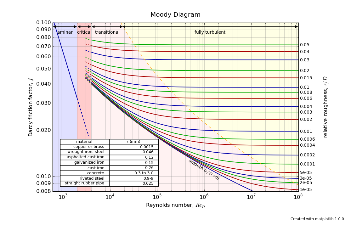
There was a request a while back to create plots that are more application-oriented for the matplotlib gallery, so I’d like to submit this one for inclusion. I tried to spruce it up a bit to show what MPL can do, and I’m sure that the folks here can improve upon it. But at any rate, this is a good first iteration I think.
I’m also going to try to replace the plot at wikipedia (for the Moody diagram) with this one. The one at wikipedia is not quite correct in the way friction factors are computed, and a nice side effect is that mpl gets some exposure there as well (although there are probably dozens of mpl plots already there, but I don’t know how to find them).
The below is meant as constructive criticism; I certainly am committed to using matplotlib and offering patches here and there as I can; I would love to see wider adoption of it. I also concede that in the below items, I might have missed something obvious. I’m trying to approach this as a user who was just introduced to matplotlib, and had to create the plot that is attached.
-
The table mechanism, while very nice and useful, could use some improvement; it should be easier to specify alignment for the table cells, and individual fonts for each cell.
-
drawing the arrows was much harder than it needs to be. Better defaults for arrowhead sizes would help a lot (instead of them being hardcoded to certain numbers, have the defaults be fungible based on how long the arrow is in pixel space), and I had to resort to using the annotate() function to draw them, after spending over an hour trying to use plt.arrow(). plt.arrow() had some problems drawing arrowheads on log-log plots, and well as not supporting a double-ended arrow.
-
drawing the shading using polygons was great and easy.
-
the title by default is placed too close to the top
-
the plot axis labels were clipped by default; had to pull the axis limits in (I know, this is a longstanding thing, but a new user would wrinkle their nose)
All in all, the plot took a lot longer to make than I had anticipated; mainly due to some fussing with the issues above until I found something that worked.
Hope that you find the sample useful.
moody_chart.py (7.38 KB)
···
–
Daniel Hyams
dhyams@…287…
Oops, one thing about the graph that I forgot to point out…does the antialiasing look a little funny? It seems a bit inconsistent, especially as the line goes flat. I increased the line width in an effort to make it less obvious; is there some other way to improve this behavior?
I’m not one of the mpl-developers, so I can’t speak about the likelihood of inclusion, but I do think it’s a great plot (esp. since my background is in fluid mechanics). I think it’d be a great example to have, especially if the gallery gets split up into different categories. (Personally, I think it would be nice to have a category for complex, application-style examples, and multiple categories for simplified-versions of most of the current examples).
I agree with most of your points, but I don’t have much to add on anything except for #2: Drawing arrows has been painful for me as well. If I find the time, I plan on putting together a PR which draws arrows using a FancyArrowPatch and a Line2D object. Although, annotate works great for it’s designed purpose, it can be cumbersome for drawing simple arrows.
-Tony
···
On Tue, Mar 20, 2012 at 4:10 PM, Daniel Hyams <dhyams@…287…> wrote:
There was a request a while back to create plots that are more application-oriented for the matplotlib gallery, so I’d like to submit this one for inclusion. I tried to spruce it up a bit to show what MPL can do, and I’m sure that the folks here can improve upon it. But at any rate, this is a good first iteration I think.
I’m also going to try to replace the plot at wikipedia (for the Moody diagram) with this one. The one at wikipedia is not quite correct in the way friction factors are computed, and a nice side effect is that mpl gets some exposure there as well (although there are probably dozens of mpl plots already there, but I don’t know how to find them).
The below is meant as constructive criticism; I certainly am committed to using matplotlib and offering patches here and there as I can; I would love to see wider adoption of it. I also concede that in the below items, I might have missed something obvious. I’m trying to approach this as a user who was just introduced to matplotlib, and had to create the plot that is attached.
- The table mechanism, while very nice and useful, could use some improvement; it should be easier to specify alignment for the table cells, and individual fonts for each cell.
- drawing the arrows was much harder than it needs to be. Better defaults for arrowhead sizes would help a lot (instead of them being hardcoded to certain numbers, have the defaults be fungible based on how long the arrow is in pixel space), and I had to resort to using the annotate() function to draw them, after spending over an hour trying to use plt.arrow(). plt.arrow() had some problems drawing arrowheads on log-log plots, and well as not supporting a double-ended arrow.
- drawing the shading using polygons was great and easy.
- the title by default is placed too close to the top
- the plot axis labels were clipped by default; had to pull the axis limits in (I know, this is a longstanding thing, but a new user would wrinkle their nose)
All in all, the plot took a lot longer to make than I had anticipated; mainly due to some fussing with the issues above until I found something that worked.
Hope that you find the sample useful.
–
Daniel Hyams
dhyams@…287…
I liked the plot very much, too. I want to start using python and matplotlib
for my everyday engineering calculations and could use any handy matplotlib
samples. This in particular looks great, compare to the
copied-and-copied-and-copied-over black-and-white scanned-in plot in the
design manual...no, I am not quite a fluid dynamics kind of guy, but
sometimes I need to do such job, anyway.
So, good job and thanks for contributing.
···
--
View this message in context: http://old.nabble.com/sample-to-contribute-to-mpl-gallery-tp33541388p33544585.html
Sent from the matplotlib - users mailing list archive at Nabble.com.