This is a really nice tool!
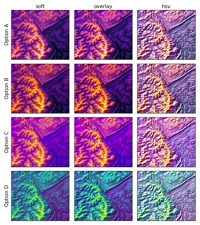
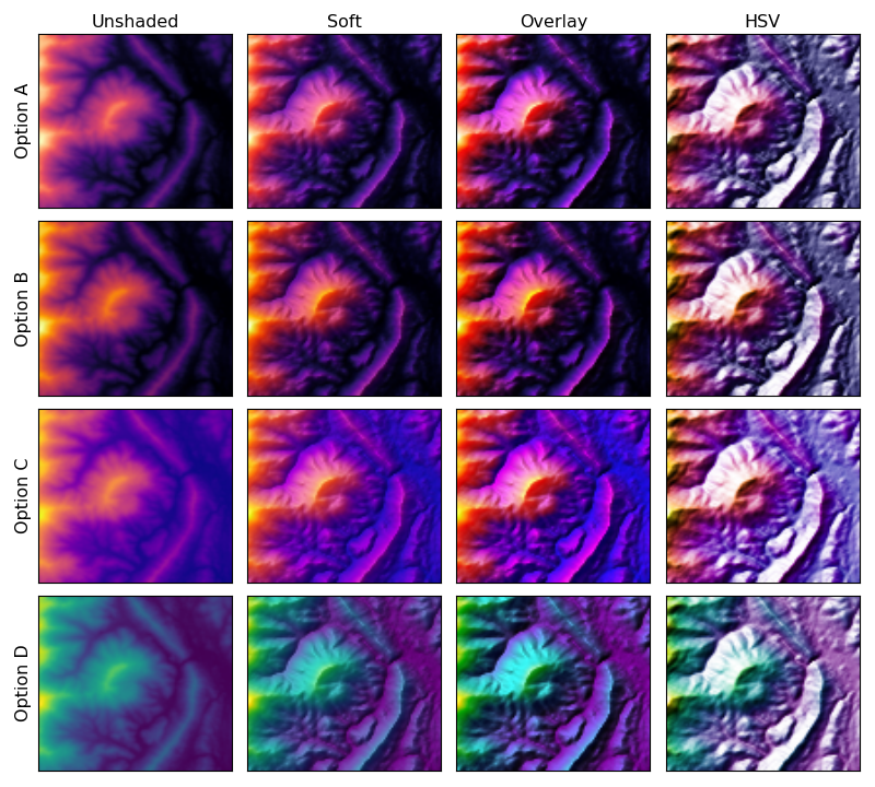
Attached is an example of a map that circles the other direction, and that sacrifices some visual delta for less extreme ends. Although I think the "sunrise" type of map that you offered in versions A, B, and C is a good one to have in the arsenal, I am not convinced that it should be the only category to be considered as a default. Do we really want to reject the somewhat Parula-like category just because Matlab uses the real Parula?
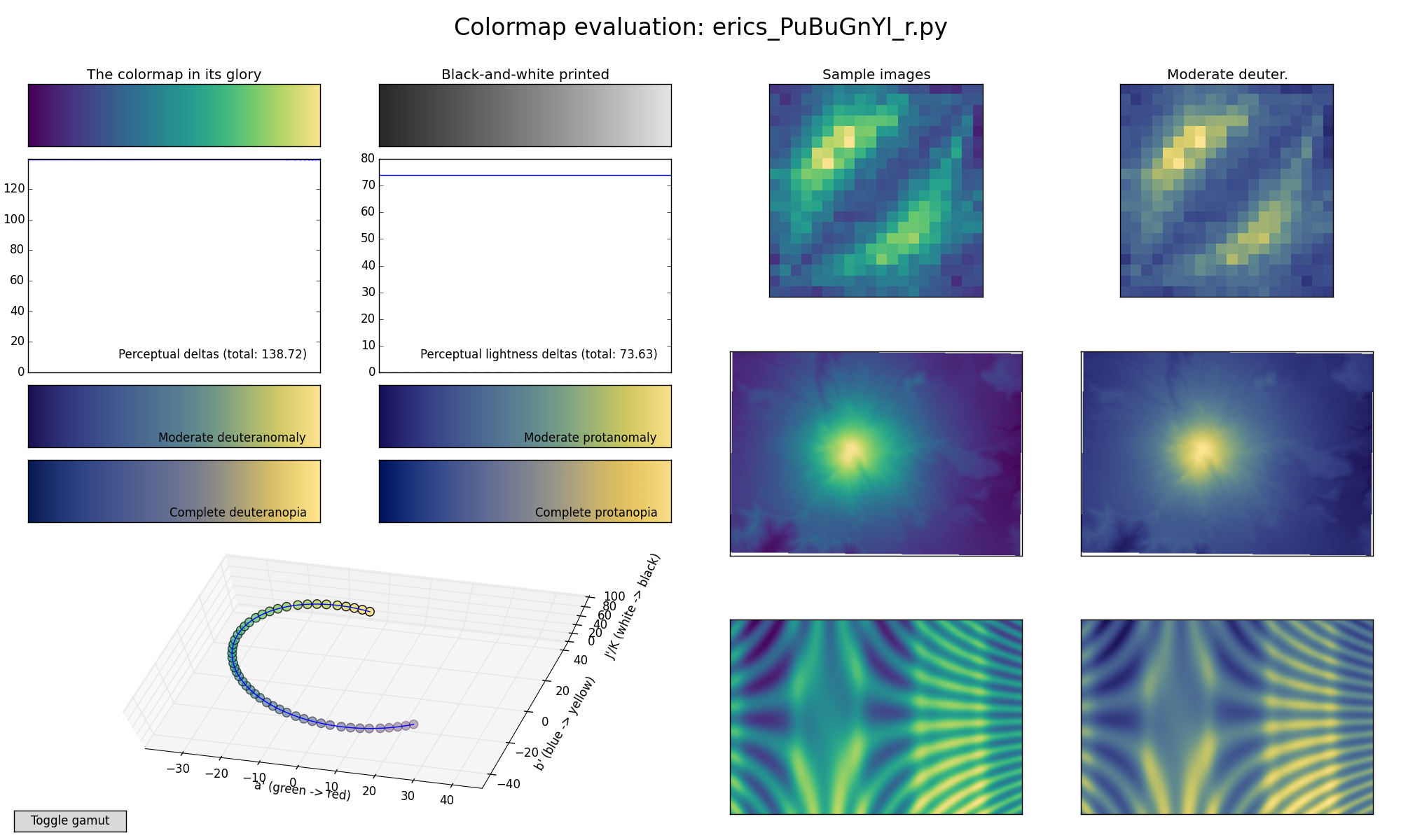
I'm not saying the attached example is particularly good; it is intended to re-introduce the category. (It is somewhat similar to a reversal of our ColorBrewer YlGnBu, so I tried to name it following that scheme.)
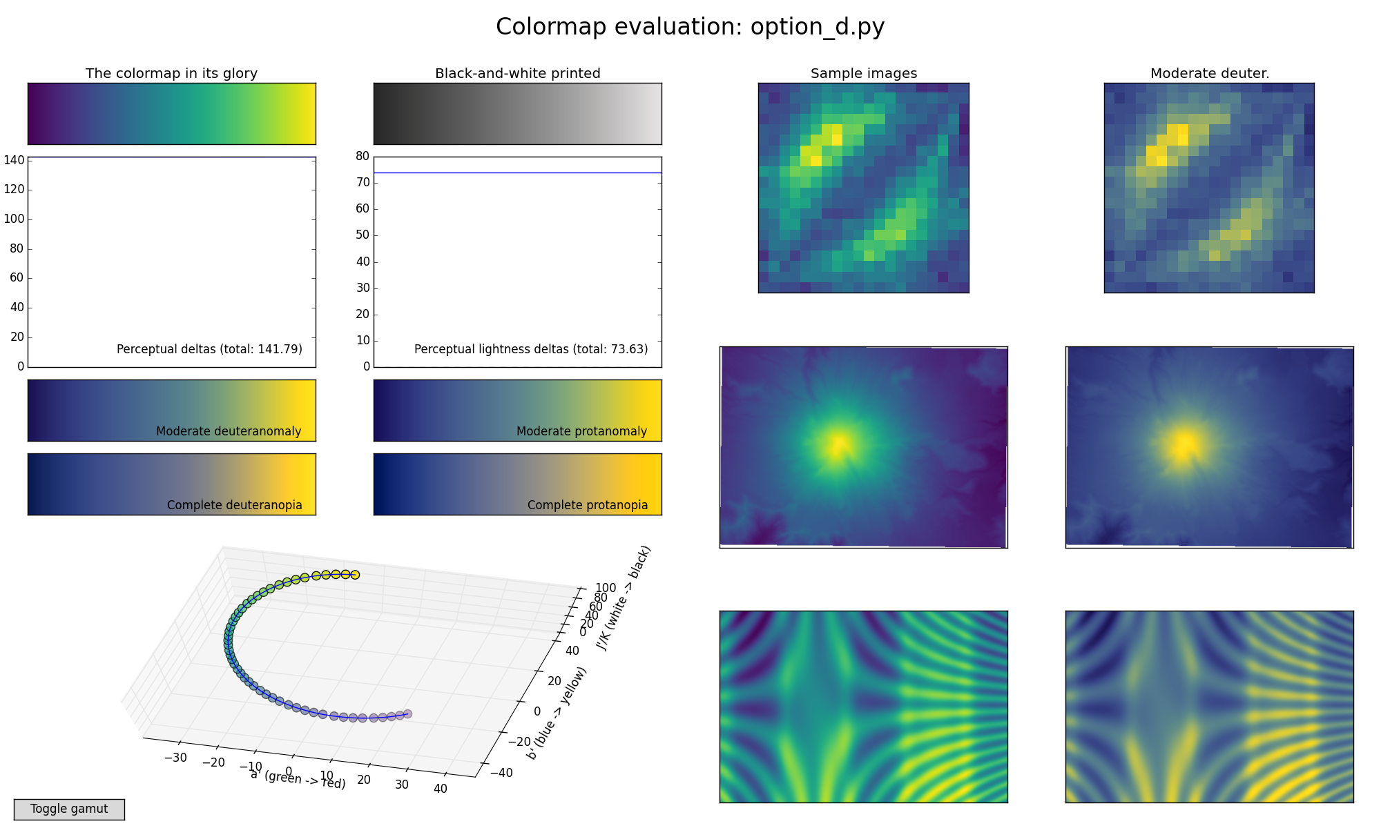
It seems that the fundamental constraints in this map generator tend to yield a somewhat muddy dark end and a muted middle. That's one compromise among many that are possible.
Eric
PuBuGnYl_r.py (12.9 KB)
···
On 2015/06/02 7:58 PM, Nathaniel Smith wrote:
On Tue, Jun 2, 2015 at 10:03 PM, Paul Ivanov <pi@...453...> wrote:
That said, if you want to play around with the editor tool, it's
linked on the webpage :-).