Hi all,
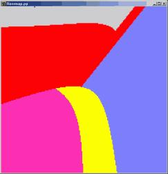
I have a simple ‘region map’ like the that shown below (currently
generated as a gtk.gdk.Pixbuf) that I would like to plot on matplotlib
axes, and then draw some points and lines on top of. I would also like
to add to my graph a legend that shows what the various colours mean.
Is there any way I can do this with matplot lib? The closest I found
was the following, but there’s no mention of the issue of creating a
legend.
Cheers
JP
···
http://www.scipy.org/Cookbook/Matplotlib/Plotting_Images_with_Special_Values
-- John Pye
School of Mechanical and Manufacturing Engineering
The University of New South Wales
Sydney NSW 2052 Australia
t +61 2 9385 5127
f +61 2 9663 1222
mailto:john.pye_AT_student_DOT_unsw.edu.auhttp://pye.dyndns.org/