Hello,
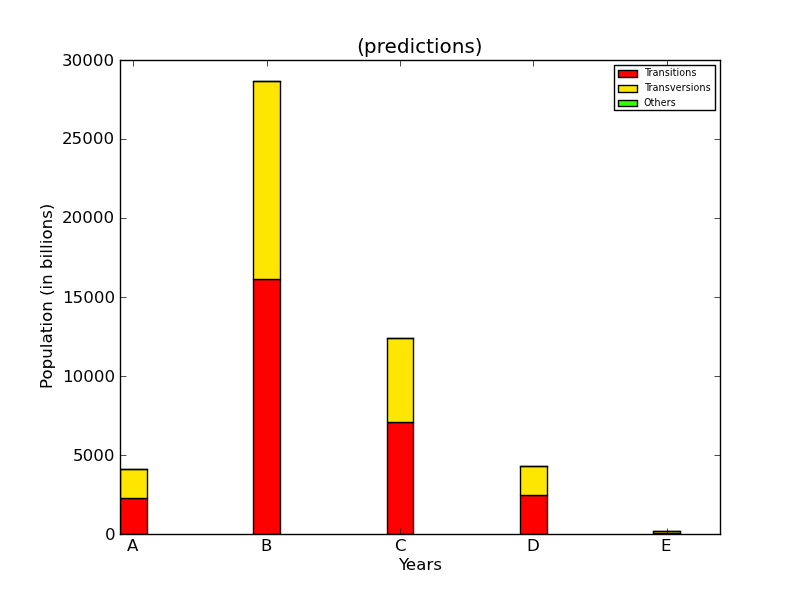
Please find attached the a bar chart picture. How is it possible to reduce the space between the bars and xticks with the following code:
prepare the bottom array
bottom = np.zeros(len(snp_types))
width = .2
for each line in data
for row in range(len(data)):
create the bars for each element, on top of the previous bars
bt = plt.bar(range(len(data[row])), data[row], width=width,
color=cm.hsv(39*(row)), label=mutations[row],
bottom=bottom)
update the bottom array
bottom += data[row]
label the X ticks with years
snp_types = [‘A’, ‘B’, ‘C’, ‘D’, ‘E’]
plt.xticks(np.arange(len(snp_types))+width/2, snp_types)
print np.arange(len(snp_types))+width/2, snp_types
# some information on the plot
plt.xlabel(‘Years’)
plt.ylabel(‘Population (in billions)’)
plt.title(’(predictions)’)
···
# draw a legend, with a smaller font
plt.legend(loc=‘upper right’,
prop=font_manager.FontProperties(size=7))
# apply the custom function as Y axis formatter
plt.gca().yaxis.set_major_formatter(FuncFormatter(billions))
plt.subplots_adjust(bottom=0.11, left=0.15)
plt.savefig(‘7900_09_04.png’)
Thank you in advance,