I assume you mean the first example, the wire frame (see
below). It works for me.
I've tried that code as well, and p.show() doesn't return until
the window is closed. If I use code like that in a python
program, the program becomes non-responsive until the plot
window is closed.
I've switched to using wxmpl to embed figure in a wxWidgets
panel. That almost works -- except I loose the ability for the
user to rotate/zoom using the mouse.
No problems. When pylab (matplotlib) plots it does so in a
window associated with a Python process that is separate from
the terminal (I assume you are using a terminal).
I'm not sure what you mean by "using a terminal". I'm running
my python app from the command line in a terminal emulator
window.
···
On 2007-04-09, Lou Pecora <lou_boog2000@...9...> wrote:
--
Grant Edwards grante Yow! Hey, I LIKE that
at POINT!!
visi.com
I get this behaviour as well, but only on first usage of show(). However, after that there is no problem. The default is to start off with interactive mode off, but the first usage of show() turns it on.
So I would guess that the problem is that with interactive mode turned off, the figure window is not returning.
···
On Mon, 9 Apr 2007, Grant Edwards wrote:
I've tried that code as well, and p.show() doesn't return until
the window is closed. If I use code like that in a python
program, the program becomes non-responsive until the plot
window is closed.
> I assume you mean the first example, the wire
frame (see
> below). It works for me.
I've tried that code as well, and p.show() doesn't
return until
the window is closed. If I use code like that in a
python
program, the program becomes non-responsive until
the plot
window is closed.
That is how pylab works. The program has to respond
to events in the plot window and cannot respond to the
command line.
I've switched to using wxmpl to embed figure in a
wxWidgets
panel. That almost works -- except I loose the
ability for the
user to rotate/zoom using the mouse.
I have not tried this approach very much. I'm sorry,
but I can't think of a way to retain the rotate/zoom.
Perhaps others can offer help.
> No problems. When pylab (matplotlib) plots it
does so in a
> window associated with a Python process that is
separate from
> the terminal (I assume you are using a terminal).
I'm not sure what you mean by "using a terminal".
I'm running
my python app from the command line in a terminal
emulator
window.
Yes, that is what I meant by using a terminal.
-- Lou Pecora, my views are my own.
···
--- Grant Edwards <grante@...1551...> wrote:
On 2007-04-09, Lou Pecora <lou_boog2000@...9...> > wrote:
---------------
"I knew I was going to take the wrong train, so I left early."
--Yogi Berra
____________________________________________________________________________________
Need Mail bonding?
Go to the Yahoo! Mail Q&A for great tips from Yahoo! Answers users. http://answers.yahoo.com/dir/?link=list&sid=396546091
I'm afraid that the current version of WxMpl doesn't play nicely with matplotlib's event system. I hope to integrate the two event models so stuff like 3D rotations work. Unfortunately that probably won't be happening for some time yet.
Ken
···
On Apr 9, 2007, at 1:16 PM, Grant Edwards wrote:
I've switched to using wxmpl to embed figure in a wxWidgets
panel. That almost works -- except I loose the ability for the
user to rotate/zoom using the mouse.
If there are a set of data points being plotted in a
subplot, say 0 to 1000 points; the subplot displays
the ticks as 0 to 1000 points and it is desired to
"translate" those points to 0 t0 250 points on the
subplot display - with point 0 mapping to point 0,
point 250 mapping to point 2 and so on, what could be
the best way to do this ?
Just curious,
thanks,
iyer
···
____________________________________________________________________________________
Never miss an email again!
Yahoo! Toolbar alerts you the instant new Mail arrives. http://tools.search.yahoo.com/toolbar/features/mail/
Not sure if I understand, but I think this is what you want to do:
y = rand(1000) # your 1000 random points
x = linspace(0, 250, y.size)
plot(x,y)
/A
Iyer wrote:
···
I think this is a trivial question..
If there are a set of data points being plotted in a
subplot, say 0 to 1000 points; the subplot displays
the ticks as 0 to 1000 points and it is desired to
"translate" those points to 0 t0 250 points on the
subplot display - with point 0 mapping to point 0,
point 250 mapping to point 2 and so on, what could be
the best way to do this ?
Just curious,
thanks,
iyer
____________________________________________________________________________________
Never miss an email again!
Yahoo! Toolbar alerts you the instant new Mail arrives. http://tools.search.yahoo.com/toolbar/features/mail/
-------------------------------------------------------------------------
Take Surveys. Earn Cash. Influence the Future of IT
Join SourceForge.net's Techsay panel and you'll get the chance to share your
opinions on IT & business topics through brief surveys-and earn cash http://www.techsay.com/default.php?page=join.php&p=sourceforge&CID=DEVDEV
_______________________________________________
Matplotlib-users mailing list
Matplotlib-users@lists.sourceforge.net matplotlib-users List Signup and Options
assume you have 1000 points of data and you'd like the
ticks to display from 0 to 4, since the 1000 points of
data were sampled at 250 Hz.
any "non-pylab" ideas ? Indexlocator?
-iyer
···
--- Antonio Gonzalez <Antonio.Gonzalez@...1053...> wrote:
Not sure if I understand, but I think this is what
you want to do:
y = rand(1000) # your 1000 random points
x = linspace(0, 250, y.size)
plot(x,y)
/A
Iyer wrote:
> I think this is a trivial question..
>
> If there are a set of data points being plotted in
a
> subplot, say 0 to 1000 points; the subplot
displays
> the ticks as 0 to 1000 points and it is desired to
> "translate" those points to 0 t0 250 points on the
> subplot display - with point 0 mapping to point 0,
> point 250 mapping to point 2 and so on, what could
be
> the best way to do this ?
>
> Just curious,
> thanks,
> iyer
>
>
>
>
>
>
>
>
> Take Surveys. Earn Cash. Influence the Future of
IT
> Join SourceForge.net's Techsay panel and you'll
get the chance to share your
> opinions on IT & business topics through brief
surveys-and earn cash
>
> _______________________________________________
> Matplotlib-users mailing list
> Matplotlib-users@lists.sourceforge.net
>
While your suggestion picks out the samples from the
sample set, and discards other samples - what I was
looking at --
when I plot a sample set, of say - 1000 points, the
xticks shows up as 0 to 1000 points on the plot.
I was wondering if there could be a way to translate
the xtick display to that of seconds, if the sampling
frequency is 250 Hz, the plot would still display the
original data set, but with different xticks -- for
e.g. it would display xticks as 0 to 4 seconds rather
than 0 to 1000 points.. hence is there a good way to
"translate ticks" ?
-iyer
···
--- John Hunter <jdh2358@...287...> wrote:
On 4/10/07, Iyer <maseriyer@...9...> wrote:
> I'd like to avoid the pylab interface...
> linspace is good.
from matplotlib.mlab import linspace
But linspace may not be what you want. Probably
better:
In [1]: Fs = 4. # sampling at 4Hz
In [2]: dt = 1./Fs
In [3]: import numpy
In [4]: ind = numpy.arange(1000.) # the sample
number
In [5]: t = ind*dt # the sample times
In [6]: t[0]
Out[6]: 0.0
In [7]: t[1]
Out[7]: 0.25
linspace gives a slightly different answer, because
it includes the
endpoint. Sometimes this is what you want,
sometimes not.
Yes, you can certainly do this, but what we are suggesting is that it
makes more sense to simply scale your data before plotting. Is there
a reason you don't want to do this
ax.plot(ind*dt, y)
The index locator
JDH
···
On 4/10/07, Iyer <maseriyer@...9...> wrote:
I apologize if I haven't been sufficiently clear.
While your suggestion picks out the samples from the
sample set, and discards other samples - what I was
looking at --
when I plot a sample set, of say - 1000 points, the
xticks shows up as 0 to 1000 points on the plot.
I was wondering if there could be a way to translate
the xtick display to that of seconds, if the sampling
frequency is 250 Hz, the plot would still display the
original data set, but with different xticks -- for
e.g. it would display xticks as 0 to 4 seconds rather
than 0 to 1000 points.. hence is there a good way to
"translate ticks" ?
Wouldn't it make sense to simply change the xticks to
reflect the time instead of the number of data points
?
Like, if we needed to display 0 t0 1000 points over a
period of time, wouldn't it be nice to translate the
xticks to reflect the period of time ?
Would you suggest using IndexLocator in that sense ?
-iyer
···
hence is there a good way
to
> "translate ticks" ?
Yes, you can certainly do this, but what we are
suggesting is that it
makes more sense to simply scale your data before
plotting. Is there
a reason you don't want to do this
ax.plot(ind*dt, y)
The index locator
JDH
____________________________________________________________________________________
Looking for earth-friendly autos?
Browse Top Cars by "Green Rating" at Yahoo! Autos' Green Center. http://autos.yahoo.com/green_center/
My suggestion does not "discard other samples", so you may not be
understanding what I am saying. Perhaps you can try the suggested
code and see if it does what you want. My example plots all the
samples; it simply scales the xaxis to represent time and not sample
number.
···
On 4/10/07, John Hunter <jdh2358@...287...> wrote:
On 4/10/07, Iyer <maseriyer@...9...> wrote:
> I apologize if I haven't been sufficiently clear.
>
> While your suggestion picks out the samples from the
> sample set, and discards other samples - what I was
> looking at --
The plot method (plot(self, *args, **kwargs)) accepts
only x,y pairs, in ax.plot(ind*dt, y) -- the x
parameter is ind*dt - the sample times, but the data
between the sample points is lost. IMHO, the likely
way to prevent loss of sampled data points is changing
the ticks, isn't that possible to change the ticks,
while keeping the data as it is -- plotted as if it
were for a number of data points.
-iyer
···
--- John Hunter <jdh2358@...287...> wrote:
On 4/10/07, John Hunter <jdh2358@...287...> wrote:
> On 4/10/07, Iyer <maseriyer@...9...> wrote:
> > I apologize if I haven't been sufficiently
clear.
> >
> > While your suggestion picks out the samples from
the
> > sample set, and discards other samples - what I
was
> > looking at --
My suggestion does not "discard other samples", so
you may not be
understanding what I am saying. Perhaps you can try
the suggested
code and see if it does what you want. My example
plots all the
samples; it simply scales the xaxis to represent
time and not sample
number.
____________________________________________________________________________________
Looking for earth-friendly autos?
Browse Top Cars by "Green Rating" at Yahoo! Autos' Green Center. http://autos.yahoo.com/green_center/
There seems to be a huge misunderstanding here, and I am not sure what it is, but what you need to do is run examples and experiment with variations until you have some inkling of what mpl is actually doing. Start with http://matplotlib.sourceforge.net/tutorial.html.
Please note that the ticks are simply labeled locations--they have no effect on what data are plotted.
When you do ax.plot(ind*dt, y), absolutely *nothing* is lost; every value of y in your array is plotted. mpl is plotting (x,y) pairs--all of them--and labeling the axes accordingly.
To see what is being plotted, you can use plot(x,y,'ro'), for example, to plot each point as a red circle. Experiment with this.
Don't worry right now about avoiding the pylab interface; take advantage of its simplicity to get the most basic plotting concepts straightened out via quick experimentation. Use the gui zoom button to see how axis labeling works. Make your own simple examples; plot random points, plot sin waves.
The plot method (plot(self, *args, **kwargs)) accepts
only x,y pairs, in ax.plot(ind*dt, y) -- the x
parameter is ind*dt - the sample times, but the data
between the sample points is lost. IMHO, the likely
way to prevent loss of sampled data points is changing
the ticks, isn't that possible to change the ticks,
while keeping the data as it is -- plotted as if it
were for a number of data points.
-iyer
--- John Hunter <jdh2358@...287...> wrote:
On 4/10/07, John Hunter <jdh2358@...287...> wrote:
On 4/10/07, Iyer <maseriyer@...9...> wrote:
I apologize if I haven't been sufficiently
clear.
While your suggestion picks out the samples from
the
sample set, and discards other samples - what I
was
looking at --
My suggestion does not "discard other samples", so
you may not be
understanding what I am saying. Perhaps you can try
the suggested
code and see if it does what you want. My example
plots all the
samples; it simply scales the xaxis to represent
time and not sample
number.
____________________________________________________________________________________
Looking for earth-friendly autos? Browse Top Cars by "Green Rating" at Yahoo! Autos' Green Center. http://autos.yahoo.com/green_center/
-------------------------------------------------------------------------
Take Surveys. Earn Cash. Influence the Future of IT
Join SourceForge.net's Techsay panel and you'll get the chance to share your
opinions on IT & business topics through brief surveys-and earn cash http://www.techsay.com/default.php?page=join.php&p=sourceforge&CID=DEVDEV
_______________________________________________
Matplotlib-users mailing list
Matplotlib-users@lists.sourceforge.net matplotlib-users List Signup and Options
With all respect, I have certainly perused the
tutorials before posting the question. I'm still a
newbie and I acknowledge I have miles and miles to go
before I can be someone who can help out in the
Matplotlib group like you guys do.
The problem is simple, it is like the date examples in
the Matplotlib code -- the ticks for the date examples
(seconds, hours, time etc) are different from the
usual ticks, which is usually the number of samples.
If only someone could guide me, so that I can
understand better how to "translate" the ticks from
the default "number of sample" ticks to that of
different ticks - say
new_ticks=original_ticks/(some_constant). Right now
I'm clueless, your input will help a lot in
understanding Mpl.
Thanks guys for your feedback and help
iyer
There seems to be a huge misunderstanding here, and
I am not sure what
it is, but what you need to do is run examples and
experiment with
variations until you have some inkling of what mpl
is actually doing.
Start with http://matplotlib.sourceforge.net/tutorial.html.
Please note that the ticks are simply labeled
locations--they have no
effect on what data are plotted.
When you do ax.plot(ind*dt, y), absolutely *nothing*
is lost; every
value of y in your array is plotted. mpl is plotting
(x,y) pairs--all of
them--and labeling the axes accordingly.
To see what is being plotted, you can use
plot(x,y,'ro'), for example,
to plot each point as a red circle. Experiment with
this.
Don't worry right now about avoiding the pylab
interface; take advantage
of its simplicity to get the most basic plotting
concepts straightened
out via quick experimentation. Use the gui zoom
button to see how axis
labeling works. Make your own simple examples; plot
random points, plot
sin waves.
>
> The plot method (plot(self, *args, **kwargs))
accepts
> only x,y pairs, in ax.plot(ind*dt, y) -- the x
> parameter is ind*dt - the sample times, but the
data
> between the sample points is lost. IMHO, the
likely
> way to prevent loss of sampled data points is
changing
> the ticks, isn't that possible to change the
ticks,
> while keeping the data as it is -- plotted as if
it
> were for a number of data points.
>
> -iyer
>
>
>
>
> --- John Hunter <jdh2358@...287...> wrote:
>
>> On 4/10/07, John Hunter <jdh2358@...287...> > wrote:
>>> On 4/10/07, Iyer <maseriyer@...9...> wrote:
>>>> I apologize if I haven't been sufficiently
>> clear.
>>>> While your suggestion picks out the samples
from
>> the
>>>> sample set, and discards other samples - what I
>> was
>>>> looking at --
>> My suggestion does not "discard other samples",
so
>> you may not be
>> understanding what I am saying. Perhaps you can
try
>> the suggested
>> code and see if it does what you want. My
example
>> plots all the
>> samples; it simply scales the xaxis to represent
>> time and not sample
>> number.
>>
>
>
>
>
>
> Take Surveys. Earn Cash. Influence the Future of
IT
> Join SourceForge.net's Techsay panel and you'll
get the chance to share your
> opinions on IT & business topics through brief
surveys-and earn cash
>
> _______________________________________________
> Matplotlib-users mailing list
> Matplotlib-users@lists.sourceforge.net
>
____________________________________________________________________________________
Don't pick lemons.
See all the new 2007 cars at Yahoo! Autos. http://autos.yahoo.com/new_cars.html
OK, your persistence is admirable. You are still asking the wrong
question and applying the wrong solution, but dog-golly, you've earned
the right to do it the wrong way!
But really, simply scaling your x input data is the way to go. If we
want to move this conversation forward, you should try instead
plot(x/4, y)
and then explain as clearly as possibly this doesn't do what you want.
···
On 4/10/07, Iyer <maseriyer@...9...> wrote:
If only someone could guide me, so that I can
understand better how to "translate" the ticks from
the default "number of sample" ticks to that of
different ticks - say
new_ticks=original_ticks/(some_constant). Right now
I'm clueless, your input will help a lot in
understanding Mpl.
I apologize for my late response, I was in the
hospital.
Thanks for the tip, the ticks are now magically
divided by a constant.
Here's some input on scaling the input data:
Say -- you have 25000 points of data. You want to
capture each and every point of data on a plot. Mpl
lists the ticks as a function of the number of data
points, which is cool. Now comes a situation where in
you want to manipulate the ticks to display - say the
time, for eg., the 100th data point came in at 1 sec,
the 200th came in at 2 sec, and so on - Is scaling the
input data the way to go ?
-iyer
> If only someone could guide me, so that I can
> understand better how to "translate" the ticks
from
> the default "number of sample" ticks to that of
> different ticks - say
> new_ticks=original_ticks/(some_constant). Right
now
> I'm clueless, your input will help a lot in
> understanding Mpl.
OK, your persistence is admirable. You are still
asking the wrong
question and applying the wrong solution, but
dog-golly, you've earned
the right to do it the wrong way!
But really, simply scaling your x input data is the
way to go. If we
want to move this conversation forward, you should
try instead
plot(x/4, y)
and then explain as clearly as possibly this doesn't
do what you want.
____________________________________________________________________________________Boardwalk for $500? In 2007? Ha! Play Monopoly Here and Now (it's updated for today's economy) at Yahoo! Games. http://get.games.yahoo.com/proddesc?gamekey=monopolyherenow
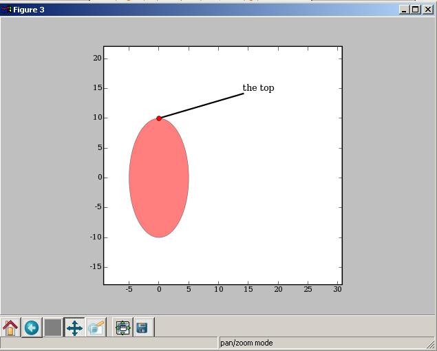
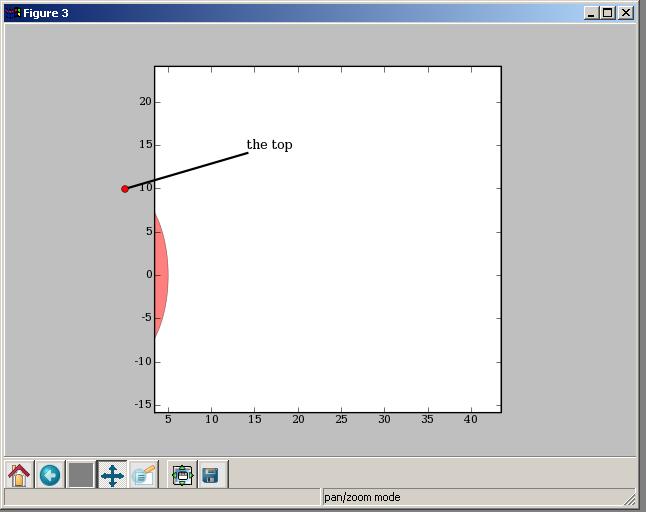
It's cool creating annotations, when the pan tool is
used , I see that the markers/annotations do not
behave in the same way as that of the plot -- i.e.,
when I pan towards the left or right, the annotations
do not disappear with the plot at the boundaries of
the subplot. The annotations continue to be displayed.
This is part feature, part bug. The feature part is that you don't
always want you annotation clipped -- sometimes you explicitly want
the annotation outside the axes and not clipped (eg in the polar demo
of examples/annotation_demo.py). The bug part is that sometimes you
do want it clipped, and this is currently broken.
The version you are using is different than the svn version, and thus
still broken, but I just committed changes to svn to fix this, so if
you want clipping you can enable it with
a = ax.annotate(something, ..., clip_on=True)
Again, this will only work with svn mpl (and in the next release)
Thanks for the report!
JDH
···
On 5/14/07, Iyer <maseriyer@...9...> wrote:
It's cool creating annotations, when the pan tool is
used , I see that the markers/annotations do not
behave in the same way as that of the plot -- i.e.,
when I pan towards the left or right, the annotations
do not disappear with the plot at the boundaries of
the subplot. The annotations continue to be displayed.