Hi all,
I am working on a correlation chart with pyplot for a monitoring web tool. The plot is looking good, but only the strange resolution of axes disturbs the view.
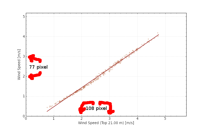
In a simple correlation plot, e.g. I want to compare two temperature sensors, I expect a line who divides the picture in two halves with an angle of 45� (optimal correlation R�=1). That feels natural and you can see whether the both sensors correlate or not without a deeper look at the exact values. But pyplot shows me a chart, where the x-axis's tick interval is larger (108 pixel) than the y-axis's tick interval (77 pixel). In attachment you can see my example.
How can I manipulate the axes that they show the same pixel resolution?
I hope I make my case clear. If more information is needed, please tell me.
Thank you very much in advance!
Miriam D.
Did you try:
ax.set_aspect(‘equal’)
I don’t know how you plotted your figure, so I don’t know which matplotlib objects you have at your disposal. My above example would operate on the Axes object returned by a call to add_subplot() or plt.subplot().
Cheers!
Ben Root
···
On Mon, Mar 25, 2013 at 11:06 AM, Miriam Degginger <md@…4321…> wrote:
Hi all,
I am working on a correlation chart with pyplot for a monitoring web tool. The plot is looking good, but only the strange resolution of axes disturbs the view.
In a simple correlation plot, e.g. I want to compare two temperature sensors, I expect a line who divides the picture in two halves with an angle of 45° (optimal correlation R²=1). That feels natural and you can see whether the both sensors correlate or not without a deeper look at the exact values. But pyplot shows me a chart, where the x-axis’s tick interval is larger (108 pixel) than the y-axis’s tick interval (77 pixel). In attachment you can see my example.
How can I manipulate the axes that they show the same pixel resolution?
I hope I make my case clear. If more information is needed, please tell me.
Thank you very much in advance!
Miriam D.
Hi Miriam,
This case is a simple one for setting the axis ratios. You want to set
the aspect ratio to equal:
gca().set_aspect('equal')
after making your plot
Jon
···
On Mon, 2013-03-25 at 16:06 +0100, Miriam Degginger wrote:
Hi all,
I am working on a correlation chart with pyplot for a monitoring web
tool. The plot is looking good, but only the strange resolution of axes
disturbs the view.
In a simple correlation plot, e.g. I want to compare two temperature
sensors, I expect a line who divides the picture in two halves with an
angle of 45° (optimal correlation R²=1). That feels natural and you can
see whether the both sensors correlate or not without a deeper look at
the exact values. But pyplot shows me a chart, where the x-axis's tick
interval is larger (108 pixel) than the y-axis's tick interval (77
pixel). In attachment you can see my example.
How can I manipulate the axes that they show the same pixel resolution?
I hope I make my case clear. If more information is needed, please tell me.
Thank you very much in advance!
Miriam D.
--
______________________________________________________________
Jonathan D. Slavin Harvard-Smithsonian CfA
jslavin@...1081... 60 Garden Street, MS 83
phone: (617) 496-7981 Cambridge, MA 02138-1516
cell: (781) 363-0035 USA
______________________________________________________________
Hi Jon,
yes, this is what I am looking for. Now, the chart is like I've expected.
Thank you all! (...also for the quick response!)
Miriam D.
···
On 25/03/13 17:00, Jonathan Slavin wrote:
Hi Miriam,
This case is a simple one for setting the axis ratios. You want to set
the aspect ratio to equal:
gca().set_aspect('equal')
after making your plot
Jon
On Mon, 2013-03-25 at 16:06 +0100, Miriam Degginger wrote:
Hi all,
I am working on a correlation chart with pyplot for a monitoring web
tool. The plot is looking good, but only the strange resolution of axes
disturbs the view.
In a simple correlation plot, e.g. I want to compare two temperature
sensors, I expect a line who divides the picture in two halves with an
angle of 45° (optimal correlation R²=1). That feels natural and you can
see whether the both sensors correlate or not without a deeper look at
the exact values. But pyplot shows me a chart, where the x-axis's tick
interval is larger (108 pixel) than the y-axis's tick interval (77
pixel). In attachment you can see my example.
How can I manipulate the axes that they show the same pixel resolution?
I hope I make my case clear. If more information is needed, please tell me.
Thank you very much in advance!
Miriam D.