Hi all,
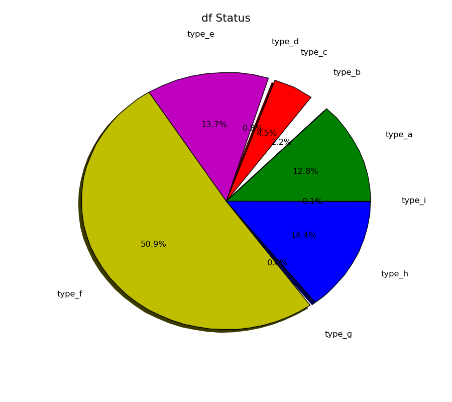
I am trying to create pie chart using matplotlib. I have 9 items to be plotted in the chart. sometimes the length of the lable appears to be long which scatteres them in the chart. Is there any way to create a link/line between label and its pie to make the represenation meaningfull and obvious ?
The other thing is, pie with small area is not being colored. These doesn’t even have outline to make them look part of pie. Any idea, what’s going on there ?
I am attaching pie chart figure and the code snippet.
···
================================
figure(figsize=(9,8),dpi=200)
ax = axes([0.1, 0.1, 0.8, 0.8])
labels = df_status_list
fracs = df_count_list
colors = ('#008000', '#3D0099', 'r', '#CE80FF', 'm', 'y',
‘r’,‘b’)
title('df Status\n', fontsize=16)
patches = pie(fracs, labels=labels, labeldistance=1.3, autopct='%1.1f%%', shadow=True,colors=colors)

savefig("df_status.png")
================================
Any help will be appreciated.
Thanks,
js