Hi folks,
I’m having an issue with displaying overlaid histograms.
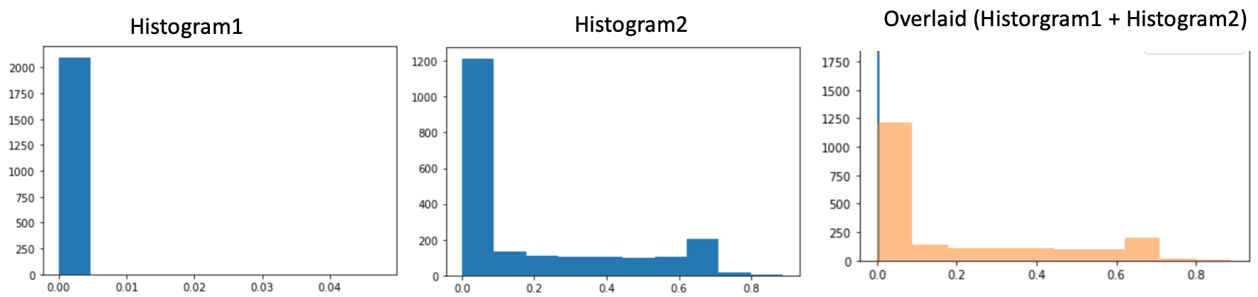
Here’s an example of two histograms separately and what happens when displayed together:
As one can observer Histogram1 shows up as a thin blue strip in the overlaid figure, any idea why is that? Why is it not shown as in Histogram 1, i.e. occupying its own bin?
Thanks for your reply, as a matter in fact the number of bins is set to 10 for each histogram in the overlaid figure and as you can see I still get this weird behaviour. Any other suggestions?
Excellent, that worked like a charm, thanks a lot!
As a user though I still don’t understand the underlying cause of the problem and why your suggested solution fixed that or why the default setting e.g. bins=10 didn’t work?
Was that only because of the different scaling? If so, I didn’t expect matplotlib to be so sensitive to these nuances.
Thanks that makes sense, I’m just wondering if previous version of matplotlib that used plt.hold(True) whether underneath the hood had any mechanism to inform subsequent plots of such discrepancies in situations like this one?
Also, from your question How could the automatic 10 bins be the same for the two calls? it seems like bins=10 just creates 10 bins but not on an equally spaced interval (correct me if I’m wrong) like linspace(0, 1, 10)?
Matplotlib just uses numpy’s histogram, and so far as I can tell, it just makes a linear set of 10 bins that span your data range. I don’t think there was ever any mechanism to link histograms.