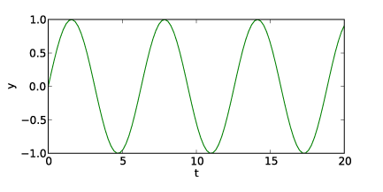
Is there a simple way to make a plot with axes that look like those in test1.png rather than like those in test.png? Here is the code that produced test.png. Thanks.
Dave Pine
import numpy as np
import matplotlib.pyplot as plt
t = np.linspace(0., 20., 100)
y = np.sin(t)
fig = plt.figure(1, figsize=(6,3) )
fig.subplots_adjust(bottom=0.2)
ax = fig.add_subplot(1,1,1)
ax.plot(t, y)
ax.set_xlabel('t')
ax.set_ylabel('y')
plt.savefig('test.png')
plt.show()
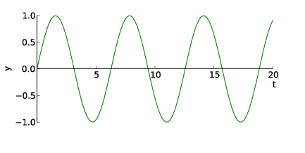
Dave, I believe that the axis spine feature is what you are looking for:
http://matplotlib.sourceforge.net/users/whats_new.html#axis-spine-placement
I hope that helps!
Ben Root
···
On Tue, Nov 30, 2010 at 2:49 AM, David Pine <dp82@…2743…> wrote:
Is there a simple way to make a plot with axes that look like those in test1.png rather than like those in test.png? Here is the code that produced test.png. Thanks.
Dave Pine
import numpy as np
import matplotlib.pyplot as plt
t = np.linspace(0., 20., 100)
y = np.sin(t)
fig = plt.figure(1, figsize=(6,3) )
fig.subplots_adjust(bottom=0.2)
ax = fig.add_subplot(1,1,1)
ax.plot(t, y)
ax.set_xlabel(‘t’)
ax.set_ylabel(‘y’)
plt.savefig(‘test.png’)
plt.show()