Hi,
The attached png (generated from GMT) (also visible here:
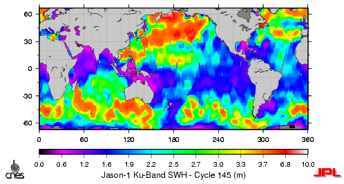
http://sayatnova.jpl.nasa.gov/genesis/swhk_jmap_145.png )
shows a non-linear color scale which I am trying to replicate using
matplotlib. Could anyone point me in the right direction as to the best
approach to do this? I've seen posts where I can subclass the
colormap/normalize classes and customize them. I've also seen
James Boyle's gmtColormap.py script to load GMT colormaps into
matplotlib colormaps however I would like to achieve a general
solution to this. The following code is the generalized function
I use to generate maps:
def plotMap(pngFile,figsize,aspect,plotTitle,colorbarTitle,
mapData,dataMin,dataMax,lonMin,lonMax,latMin,latMax,
colorbarFormat='%1.1f',colorbarOrientation='horizontal',
nanColor='k'):
"""Plot data on world map."""
m=Basemap(projection='cyl',llcrnrlon=lonMin,llcrnrlat=latMin,
urcrnrlon=lonMax,urcrnrlat=latMax,suppress_ticks=False)
m.aspect=aspect
palette=cm.jet
palette.set_bad(nanColor,1.0)
fig=m.createfigure(figsize=figsize)
im=m.imshow(mapData,cmap=palette,norm=colors.normalize(vmin=dataMin,
vmax=dataMax,clip =False))
cax=fig.colorbar(im,tickfmt=colorbarFormat,
orientation=colorbarOrientation)
cax.set_xlabel(colorbarTitle)
m.fillcontinents()
m.drawmapboundary()
gca().set_title(plotTitle)
fig.savefig(pngFile)
close(fig)
Any help is greatly appreciated.
Thanks,
Gerald