My plot went wrong randomly, has anyone met this before?

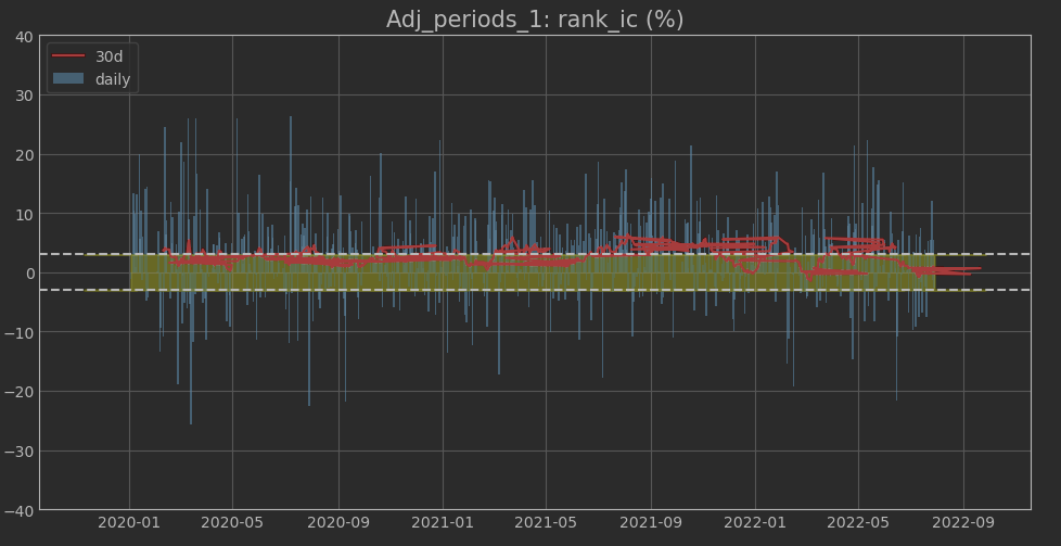
Has anyone met this kind of problem before?
The plot should be like the later one, but my computer drew like the former one.


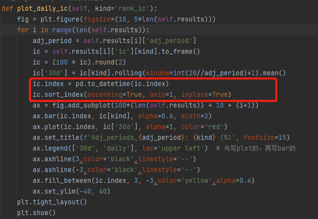
Here is my df.info and how I draw this.
<class ‘pandas.core.frame.DataFrame’>
DatetimeIndex: 105 entries, 2020-06-02 to 2022-08-04
Data columns (total 2 columns):

Column Non-Null Count Dtype


0 rank_ic 105 non-null float64
1 30d 101 non-null float64
dtypes: float64(2)
memory usage: 2.5 KB

def plot_daily_ic(self, kind='rank_ic'):
    fig = plt.figure(figsize=(10, 5*len(self.results)))
    for i in range(len(self.results)):
        adj_period = self.results[i]['adj_period']
        ic = self.results[i]['ic'][kind].to_frame()
        ic = (100 * ic).round(2)
        ic.index = pd.to_datetime(ic.index)
        ic['30d'] = ic[kind].rolling(window=int(20//adj_period)+1).mean()
        ax = fig.add_subplot(100*(len(self.results)) + 10 + (i+1))
        ax.bar(ic.index, ic[kind], alpha=0.6, width=2)
        ax.plot(ic.index, ic['30d'], alpha=1, color='red')
        ax.set_title(f'Adj_periods_{adj_period}: {kind} (%)', fontsize=15)
        ax.legend(['30d', 'daily'], loc='upper left')  # 先写plot的,再写bar的
        ax.axhline(3,color='black',linestyle='--')
        ax.axhline(-3,color='black',linestyle='--')
        ax.fill_between(ic.index, 3, -3,color='yellow',alpha=0.4)
        ax.set_ylim(-40, 40)
    plt.tight_layout()
    plt.show()

I used to meet this problem by starting a multiprocessing program, it seemed like a triger and it would cause my data goes wrong randomly. Then I found out it could because that I didn’t use deepcopy which contaminates my RAM. I fixed this before and all went well.

But yesterday, I went on another multiprocessing program and the problem showed up again, but after I checked all my data figures are correct, I can’t get my plot right :face_with_head_bandage:

can you please print ic.index? and can you try ic[kind].plot() and ic['30d'].plot?

Your index is not sorted. My guess would be you are interpreting months as days and days as months, perhaps due to a locale change. Your preferred debugging here would be to make a small version of the data frame and try your plot on that, and then look at the raw data and see if it makes sense

1 Like

Thx you all, but I still can’t get it right (plot is a a bit different cause I used another dataset.) And I check my df , those number are all right, and it seems that matplotlib will randomly give me sth not inside :face_with_head_bandage:


00e20cc1c407ca78e367d6b7631a077

This happend just on my PC so I also doubt that I need to reinstall my system (maybe this weekend) and for that I have install and uninstall python anaconda and matplotlib for couple of times)

Do not re-install your whole system. Its really hard to help without a data sample. Maybe print out a few values of ic.index before and after the conversion to_datetime.

Note that matplotlib does not handle pandas Timestamps directly - that is all largely handled by pandas, so you may need to discuss that with them…

1 Like

If we are going to be able to help debug this further we need an example dataset that fails and a copy-pastable code snippet (not a screen shot) to test with.

Sorry for the late responding, but I’m so graceful to see you all care about my problem. I’m actually a beginner in programming and I’m an inter for a quantative PE. My collegue and I have worked together on this factor backtest project since last week and the original code is public on his github. It’s very easy and free to use, if you happen to find this useful, we would be much thankful! (and welcome any kind of suggestion and question about this) GitHub - ZHAOYANZHOU/Factor_Analysis: To analysis single factor But this hasn’t been upgraded for several days.

So here I offer an exemple for you to test.GitHub - Cachalothomas/A-simple-exemple-for-FA

Another thing is that if I rerun my code for different times, the wrong picture would get wrong in different ways and it would even be prossible to get this all right in one time on my PC.