[Matplotlib-users] Unusual layout (GridSpec?)

Hi there,

I’m trying to combine three graphs into one, but with some specific
constraints on the layout. The three graphs are having the same x and y
variables, but not over the same span. Each graph size should reflects
that (e.g. if a change of 1 on the x axis is 1 cm on one graph, so
should it be for the other ones). Also, I’d like the y label and ticks
labels to be shared amongst the three graphs. Same goes for the colorbar
(those are scatter plots) and the legend.

Attached are the three figures (.pdf), and what the combined version
should look like (target.png, but here it was obtained by removing parts
by hand and stretching everything to fit).

Below is some minimal code to produce three similarly looking graphs, if
someone has an idea (GridSpec?) for this, I should be able to adapt it
to my actual code:

import matplotlib.pyplot as plt
import numpy as np

plt.scatter(np.repeat(np.linspace(0,3.5,15)[:,None],11,axis=1),np.repeat(np.linspace(0,0.5,11)[None,:],15,axis=0),c=np.random.random((15,11)),label="Some
label")

plt.scatter(np.repeat(np.linspace(0,6,25)[:,None],11,axis=1),np.repeat(np.linspace(0,0.5,11)[None,:],25,axis=0),c=np.random.random((25,11)),marker='*',label="Some
other label")

plt.scatter(np.repeat(np.linspace(0,11,23)[:,None],11,axis=1),np.repeat(np.linspace(0,0.5,11)[None,:],23,axis=0),c=np.random.random((23,11)),marker='D',label="Yet
another label")

Regards,
Bruno

(Attachment explosion2.pdf is missing)

(Attachment explosion3.pdf is missing)

(Attachment explosion4.pdf is missing)

I don’t think I understand your problem fully, but a GridSpec sounds like it’ll fit the bill. We have a tutorial on it at our website. You’ll probably get the most mileage out of the width_ratios and height_ratios parameters:

https://matplotlib.org/tutorials/intermediate/gridspec.html

···

On Thu, Sep 19, 2019 at 12:02 PM Bruno Pagani bruno.pagani@astrophysics.eu wrote:

Hi there,

I’m trying to combine three graphs into one, but with some specific

constraints on the layout. The three graphs are having the same x and y

variables, but not over the same span. Each graph size should reflects

that (e.g. if a change of 1 on the x axis is 1 cm on one graph, so

should it be for the other ones). Also, I’d like the y label and ticks

labels to be shared amongst the three graphs. Same goes for the colorbar

(those are scatter plots) and the legend.

Attached are the three figures (.pdf), and what the combined version

should look like (target.png, but here it was obtained by removing parts

by hand and stretching everything to fit).

Below is some minimal code to produce three similarly looking graphs, if

someone has an idea (GridSpec?) for this, I should be able to adapt it

to my actual code:

import matplotlib.pyplot as plt

import numpy as np

plt.scatter(np.repeat(np.linspace(0,3.5,15)[:,None],11,axis=1),np.repeat(np.linspace(0,0.5,11)[None,:],15,axis=0),c=np.random.random((15,11)),label="Some

label")

plt.scatter(np.repeat(np.linspace(0,6,25)[:,None],11,axis=1),np.repeat(np.linspace(0,0.5,11)[None,:],25,axis=0),c=np.random.random((25,11)),marker=‘*’,label="Some

other label")

plt.scatter(np.repeat(np.linspace(0,11,23)[:,None],11,axis=1),np.repeat(np.linspace(0,0.5,11)[None,:],23,axis=0),c=np.random.random((23,11)),marker=‘D’,label="Yet

another label")

Regards,

Bruno


Matplotlib-users mailing list

Matplotlib-users@python.org

https://mail.python.org/mailman/listinfo/matplotlib-users

I don't think this is what gridspec is for, or can handle. Instead, I think you will have to use a very manual approach to figure out the positions of the Axes objects that will make them and their tick locations line up as desired. An example is in the attached script.

Caution: the example will work correctly only if your dpi setting is such that the specified figsize can be fully displayed on your screen; if it is too big, mpl will shrink it to fit, and then all the calculations will be out of whack.

Eric

(Attachment custom_layout.py is missing)

···

On 2019/09/19 10:39 AM, Paul Hobson wrote:

I don't think I understand your problem fully, but a GridSpec sounds like it'll fit the bill. We have a tutorial on it at our website. You'll probably get the most mileage out of the width_ratios and height_ratios parameters:
https://matplotlib.org/tutorials/intermediate/gridspec.html

On Thu, Sep 19, 2019 at 12:02 PM Bruno Pagani > <bruno.pagani@astrophysics.eu <mailto:bruno.pagani@astrophysics.eu>> wrote:

    Hi there,

    I’m trying to combine three graphs into one, but with some specific
    constraints on the layout. The three graphs are having the same x and y
    variables, but not over the same span. Each graph size should reflects
    that (e.g. if a change of 1 on the x axis is 1 cm on one graph, so
    should it be for the other ones). Also, I’d like the y label and ticks
    labels to be shared amongst the three graphs. Same goes for the colorbar
    (those are scatter plots) and the legend.

    Attached are the three figures (.pdf), and what the combined version
    should look like (target.png, but here it was obtained by removing parts
    by hand and stretching everything to fit).

    Below is some minimal code to produce three similarly looking graphs, if
    someone has an idea (GridSpec?) for this, I should be able to adapt it
    to my actual code:

    import matplotlib.pyplot as plt
    import numpy as np

    plt.scatter(np.repeat(np.linspace(0,3.5,15)[:,None],11,axis=1),np.repeat(np.linspace(0,0.5,11)[None,:],15,axis=0),c=np.random.random((15,11)),label="Some
    label")

    plt.scatter(np.repeat(np.linspace(0,6,25)[:,None],11,axis=1),np.repeat(np.linspace(0,0.5,11)[None,:],25,axis=0),c=np.random.random((25,11)),marker='*',label="Some
    other label")

    plt.scatter(np.repeat(np.linspace(0,11,23)[:,None],11,axis=1),np.repeat(np.linspace(0,0.5,11)[None,:],23,axis=0),c=np.random.random((23,11)),marker='D',label="Yet
    another label")

    Regards,
    Bruno

    _______________________________________________
    Matplotlib-users mailing list
    Matplotlib-users@python.org <mailto:Matplotlib-users@python.org>
    Matplotlib-users Info Page

_______________________________________________
Matplotlib-users mailing list
Matplotlib-users@python.org
Matplotlib-users Info Page

Evidently mailing lists like this are crippled by not being able to handle attachments. Here is the script inline:

···

=================================

import numpy as np
import matplotlib.pyplot as plt

def axes_inches(fig, rect, **kw):
     """
     Wrapper for Figure.add_axes in which *rect* is given in inches.
     The translation to normalized coordinates is done immediately
     based on the present figsize.

     *rect* is left, bottom, width, height in inches
     *kw* are passed to Figure.add_axes

     """

     fw = fig.get_figwidth()
     fh = fig.get_figheight()
     l, b, w, h = rect
     relrect = [l / fw, b / fh, w / fw, h / fh]
     ax = fig.add_axes(relrect, **kw)
     return ax

# We will assume that the x and y data limits all start with 0.

# The actual data limits:
xranges = np.array([[0, 15], [0, 25], [0, 23]])
yranges = np.array([[0, 0.5], [0, 0.3], [0, 0.2]])

# Add margins:
xmranges = xranges + np.array([-0.5, 0.5])
ymranges = yranges + np.array([-0.05, 0.05])

# Scales in data units per inch:
xscale = 10 # so the max, 25, is 2.5 inches
yscale = 0.1 # so the max, 0.5, is 5 inches

# Separation in inches:
xsep = 0.4

# Force the y tick locations:
yticks = np.arange(0, 0.501, 0.1)

fig = plt.figure(figsize=(8.5, 7))
axs =
left, bottom = 0.5, 0.5 # Starting point in inches.
for xm, ym in zip(xmranges, ymranges):
     w = (xm[1] - xm[0]) / xscale
     h = (ym[1] - ym[0]) / yscale
     ax = axes_inches(fig, (left, bottom, w, h))
     ax.set_xlim(xm)
     ax.set_ylim(ym)
     ax.set_yticks(yticks[yticks < ym[-1]])
     axs.append(ax)
     left += (xsep + w)

plt.show()

============================
Eric

On 2019/09/19 10:39 AM, Paul Hobson wrote:

I don't think I understand your problem fully, but a GridSpec sounds like it'll fit the bill. We have a tutorial on it at our website. You'll probably get the most mileage out of the width_ratios and height_ratios parameters:
https://matplotlib.org/tutorials/intermediate/gridspec.html

On Thu, Sep 19, 2019 at 12:02 PM Bruno Pagani > <bruno.pagani@astrophysics.eu <mailto:bruno.pagani@astrophysics.eu>> wrote:

    Hi there,

    I’m trying to combine three graphs into one, but with some specific
    constraints on the layout. The three graphs are having the same x and y
    variables, but not over the same span. Each graph size should reflects
    that (e.g. if a change of 1 on the x axis is 1 cm on one graph, so
    should it be for the other ones). Also, I’d like the y label and ticks
    labels to be shared amongst the three graphs. Same goes for the colorbar
    (those are scatter plots) and the legend.

    Attached are the three figures (.pdf), and what the combined version
    should look like (target.png, but here it was obtained by removing parts
    by hand and stretching everything to fit).

    Below is some minimal code to produce three similarly looking graphs, if
    someone has an idea (GridSpec?) for this, I should be able to adapt it
    to my actual code:

    import matplotlib.pyplot as plt
    import numpy as np

    plt.scatter(np.repeat(np.linspace(0,3.5,15)[:,None],11,axis=1),np.repeat(np.linspace(0,0.5,11)[None,:],15,axis=0),c=np.random.random((15,11)),label="Some
    label")

    plt.scatter(np.repeat(np.linspace(0,6,25)[:,None],11,axis=1),np.repeat(np.linspace(0,0.5,11)[None,:],25,axis=0),c=np.random.random((25,11)),marker='*',label="Some
    other label")

    plt.scatter(np.repeat(np.linspace(0,11,23)[:,None],11,axis=1),np.repeat(np.linspace(0,0.5,11)[None,:],23,axis=0),c=np.random.random((23,11)),marker='D',label="Yet
    another label")

    Regards,
    Bruno

    _______________________________________________
    Matplotlib-users mailing list
    Matplotlib-users@python.org <mailto:Matplotlib-users@python.org>
    Matplotlib-users Info Page

_______________________________________________
Matplotlib-users mailing list
Matplotlib-users@python.org
Matplotlib-users Info Page

_______________________________________________
Matplotlib-users mailing list
Matplotlib-users@python.org
https://mail.python.org/mailman/listinfo/matplotlib-users
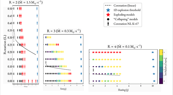
Hi there,

Thank you both for your advices. I was hoping for a GridSpec solution
because I think such a one would have been able to leverage
constrained_layout to automatically fit the space correctly. There might
exists one, but I did not had a lot of time for researching.

Instead, I went with Eric’s PoC that I was able to tweak nicely in order
to suit my needs (btw Eric, the attached script was perfectly received
on my end). The end result is attached to this email. So many thanks for
that piece of code Eric, it proved to be very helpful. :wink:

Regards,
Bruno Pagani

(Attachment explosions.pdf is missing)

···

Le 20/09/2019 à 00:01, Eric Firing a écrit :

I don't think this is what gridspec is for, or can handle. Instead, I
think you will have to use a very manual approach to figure out the
positions of the Axes objects that will make them and their tick
locations line up as desired. An example is in the attached script.

Caution: the example will work correctly only if your dpi setting is
such that the specified figsize can be fully displayed on your screen;
if it is too big, mpl will shrink it to fit, and then all the
calculations will be out of whack.

Eric

On 2019/09/19 10:39 AM, Paul Hobson wrote:

I don't think I understand your problem fully, but a GridSpec sounds
like it'll fit the bill. We have a tutorial on it at our website.
You'll probably get the most mileage out of the width_ratios and
height_ratios parameters:
https://matplotlib.org/tutorials/intermediate/gridspec.html

On Thu, Sep 19, 2019 at 12:02 PM Bruno Pagani >> <bruno.pagani@astrophysics.eu <mailto:bruno.pagani@astrophysics.eu>> >> wrote:

Hi there,

I’m trying to combine three graphs into one, but with some specific
constraints on the layout\. The three graphs are having the same x

and y
variables, but not over the same span. Each graph size should
reflects
that (e.g. if a change of 1 on the x axis is 1 cm on one graph, so
should it be for the other ones). Also, I’d like the y label and
ticks
labels to be shared amongst the three graphs. Same goes for the
colorbar
(those are scatter plots) and the legend.

Attached are the three figures \(\.pdf\), and what the combined version
should look like \(target\.png, but here it was obtained by

removing parts
by hand and stretching everything to fit).

Below is some minimal code to produce three similarly looking

graphs, if
someone has an idea (GridSpec?) for this, I should be able to
adapt it
to my actual code:

import matplotlib\.pyplot as plt
import numpy as np

plt.scatter(np.repeat(np.linspace(0,3.5,15)[:,None],11,axis=1),np.repeat(np.linspace(0,0.5,11)[None,:],15,axis=0),c=np.random.random((15,11)),label="Some
label")

plt.scatter(np.repeat(np.linspace(0,6,25)[:,None],11,axis=1),np.repeat(np.linspace(0,0.5,11)[None,:],25,axis=0),c=np.random.random((25,11)),marker='*',label="Some
other label")

plt.scatter(np.repeat(np.linspace(0,11,23)[:,None],11,axis=1),np.repeat(np.linspace(0,0.5,11)[None,:],23,axis=0),c=np.random.random((23,11)),marker='D',label="Yet
another label")

Regards,
Bruno