Hi ,
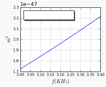
I made the changes as bellow and it displays the x-axis values formatted
as expected, see my current image and my code. But, now i need to change the scale and the numbers of decimal places in order to appear on
the graph like this: 3.0 3.1 3.2 … 3.4
My code: http://pastebin.com/vSbkXDzE
Can you help me?
Waleria
···
On Thu, Jul 29, 2010 at 5:46 AM, matplotlib-users-request@lists.sourceforge.net wrote:
Send Matplotlib-users mailing list submissions to
matplotlib-users@lists.sourceforge.netTo subscribe or unsubscribe via the World Wide Web, visit
[https://lists.sourceforge.net/lists/listinfo/matplotlib-users](https://lists.sourceforge.net/lists/listinfo/matplotlib-users)or, via email, send a message with subject or body ‘help’ to
matplotlib-users-request@lists.sourceforge.netYou can reach the person managing the list at
matplotlib-users-owner@lists.sourceforge.netWhen replying, please edit your Subject line so it is more specific
than “Re: Contents of Matplotlib-users digest…”
Today’s Topics:
Re: Saving as eps file shifts image? (Jenna L.)
Re: hz to khz (Samuel Teixeira Santos)
Contour plot of non-uniformly sampled data (Nikolaus Rath)
Re: Contour plot of non-uniformly sampled data (Jeff Whitaker)
Re: Confusion Matrix (Matthieu Brucher)
Re: Confusion Matrix (Friedrich Romstedt)
Re: Confusion Matrix (Simon Friedberger)
Message: 1
Date: Wed, 28 Jul 2010 16:55:46 -0700 (PDT)
From: “Jenna L.” <jenna@…878…2124…>
Subject: Re: [Matplotlib-users] Saving as eps file shifts image?
To: matplotlib-users@lists.sourceforge.net
Message-ID: <29291928.post@…878…986…>
Content-Type: text/plain; charset=UTF-8
Hmm that is not what my output looks like. Attached is a capture of my
output. I am using matplotlib version 0.98.5.3
http://old.nabble.com/file/p29291928/shift_subplot_test.png
shift_subplot_test.png
Jae-Joon Lee wrote:
On Thu, Jul 29, 2010 at 1:17 AM, Jenna L. <jenna@…2124…> > > > wrote:
That looks fine to me too, but if you plot that as one subplot in a 5x5
array
of subplots or more, then you can see the shift I am talking about in the
eps file. ?Example:
I still don’t see it (a capture of my eps output is attached).
Can you post your output (original eps file that shows the shift)?
Again, what is your matplotlib version?
Regards,
-JJ
The Palm PDK Hot Apps Program offers developers who use the
Plug-In Development Kit to bring their C/C++ apps to Palm for a share
of $1 Million in cash or HP Products. Visit us here for more details:
Matplotlib-users mailing list
https://lists.sourceforge.net/lists/listinfo/matplotlib-users
–
View this message in context: http://old.nabble.com/Saving-as-eps-file-shifts-image–tp29232680p29291928.html
Sent from the matplotlib - users mailing list archive at Nabble.com.
Message: 2
Date: Wed, 28 Jul 2010 22:36:31 -0300
From: Samuel Teixeira Santos <arcanosam@…287…>
Subject: Re: [Matplotlib-users] hz to khz
To: Matplotlib Users matplotlib-users@lists.sourceforge.net
Message-ID:
<AANLkTinzToS+b-9x=t4rk6BxZVQMENij1XyFW+dWsV-x@...288...>Content-Type: text/plain; charset=“iso-8859-1”
I think her problem is something like that
His values on X Axis is a range between 3000 to 3400
without this division by 1000.0 his graphic processing normally
but instead on X axis to show the range between 3000 to 3400
she needs to show this values transform in Hz (I think) that’s why the
division by 1000.0
only problem when this division occur
the values o X axis became 3.0 to 3.4
and that’s what she’s send to plot
she should send the original values (3000 to 3400) and some how change the X
values that appear on X axis by another way
because the way it’s goes, plot function receive a little range on X axis to
plot a graphic
incompatible to Y axis values, that are passing on Sseries variable
that’s why she’s graphics not show after that division
and appear when the division is remove from the code.
so… she question should be something like
I send to plot on X axis values between 3000 to 3400
but on X axis they must appear as 3.0 to 3.4
how can I change the values on X axis
without change the real X axis values I send…
… did I help…? I hope so…
see ya all
2010/7/28 Benjamin Root <ben.root@…1304…>
On Wed, Jul 28, 2010 at 2:39 PM, Angus McMorland <amcmorl@…287…>wrote:
On 28 July 2010 15:25, Wal?ria Antunes David <waleriantunes@…287…> > > >> wrote:
Hello all,
Well, my problem is … My current code is as follow bellow:
Hi Wal?ria,
We can’t easily fix your problem without knowing what data f and
Sserie contain. It would help us to help you if you could post a
standalone example that shows your problem without relying on external
data.
Angus.
–
AJC McMorland
Post-doctoral research fellow
Neurobiology, University of Pittsburgh
Angus is correct that providing a stand-alone version of the script that
replicates your problem would be most useful. I would like to mention a
couple of possible improvements to your code. These improvements may or may
not fix your issue, but they will improve your current code.
- Use list comprehensions
Change
y=
for n in f:
y.append(n/Decimal(1000))y = numpy.array(y)
into:
y = numpy.array(f) / 1000.0
Also,
ax.grid(‘TRUE’)
should be:
ax.grid(True)
I hope this helps. If not, then please send a stand-alone example that
duplicates the problem you are having.
Ben Root
The Palm PDK Hot Apps Program offers developers who use the
Plug-In Development Kit to bring their C/C++ apps to Palm for a share
of $1 Million in cash or HP Products. Visit us here for more details:
Matplotlib-users mailing list
https://lists.sourceforge.net/lists/listinfo/matplotlib-users
-------------- next part --------------
An HTML attachment was scrubbed…
Message: 3
Date: Wed, 28 Jul 2010 22:32:39 -0400
From: Nikolaus Rath <Nikolaus@…83…3072…>
Subject: [Matplotlib-users] Contour plot of non-uniformly sampled data
To: matplotlib-users@lists.sourceforge.net
Message-ID: <874ofj81bs.fsf@…3215…>
Content-Type: text/plain; charset=utf-8
Hello,
What is the best way to generate a contour plot from a set of
non-uniformly sampled data (i.e., the datapoints do not lie on the
points of a rectangular grid but are randomly distributed)?
Thanks,
-Nikolaus
–
?Time flies like an arrow, fruit flies like a Banana.?
PGP fingerprint: 5B93 61F8 4EA2 E279 ABF6 02CF A9AD B7F8 AE4E 425C
Message: 4
Date: Wed, 28 Jul 2010 21:02:52 -0600
From: Jeff Whitaker <jswhit@…3220…>
Subject: Re: [Matplotlib-users] Contour plot of non-uniformly sampled
dataTo: Nikolaus Rath <Nikolaus@…3105…72…>, matplotlib-users
<matplotlib-users@lists.sourceforge.net>Message-ID: <4C50EF5C.7090600@…146…>
Content-Type: text/plain; charset=UTF-8; format=flowed
On 7/28/10 8:32 PM, Nikolaus Rath wrote:
Hello,
What is the best way to generate a contour plot from a set of
non-uniformly sampled data (i.e., the datapoints do not lie on the
points of a rectangular grid but are randomly distributed)?
Thanks,
-NikolausNikolaus: You can either use mlab.griddata to interpolate the data to a
regular grid, or use pyplot.tricontour to perform a delaunay
triangulation and contour the resulting triangle values.
-Jeff
Message: 5
Date: Thu, 29 Jul 2010 08:44:56 +0200
From: Matthieu Brucher <matthieu.brucher@…287…>
Subject: Re: [Matplotlib-users] Confusion Matrix
To: matplotlib-users@lists.sourceforge.net
Message-ID:
<AANLkTikxLVZGjmgxq0madar7GJ+1yEEVqYQ9SJND186v@...3221.....>Content-Type: text/plain; charset=ISO-8859-1
Hi,
In scikits.learn, there is a confusion matrix and in the samples,
there are several plots (scikit-learn.sf.net).
Matthieu
2010/7/16 Simon Friedberger <simon+matplotlib@…3202…>:
Hello List.
I’m trying to plot a confusion matrix and I got this far:
Basically what I still want to do is get the ticklabels from the bottom
to the top, have every ticklabel shown and start showing them from the
first not from the second.
I have experimented with this for a while now and don’t have all the
code states at hand anymore but basically at several points some of the
above worked but the others didn’t or something else (like the axis
length) broke.
Best
Simon
This SF.net email is sponsored by Sprint
What will you do first with EVO, the first 4G phone?
Visit sprint.com/first – http://p.sf.net/sfu/sprint-com-first
Matplotlib-users mailing list
https://lists.sourceforge.net/lists/listinfo/matplotlib-users
–
Information System Engineer, Ph.D.
Blog: http://matt.eifelle.com
LinkedIn: http://www.linkedin.com/in/matthieubrucher
Message: 6
Date: Thu, 29 Jul 2010 09:26:33 +0200
From: Friedrich Romstedt <friedrichromstedt@…287…>
Subject: Re: [Matplotlib-users] Confusion Matrix
To: matplotlib-users@lists.sourceforge.net
Message-ID:
<AANLkTi=fOU0wM3yZ2y5xMUKj+wW+OPepW2sjjfqJXJsT@...288...>Content-Type: text/plain; charset=ISO-8859-1
2010/7/29 Simon Friedberger <simon+matplotlib@…3202…>:
Also I have now finished my confusion matrix program:
Comments on the code would be very welcome.
I think you can make use of
axis.set_label_position(‘top’)
axis.set_ticks_position(‘none’)
Friedrich
Message: 7
Date: Thu, 29 Jul 2010 10:46:42 +0200
From: Simon Friedberger <simon+matplotlib@…3202…>
Subject: Re: [Matplotlib-users] Confusion Matrix
To: matplotlib-users@lists.sourceforge.net
Message-ID: <20100729084642.GD1146@…3202…>
Content-Type: text/plain; charset=us-ascii
For some magical reason when I set the ticks_position to none, setting
the label_position to ‘top’ is ignored.
Did you try this? Is it another command arrangement thing?
On 09:26 Thu 29.07.10, Friedrich Romstedt wrote:
axis.set_label_position(‘top’)
axis.set_ticks_position(‘none’)
The Palm PDK Hot Apps Program offers developers who use the
Plug-In Development Kit to bring their C/C++ apps to Palm for a share
of $1 Million in cash or HP Products. Visit us here for more details:
http://p.sf.net/sfu/dev2dev-palm
Matplotlib-users mailing list
Matplotlib-users@lists.sourceforge.net
https://lists.sourceforge.net/lists/listinfo/matplotlib-users
End of Matplotlib-users Digest, Vol 50, Issue 80