Hi Benjamim,
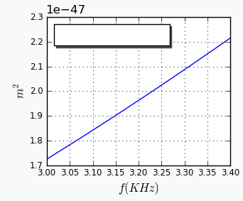
I made the changes as bellow and it displays the x-axis values formatted
as expected, see my current image and my code. But, now i need to change the scale and the numbers of decimal places in order to appear on
the graph like this: 3.0 3.1 3.2 … 3.4
My code: http://pastebin.com/vSbkXDzE
Can you help me?
Waleria
···
On Wed, Jul 28, 2010 at 8:41 PM, matplotlib-users-request@lists.sourceforge.net wrote:
Send Matplotlib-users mailing list submissions to
matplotlib-users@lists.sourceforge.netTo subscribe or unsubscribe via the World Wide Web, visit
[https://lists.sourceforge.net/lists/listinfo/matplotlib-users](https://lists.sourceforge.net/lists/listinfo/matplotlib-users)or, via email, send a message with subject or body ‘help’ to
matplotlib-users-request@lists.sourceforge.netYou can reach the person managing the list at
matplotlib-users-owner@lists.sourceforge.netWhen replying, please edit your Subject line so it is more specific
than “Re: Contents of Matplotlib-users digest…”
Today’s Topics:
Re: hz to khz (Angus McMorland)
Re: hz to khz (Benjamin Root)
Arrow in log space (Thomas Robitaille)
Re: Arrow in log space (Benjamin Root)
Re: Confusion Matrix (Simon Friedberger)
Re: Saving as eps file shifts image? (Jae-Joon Lee)
Message: 1
Date: Wed, 28 Jul 2010 15:39:29 -0400
From: Angus McMorland <amcmorl@…2015…87…>
Subject: Re: [Matplotlib-users] hz to khz
To: Matplotlib Users matplotlib-users@lists.sourceforge.net
Message-ID:
<AANLkTinomazdZccuuKenq+C99Y+0EWC_o7O+6JPZqg3H@...83...288...>Content-Type: text/plain; charset=ISO-8859-1
On 28 July 2010 15:25, Wal?ria Antunes David <waleriantunes@…287…> wrote:
Hello all,
Well, my problem is … My current code is as follow bellow:
Hi Wal?ria,
We can’t easily fix your problem without knowing what data f and
Sserie contain. It would help us to help you if you could post a
standalone example that shows your problem without relying on external
data.
Angus.
–
AJC McMorland
Post-doctoral research fellow
Neurobiology, University of Pittsburgh
Message: 2
Date: Wed, 28 Jul 2010 14:59:35 -0500
From: Benjamin Root <ben.root@…83…1304…>
Subject: Re: [Matplotlib-users] hz to khz
To: Angus McMorland <amcmorl@…1972…>
Cc: Matplotlib Users matplotlib-users@lists.sourceforge.net
Message-ID:
<AANLkTi=O73E3atkQprZO5_LMpfOu=72CNvJbLTSNnDUY@...288...>Content-Type: text/plain; charset=“iso-8859-1”
On Wed, Jul 28, 2010 at 2:39 PM, Angus McMorland <amcmorl@…287…> wrote:
On 28 July 2010 15:25, Wal?ria Antunes David <waleriantunes@…287…> > > > wrote:
Hello all,
Well, my problem is … My current code is as follow bellow:
Hi Wal?ria,
We can’t easily fix your problem without knowing what data f and
Sserie contain. It would help us to help you if you could post a
standalone example that shows your problem without relying on external
data.
Angus.
–
AJC McMorland
Post-doctoral research fellow
Neurobiology, University of Pittsburgh
Angus is correct that providing a stand-alone version of the script that
replicates your problem would be most useful. I would like to mention a
couple of possible improvements to your code. These improvements may or may
not fix your issue, but they will improve your current code.
- Use list comprehensions
Change
y=
for n in f:
y.append(n/Decimal(1000))y = numpy.array(y)
into:
y = numpy.array(f) / 1000.0
Also,
ax.grid(‘TRUE’)
should be:
ax.grid(True)
I hope this helps. If not, then please send a stand-alone example that
duplicates the problem you are having.
Ben Root
-------------- next part --------------
An HTML attachment was scrubbed…
Message: 3
Date: Wed, 28 Jul 2010 16:56:41 -0400
From: Thomas Robitaille <thomas.robitaille@…287…>
Subject: [Matplotlib-users] Arrow in log space
To: matplotlib-users@lists.sourceforge.net
Message-ID: <FC45934C-52AA-4B5D-91B1-D155E7E753A8@…287…>
Content-Type: text/plain; charset=us-ascii
Hi,
How does one plot an arrow in a log log plot? In the following example, I can’t get the arrow head, regardless of what value I use for the head width:
import matplotlib as mpl
mpl.use(‘Agg’)
import matplotlib.pyplot as plt
fig = plt.figure()
ax = fig.add_subplot(1,1,1)
ax.arrow(0.2,0.2,0.5,0.5,head_width=1.)
ax.set_xscale(‘log’)
ax.set_yscale(‘log’)
ax.set_xlim(0.1,1.)
ax.set_ylim(0.1,1.)
fig.savefig(‘test.png’)
In addition, the documentation for arrow does not even mention any arrow specific options such as the head width/length, and the example plot is missing (there is a ‘Exception occurred rendering plot.’ message instead)
http://matplotlib.sourceforge.net/api/axes_api.html?highlight=arrow#matplotlib.axes.Axes.arrow
Thanks for any help,
Thomas
Message: 4
Date: Wed, 28 Jul 2010 16:45:39 -0500
From: Benjamin Root <ben.root@…83…1304…>
Subject: Re: [Matplotlib-users] Arrow in log space
To: Thomas Robitaille <thomas.robitaille@…287…>
Cc: matplotlib-users@lists.sourceforge.net
Message-ID:
<AANLkTi=hCGCs9FVO0O6z=qVybsBMNwoBo=OW9f9wRw5t@...288...>Content-Type: text/plain; charset=“iso-8859-1”
On Wed, Jul 28, 2010 at 3:56 PM, Thomas Robitaille < > > thomas.robitaille@…287…> wrote:
Hi,
How does one plot an arrow in a log log plot? In the following example, I
can’t get the arrow head, regardless of what value I use for the head width:
import matplotlib as mpl
mpl.use(‘Agg’)
import matplotlib.pyplot as plt
fig = plt.figure()
ax = fig.add_subplot(1,1,1)
ax.arrow(0.2,0.2,0.5,0.5,head_width=1.)
ax.set_xscale(‘log’)
ax.set_yscale(‘log’)
ax.set_xlim(0.1,1.)
ax.set_ylim(0.1,1.)
fig.savefig(‘test.png’)
In addition, the documentation for arrow does not even mention any arrow
specific options such as the head width/length, and the example plot is
missing (there is a ‘Exception occurred rendering plot.’ message instead)
http://matplotlib.sourceforge.net/api/axes_api.html?highlight=arrow#matplotlib.axes.Axes.arrow
Thanks for any help,
Thomas
I can’t say anything with regards to why your figure is not working, or why
the plot fails to render online (it renders just fine for myself when built
locally). However, I have noticed that the lack of information regarding
the options for arrow seems to be related to the docstring for arrow()
referring to the kwargs for FancyArrow, but none of those are defined. And
the docstring for FancyArrow appears to be incomplete.
Ben Root
-------------- next part --------------
An HTML attachment was scrubbed…
Message: 5
Date: Thu, 29 Jul 2010 00:04:41 +0200
From: Simon Friedberger <simon+matplotlib@…3202…>
Subject: Re: [Matplotlib-users] Confusion Matrix
To: matplotlib-users@lists.sourceforge.net
Message-ID: <20100728220441.GC1146@…3202…>
Content-Type: text/plain; charset=us-ascii
On 18:32 Sun 18.07.10, Friedrich Romstedt wrote:
Try to add:
ax.set_xticks(range(0, 10))
ax.set_yticks(range(0, 10))
before the imshow call.
For some reason it must happen before the imshow call and not after,
else the yscaling will change (I don’t understand this).
Thanks for this tip. Apparently there is a necessary order for some calls.
Is this documented anywhere? It seems quite problematic.
Also I have now finished my confusion matrix program:
http://paste.pocoo.org/show/242834/
Comments on the code would be very welcome.
If people like it maybe it could be included in the examples. I think it’s a
relatively common usecase.
Regards
Simon
Message: 6
Date: Thu, 29 Jul 2010 08:40:54 +0900
From: Jae-Joon Lee <lee.j.joon@…120…287…>
Subject: Re: [Matplotlib-users] Saving as eps file shifts image?
To: “Jenna L.” <jenna@…2015…124…>
Cc: matplotlib-users@lists.sourceforge.net
Message-ID:
<AANLkTik-TQ9iwoZheH6_Aa2XOheMbiXtLhTGX7WhVO3P@...288...>Content-Type: text/plain; charset=“utf-8”
On Thu, Jul 29, 2010 at 1:17 AM, Jenna L. <jenna@…2124…> wrote:
That looks fine to me too, but if you plot that as one subplot in a 5x5 array
of subplots or more, then you can see the shift I am talking about in the
eps file. ?Example:
I still don’t see it (a capture of my eps output is attached).
Can you post your output (original eps file that shows the shift)?
Again, what is your matplotlib version?
Regards,
-JJ
-------------- next part --------------
A non-text attachment was scrubbed…
Name: image_shift_test.png
Type: image/png
Size: 13176 bytes
Desc: not available
The Palm PDK Hot Apps Program offers developers who use the
Plug-In Development Kit to bring their C/C++ apps to Palm for a share
of $1 Million in cash or HP Products. Visit us here for more details:
http://p.sf.net/sfu/dev2dev-palm
Matplotlib-users mailing list
Matplotlib-users@lists.sourceforge.net
https://lists.sourceforge.net/lists/listinfo/matplotlib-users
End of Matplotlib-users Digest, Vol 50, Issue 79