Hi everyone,
I am trying to make a color-map which will respond to the range of values in the data itself. That is - I want to take one of the mpl colormaps and use parts of it, depending on the range of the data.
In particular, I am interested in using the plt.cm.RdYlBu_r colormap. If the data has both negative and positive values, I want 0 to map to the central value of this colormap (a pale whitish yellow) and I want negative values to be in blue and positive numbers to be in red. Also - I would want to use the parts of the colormap that represent how far away the smallest and largest values in the data are from 0. So - if my data is in the range [x1,x2] I would want to use the part of the colormap in indices 127-127abs(x1)/(x2-x1) through 127+127x2/(x2-x1). If the data only includes positive numbers, I would want to only use the blue part of the colormap and if there are negative numbers, I would want to only use the red part of the colormap (in these cases, I would also want to take only a portion of the colormap which represents the size of the interval [x1,x2] relative to the interval [0,x1] or [x2,0], as the case may be).
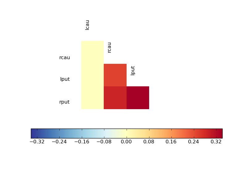
I think that this might be useful when comparing matrices generated from different data, but with the same computation, such as correlation or coherence (see http://nipy.sourceforge.net/nitime/examples/fmri.html to get an idea of what I mean).
First of all - is this a good idea? Or in other words - is there any reason I am not thinking of why this idea is a really bad idea?
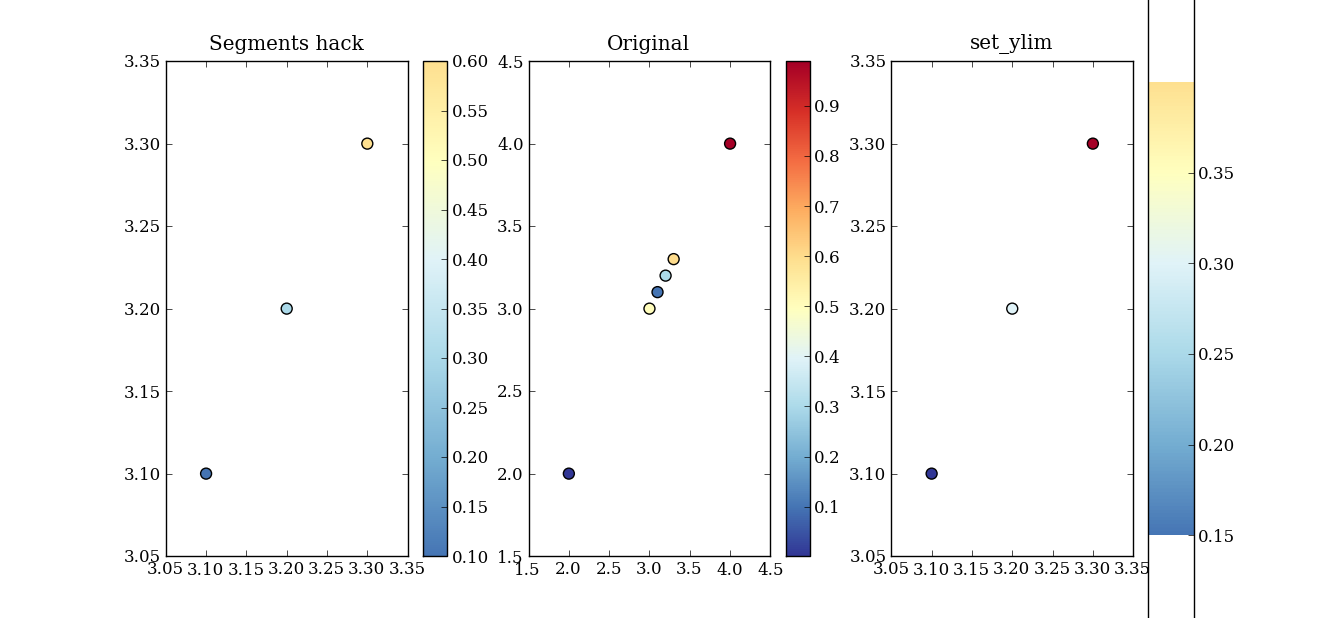
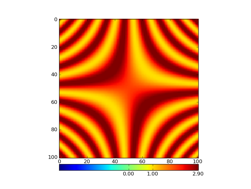
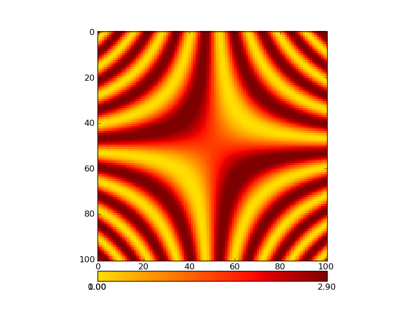
Second - the technical questions. I think that I can make this happen by using matplotlib.colors.LinearSegmentedColormap, after fiddling with the values of the color-map a bit (as described above), but in order to do that, I need to know what segmentdata was used in order to generate the original colormap (for example, how many lines did each of the entries in the cdict have? Looking at a plot of the cmap it looks like there must have been 8 or 9 for RdYlBu_r, but I can’t be sure). I could analyze it in more detail to get that out empirically, but I am guessing that someone around here might be able to spare me that lunacy (if not others…).
Thanks in advance,
Ariel
···
–
Ariel Rokem
Helen Wills Neuroscience Institute
University of California, Berkeley
http://argentum.ucbso.berkeley.edu/ariel