Hello community!
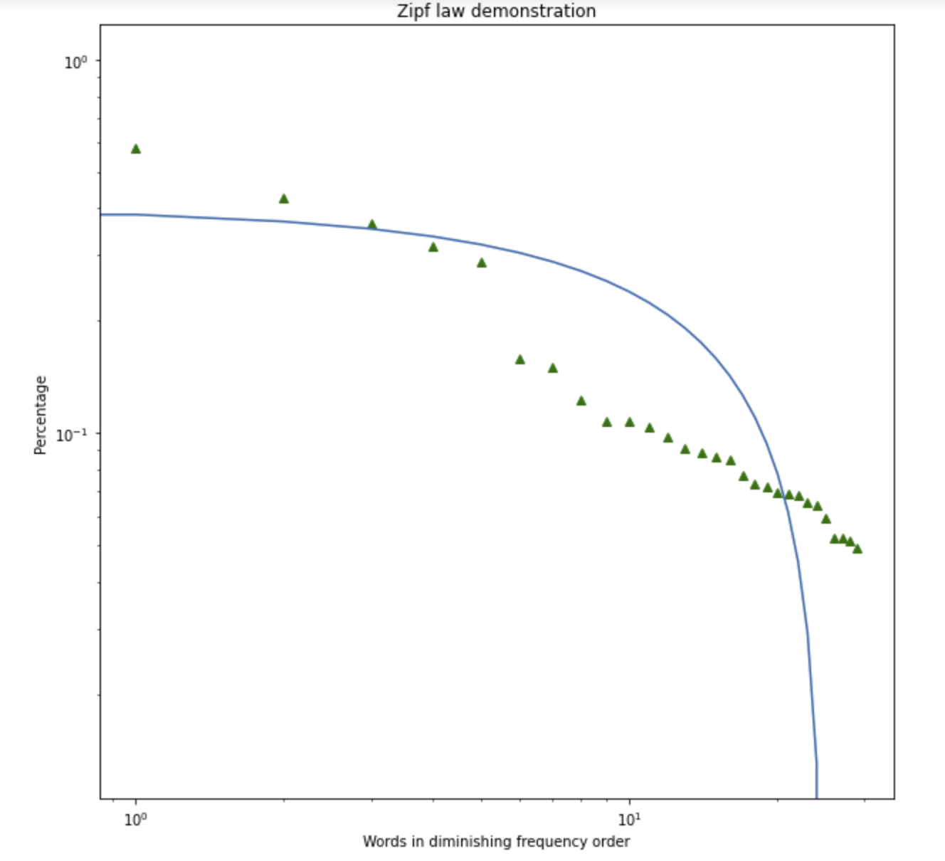
I am using a loglog plot and a linear regression on top of it.
My linear regression looks curved. How can I impose different axes on the graph?
plt.xscale('log')
plt.yscale('log')
x = np.array(mini['num'])
y = np.array(mini['percentage'])

plt.rcParams["figure.figsize"] = (10,10)
plt.plot(y, 'g^')

m, b = np.polyfit(x,y, 1)
plt.plot(m*x+b)