Logarithmic colormap with non-blending extremes

I need a Sequential colour-map to display a joint probability distribution (hist2d). But the problem is that I have to use a LogNorm for the colours in order to highlight the highs and lows. In order to do so, I need a colour-map that has colours in the extremes that are visible against a white (or even black) background. This is because due to the logarithmic scale, a lot of the space in the plot is just the background (when there is not data).

The colour-map I found to be most appropriate is cool, but it does not translate very well into greyscale (which is necessary when making figures for publication). Another nice colour-map is cividis, which does satisfy that, but then blends into the background.

Is there anything that satisfies both these constraints?

Edit: Click on the figures to see what they look like with a dark/black background (because alpha channel is 0). You will notice that the extreme bins are still visible with cool whereas they maximum values if cividis blend into the dark background.

So, to be totally honest, I don’t understand from your question completely whether or not you need the graph to look good on a white background, a black background, or both. Since you mention publication I assume only white is relevant? But then the links are to the black background example…

Fundamentally for full color-blind friendliness a good rule-of-thumb is that you should design your two “extreme” colors to have very different lightness values (In e.g. Lab space).

But if you don’t know whether your background will be white or black, then you’re incredibly constrained w.r.t. how high and how low (respectively) you can make these L values, to prevent them from blending into the background…

It’s not uncommon to need to use LogNorm, and I wouldn’t think about that as affecting the colors so much as I would think of it as translating the data into a space where the values you want to differentiate with color are distributed (as) linearly (as possible). The usage of this norm should not affect how much of the plot is made up of the background, because it does not affect where there is no data, it just scales what the values of the data are at points where there is data. But again, maybe I’m misunderstanding.

If you want a sequential colormap that looks okay against both white and black, I assume you’ve tried plasma?

If not, you’ll have to create your own colormap (try extracting the a* and b* values of the colors in your favorite perceptually uniform color map, then change the lightness to range between, say 0.4 and 0.6 instead of 0.3,0.8 or whatever the default is).

I also do not understand the statement that alpha is zero.

Well, yes, most probably only white, but the other thing that is important is that it represents the same information in greyscale. The does not seem to happen with cool.

Sorry, I only meant to say that the PNGs I included above have a transparent background, and so may be visualised either in a white or black setting for comparison.

Yes, so cividis satisfies that , due to being a good sequntial colour-map, while the L* of cool does not vary so linearly. But as I said above, its advantage is that I’m able to highlight the extremes properly.

The reason this is relevant for me is due to the fact that whereever the count in the 2d histogram is 0, is completely outside the colour-map, and so subject to a background colour (most likely white). So, I need a colour-map where its hue or L* do not cause it to blend into white (like the brightest yellow in cividis).

That has the same issue I described above. cividis is actually slightly better.

Yeah, or if I don’t have to worry about blending with a black background, then take L* from 0.0 to 0.7 or something like that. Do you have any advice on what software I can use to do this?

Hi sorry for the lag, definitely understand the issue better now.

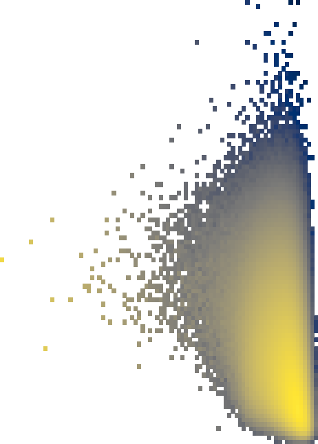
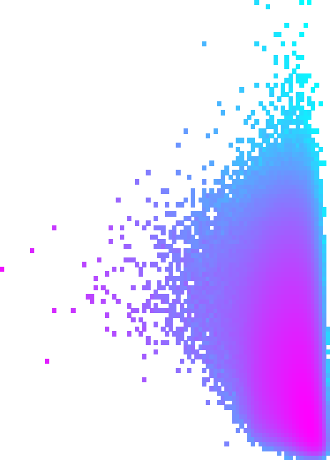
I think you can manually map the values that are “zero” to a very very small number and that will solve the problem of getting see-thru pixels. In fact, if you do that, you can use colormap.set_under to choose literally any color you want to correspond to those bins.

I recommend using the color module in scikit image to take the L and a*/b* values (which it sounds like you figured out how to get those?) and make them into RGB values that matplotlib can understand.

For example, here’s a code snippet I used to make plots for a recent paper that needed to be “3-way diverging” with a specific color scheme, where values below zero are grey:

vmax_long = 5.7
total_colors = 5000

three_colors = [[ 56/255   , 125/255   , 156/255  ], 
                [ 63/255   , 138/255   ,  92/255  ], 
                [163/255   , 85/255    , 153/255  ]]

# need to add a dim, since skimage expects >=2d images
lab_colors = color.rgb2lab(np.array([three_colors]), illuminant='D65', observer='2')[0]

def bruno_div_map(n, left_lab, right_lab, midpoint_l, target_l=None):
    l, a, b = 0, 1, 2
    left_l = left_lab[l] if target_l is None else target_l
    right_l = right_lab[l] if target_l is None else target_l
    t = np.linspace(0, 1, n)
    lab_a = np.interp(t, [0, 1], [left_lab[a], right_lab[a]])
    lab_b = np.interp(t, [0, 1], [left_lab[b], right_lab[b]])
    lab_l = np.interp(t, [0, 1/2, 1], [left_l, midpoint_l, right_l])
    return list(zip(lab_l, lab_a, lab_b))

# a very hack-y way to figure out how many colors to return so that the peaks
# of lumonisity align with the points I care about in the data. Basically,
# artificially place the sawtooth peak at T=3.5
num_grey = int(((0 - (-1))/(vmax_long - (-1))) * total_colors) - 1
num_left = int(((3.5 - 0)/(vmax_long - (-1))) * total_colors)
num_right = int(((vmax_long - 3.5)/(vmax_long - (-1))) * total_colors)
num_sim = 15  # whatever, man, matplotlib smoothes

# two sawtooths in luminosity concatenated
blended_divs = np.concatenate((
    bruno_div_map(num_left, lab_colors[0], lab_colors[1], midpoint_l=80, target_l=50),
    bruno_div_map(num_right, lab_colors[1], lab_colors[2], midpoint_l=80, target_l=50)[1:]
))
# now make back into rgb
bgr_long = color.lab2rgb(np.array([blended_divs]), illuminant='D65', observer='2')[0]
# and manually add the grey
bgr_long = np.concatenate((np.tile(grey, (num_grey, 1)), bgr_long))
         
# now we have the list of colors, make them into a cmap
cmap_long = mpl.colors.ListedColormap(bgr_long)
# specify the range of values the colors should map to
long_cnorm_continuous = mpl.colors.Normalize(vmin=-1, vmax=vmax_long)
# for setting axis ticks and labels
long_locator = ticker.MultipleLocator(1)
long_formatter = ticker.FuncFormatter(lambda i, _: f'$T_{{{int(i)}}}$' if i >= 0 else '$G_0$')
# for passing to colorbar
long_sm_continuous = mpl.cm.ScalarMappable(norm=long_cnorm_continuous, cmap=cmap_long)
long_sm_continuous.set_array([])

Sorry that the code is quite messy, it was never meant to be seen by anyone.

For your case, you probably want to use .set_under instead of manually slotting the “under” color in like I do.

That sounds good; it will make the whole plot box take on a different colour, which isn’t ideal, but it works. Thanks.

I’ll try playing around with those colour-maps too.