I’d like to create a campbell diagram (sound pressure level over time and frequency) with python. That works fine as long as the y-axis that shows the frequency is linear.
When I switch to log (which is industry standard), the result looks unexpected. No matter what I enter for plt.ylim, the diagram looks the same with the distorted y-axis.
Since it looks the same both on my Win10 business box as well as on my private linux laptop, I assume that I am missing s.th. Any hint is greatly appreciated.
from scipy import signal

import numpy as np
import sounddevice as sd
import matplotlib.pyplot as plt

fs=44100 # Samplerate
duration = 2  # seconds
leng=duration*fs
# Get a signal from the default microphone
myrec = sd.rec(int(leng), samplerate=fs, channels=1, blocking=True)
myrec=myrec.flatten()
f, t, Zxx=signal.stft(myrec,fs,window='hann',nperseg=256)
plt.pcolormesh(t, f, np.abs(Zxx), shading='gouraud')
plt.title('Campbell')
plt.ylabel('frequency [Hz]')
# Log plot - for the linear plot that looks ok skip the next two lines

plt.ylim=(10,10000)
plt.yscale('log')
#
plt.xlabel('time [s]')
plt.show()
Not as expected:
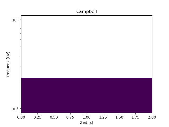
Set the scale before you set the limits…
Did you try it?
No matter where I set scale or limits - the result is always the same as above.
Sorry I can’t try it because I don’t have your data. I have no trouble setting the ylimits on semilogy plots, so it’s hard to know why you are having trouble. Perhaps print out what f is?
Ok, I didn’t focus on the data because the axis should be formatted as requested no matter what the data is. 
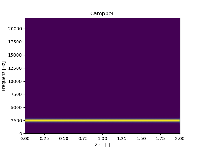
To value your input I modified the example with computed instead of recorded data:
from scipy import signal

import numpy as np
import matplotlib.pyplot as plt

fs=44100 # Samplerate
N = 88200 # 2s
amp = 2 * np.sqrt(2)
time = np.arange(N) / float(fs)
carrier = amp * np.sin(2*np.pi*2.5e3*time)
f, t, Zxx=signal.stft(carrier,fs,window='hann',nperseg=256)
plt.pcolormesh(t, f, np.abs(Zxx), shading='gouraud')
plt.title('Campbell')
plt.ylabel('Frequenz [Hz]')
# Linear
#plt.yscale('log')
#plt.ylim=(10,10000)
plt.xlabel('Zeit [s]')
plt.show()
With the comments active you get a linear y-axis with the correct plot (the signal is a 2s sinus with 2.5 kHz). If you remove the comments before yscale and ylim you get the same unexpected result as in the first post.
I’m sorry. You have a typo. Try plt.ylim(10, 1000)
You’re a genius…how blind can a person (=me) be? Thanks a lot.