Hi,
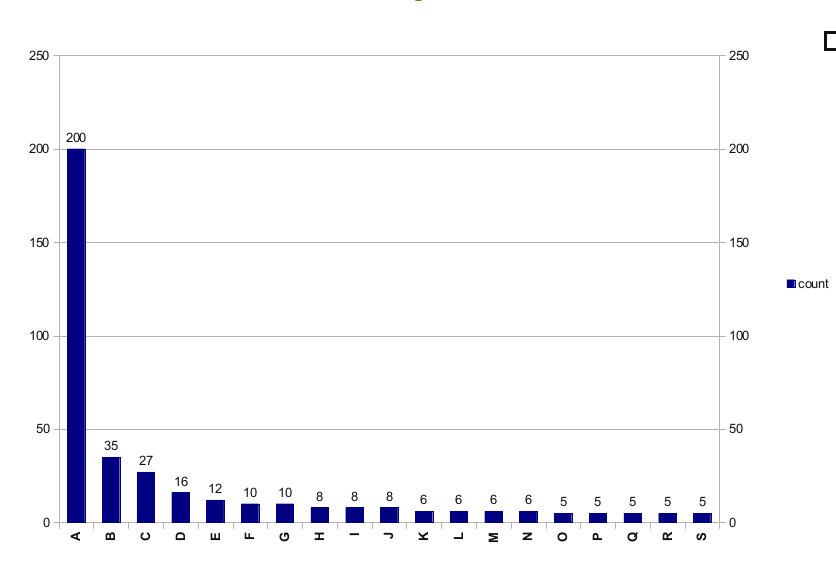
I would like to create a bar chart like the attached example but with the addition
that each bar would have a different color. I tried to learn this from the examples
on matplotlib web but still do not see a close example for that. 
many thanks,
Martin
Here’s an example that does what you want (I think). There may be a better way of setting the colors of the bars, but I don’t use bar plots very often.
Hope that helps,
-Tony
import numpy as np
import matplotlib.pyplot as plt
colorcycle = [‘red’,
‘steelblue’,
‘gold’,
‘darkorchid’,
‘yellowgreen’,
‘darkorange’,
‘silver’,
‘darkturquoise’,
‘hotpink’,
‘mediumblue’]
yy = np.random.uniform(5, 200, size=10).astype(int)
xx = range(len(yy))
width = 0.5
bars = plt.bar(xx, yy, width=width)
add bar labels
for x, y in zip(xx, yy):
plt.text(x + 0.5*width, y, str(y), ha=‘center’, va=‘bottom’)
change color of bars
for b, c in zip(bars, colorcycle):
b.set_color(c)
plt.show()
···
On Tue, Feb 7, 2012 at 1:01 PM, Martin Mokrejs <mmokrejs@…3951…> wrote:
Hi,
I would like to create a bar chart like the attached example but with the addition
that each bar would have a different color. I tried to learn this from the examples
on matplotlib web but still do not see a close example for that. 
many thanks,
Martin