Hello everyone
I need to create a data story which shows if the blues musicians live longer then the jazz musicians.
I already created a line graph but there are more disadvantages then advantages:
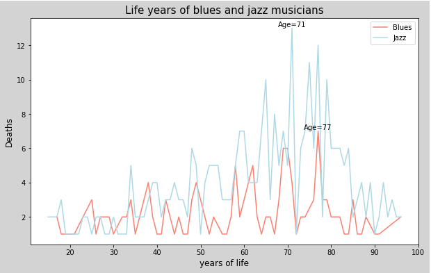
Advantages: You can see exactly in which age the most jazz or blues musicians died.
Disadvantage: You can see that the quantity of jazz musicians are not equal to the blues musicians and it’s hard to read out of the graph if the blues musicians live longer than the jazz musicians.
Has somebody a better idea of a data visualization design?