In many cases in geoscience mapping we want to show the some missing values
as some special color in the colorbar. like attached one.
I know there is one method in matplotlib colormap called "set_bad", official
docs says:
Set color to be used for masked values.
But I don't know how to make this work when I call the colorbar method.
It is not a matter of calling the colorbar method, but of setting up the colormap used on the color-mapped plot for which the colorbar is made.
The one wrinkle to this is that if you are using contourf, the masked regions are not filled at all, so they take on the color of the background. To give them the color you assigned to the colormap with set_bad, you need to assign that same color to the background, e.g.
ax.set_axis_bgcolor("#bdb76b")
On re-reading your message, however, I think you are asking something else, but it is not clear to me from your example exactly what you are trying to do.
The colorbar is strictly for a range or sequence of colors, which can include triangle regions for the "over" and "under" values; there is no place on the colorbar for a "bad" or "missing" value. Where would you put one? I don't see any such region on the example colorbar you attached.
Eric
···
On 2014/03/01 9:57 AM, Chao YUE wrote:
Is there anyone who have the some successful experience?
Thanks a lot in advance!
Chao
--
***********************************************************************************
Chao YUE
Laboratoire des Sciences du Climat et de l'Environnement (LSCE-IPSL)
UMR 1572 CEA-CNRS-UVSQ
Batiment 712 - Pe 119
91191 GIF Sur YVETTE Cedex
Tel: (33) 01 69 08 29 02; Fax:01.69.08.77.16
************************************************************************************
------------------------------------------------------------------------------
Flow-based real-time traffic analytics software. Cisco certified tool.
Monitor traffic, SLAs, QoS, Medianet, WAAS etc. with NetFlow Analyzer
Customize your own dashboards, set traffic alerts and generate reports.
Network behavioral analysis & security monitoring. All-in-one tool. http://pubads.g.doubleclick.net/gampad/clk?id=126839071&iu=/4140/ostg.clktrk
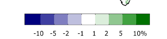
thanks for answering. I updated the attached figure.
The idea is, we want to show the tree cover difference, but to make
the negative and positive values very contrastive, we would like to
assign the values falling in small range of change (in the figure, it’s -1 to 1)
as blank (or gray), in order to make the remaining data constrasting different.
The most correct way might be to design a new colormap with white color
exactly in the middle, however this is very tedious, especially if I want to try
different colormaps. so the alternative approach would be to set the values
falling in (-1,1) as being masked, so they will be the same as the axes
background color as you mentioned (in our case it’s white). My question is,
how can I put this background color (which shows maksed data) in the colorbar,
by avoiding design a new colormap?
Then I notice in the colormap methos there is one called “set_bad”, I guess this
is for this purpose, as in the case of “set_over” and “set_under”, which will
influence the colors in the colorbar when you later call the colorbar method.
On Sat, Mar 1, 2014 at 9:16 PM, Eric Firing [via matplotlib] <[hidden email]> wrote:
On 2014/03/01 9:57 AM, Chao YUE wrote:
Dear all,
In many cases in geoscience mapping we want to show the some missing values
as some special color in the colorbar. like attached one.
I know there is one method in matplotlib colormap called “set_bad”, official
docs says:
Set color to be used for masked values.
But I don’t know how to make this work when I call the colorbar method.
It is not a matter of calling the colorbar method, but of setting up the
colormap used on the color-mapped plot for which the colorbar is made.
The one wrinkle to this is that if you are using contourf, the masked
regions are not filled at all, so they take on the color of the
background. To give them the color you assigned to the colormap with
set_bad, you need to assign that same color to the background, e.g.
ax.set_axis_bgcolor(“#bdb76b”)
On re-reading your message, however, I think you are asking something
else, but it is not clear to me from your example exactly what you are
trying to do.
The colorbar is strictly for a range or sequence of colors, which can
include triangle regions for the “over” and “under” values; there is no
place on the colorbar for a “bad” or “missing” value. Where would you
put one? I don’t see any such region on the example colorbar you attached.
Eric
Is there anyone who have the some successful experience?
Thanks a lot in advance!
Chao
–
Chao YUE
Laboratoire des Sciences du Climat et de l’Environnement (LSCE-IPSL)
To start a new topic under matplotlib - users, email [hidden email]
  To unsubscribe from matplotlib, click here.


  [NAML](http://matplotlib.1069221.n5.nabble.com/template/NamlServlet.jtp?macro=macro_viewer&id=instant_html%21nabble%3Aemail.naml&base=nabble.naml.namespaces.BasicNamespace-nabble.view.web.template.NabbleNamespace-nabble.view.web.template.NodeNamespace&breadcrumbs=notify_subscribers%21nabble%3Aemail.naml-instant_emails%21nabble%3Aemail.naml-send_instant_email%21nabble%3Aemail.naml)
–
Chao YUE
Laboratoire des Sciences du Climat et de l’Environnement (LSCE-IPSL)
UMR 1572 CEA-CNRS-UVSQ
Batiment 712 - Pe 119
91191 GIF Sur YVETTE Cedex
It's not the answer you want to hear, but I think the correct answer is that you should do this via the colormap, and not by masking the low values. It doesn't have to be painful. If, in contourf, you use a diverging colormap with white already in the middle (http://matplotlib.org/examples/color/colormaps_reference.html) and a norm with symmetric limits (vmin and vmax; you can let them be set automatically after you specify your symmetric set of contour boundaries appropriately) then it will be done for you.
The most correct way might be to design a new colormap with white color
exactly in the middle, however this is very tedious, especially if I
want to try
different colormaps. so the alternative approach would be to set the values
falling in (-1,1) as being masked, so they will be the same as the axes
background color as you mentioned (in our case it's white). My question is,
how can I put this background color (which shows maksed data) in the
colorbar,
by avoiding design a new colormap?
I think I will revisit this issue when I have time (not promised).
do you think this could be some feature desirable?
Cheers,
Chao
···
On Sat, Mar 1, 2014 at 10:39 PM, Eric Firing [via matplotlib] <[hidden email]> wrote:
On 2014/03/01 11:03 AM, ChaoYue wrote:
The most correct way might be to design a new colormap with white color
exactly in the middle, however this is very tedious, especially if I
want to try
different colormaps. so the alternative approach would be to set the values
falling in (-1,1) as being masked, so they will be the same as the axes
background color as you mentioned (in our case it’s white). My question is,
how can I put this background color (which shows maksed data) in the
colorbar,
by avoiding design a new colormap?
It’s not the answer you want to hear, but I think the correct answer is
that you should do this via the colormap, and not by masking the low
values. It doesn’t have to be painful. If, in contourf, you use a
diverging colormap with white already in the middle
(http://matplotlib.org/examples/color/colormaps_reference.html) and a
norm with symmetric limits (vmin and vmax; you can let them be set
automatically after you specify your symmetric set of contour boundaries
appropriately) then it will be done for you.
To start a new topic under matplotlib - users, email [hidden email]
  To unsubscribe from matplotlib, click here.


  [NAML](http://matplotlib.1069221.n5.nabble.com/template/NamlServlet.jtp?macro=macro_viewer&id=instant_html%21nabble%3Aemail.naml&base=nabble.naml.namespaces.BasicNamespace-nabble.view.web.template.NabbleNamespace-nabble.view.web.template.NodeNamespace&breadcrumbs=notify_subscribers%21nabble%3Aemail.naml-instant_emails%21nabble%3Aemail.naml-send_instant_email%21nabble%3Aemail.naml)
–
Chao YUE
Laboratoire des Sciences du Climat et de l’Environnement (LSCE-IPSL)
UMR 1572 CEA-CNRS-UVSQ
Batiment 712 - Pe 119
91191 GIF Sur YVETTE Cedex
This solved part of my problem. thanks a lot.
I think I will revisit this issue when I have time (not promised).
do you think this could be some feature desirable?
I don't understand what feature you are referring to; evidently I don't understand what the problem is, so I don't know what part remains unsolved.
Eric
···
On 2014/03/02 1:02 AM, ChaoYue wrote:
Cheers,
Chao
On Sat, Mar 1, 2014 at 10:39 PM, Eric Firing [via matplotlib] <[hidden > email] </user/SendEmail.jtp?type=node&node=42956&i=0>> wrote:
On 2014/03/01 11:03 AM, ChaoYue wrote:
> The most correct way might be to design a new colormap with white
color
> exactly in the middle, however this is very tedious, especially if I
> want to try
> different colormaps. so the alternative approach would be to set
the values
> falling in (-1,1) as being masked, so they will be the same as
the axes
> background color as you mentioned (in our case it's white). My
question is,
> how can I put this background color (which shows maksed data) in the
> colorbar,
> by avoiding design a new colormap?
It's not the answer you want to hear, but I think the correct answer is
that you should do this via the colormap, and not by masking the low
values. It doesn't have to be painful. If, in contourf, you use a
diverging colormap with white already in the middle
(http://matplotlib.org/examples/color/colormaps_reference.html) and a
norm with symmetric limits (vmin and vmax; you can let them be set
automatically after you specify your symmetric set of contour
boundaries
appropriately) then it will be done for you.
Maybe I understand what he means. How can a user override some value in a
colormap? Lets say, in general user wants to inherit some ready made colormap
but in addition wants to force certain colors to some data items.
M.
Eric Firing wrote:
···
On 2014/03/02 1:02 AM, ChaoYue wrote:
Dear Eric,
This solved part of my problem. thanks a lot.
I think I will revisit this issue when I have time (not promised).
do you think this could be some feature desirable?
I don't understand what feature you are referring to; evidently I don't
understand what the problem is, so I don't know what part remains unsolved.
Eric
Cheers,
Chao
On Sat, Mar 1, 2014 at 10:39 PM, Eric Firing [via matplotlib] <[hidden >> email] </user/SendEmail.jtp?type=node&node=42956&i=0>> wrote:
On 2014/03/01 11:03 AM, ChaoYue wrote:
> The most correct way might be to design a new colormap with white
color
> exactly in the middle, however this is very tedious, especially if I
> want to try
> different colormaps. so the alternative approach would be to set
the values
> falling in (-1,1) as being masked, so they will be the same as
the axes
> background color as you mentioned (in our case it's white). My
question is,
> how can I put this background color (which shows maksed data) in the
> colorbar,
> by avoiding design a new colormap?
It's not the answer you want to hear, but I think the correct answer is
that you should do this via the colormap, and not by masking the low
values. It doesn't have to be painful. If, in contourf, you use a
diverging colormap with white already in the middle
(http://matplotlib.org/examples/color/colormaps_reference.html) and a
norm with symmetric limits (vmin and vmax; you can let them be set
automatically after you specify your symmetric set of contour
boundaries
appropriately) then it will be done for you.
