Thank you for your solutions. However, with my dataset it did not work out with the following code:
import numpy as np
import matplotlib.pyplot as plt
with open(‘in.small.txt’) as f:
data = list(int(no.rstrip()) for no in f)

mean = np.mean(data)

print 'mean', mean

std = np.std(data)

print 'std', std

#fig = plt.figure(figsize=(8,6), dpi=72, facecolor='w')

fig = plt.figure()

axes = plt.subplot(111)

#axes.axvline(np.mean(data), 0, max(data), linewidth=2, color='red')

axes.axvline(x=mean, linewidth=1.5, color='r')

axes.hist(data, bins=50, normed=True)

#axes.set_ylim(0, 1)

#axes.set_xlim(-3, 3)

axes.spines['right'].set_color('none')

axes.spines['top'].set_color('none')

axes.xaxis.set_ticks_position('bottom')

axes.spines['bottom'].set_position(('data', -0.05))

axes.yaxis.set_ticks_position('left')

axes.spines['left'].set_position(('data',-3.25))

fig.savefig('myhist.png')
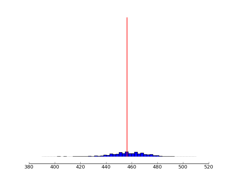
Please find attached the histogram. The dataset I am sending with next email.
Thank you in advance.
···
On Fri, Mar 9, 2012 at 9:59 AM, Paul Hobson <pmhobson@…287…> wrote:
Check out the axvline method (of pyplot or an axes object). You’ll
only have to specify the x-value, and it’ll won’t rescale your y-axis.
See my edits below:
On Wed, Mar 7, 2012 at 12:28 AM, Mic <mictadlo@…287…> wrote:
Hello,
I am able to draw a histogram with the following code:
import matplotlib.pyplot as plt
hist_data =
median = 249
f = plt.figure()
h = f.add_subplot(111)
h.hist(hist_data, bins=50, normed=True)
h.axvline(x=median, linewidth=1.5, color=‘b’)
f.savefig(‘myhist.png’)
However, I don’t know how to draw a line for median at 249 position like in
attachment.
Thank you in advance.
Virtualization & Cloud Management Using Capacity Planning
Cloud computing makes use of virtualization - but cloud computing
also focuses on allowing computing to be delivered as a service.
Matplotlib-users mailing list
https://lists.sourceforge.net/lists/listinfo/matplotlib-users