Francesco Montesano, on 2011-02-04 17:01, wrote:
Dear all again,
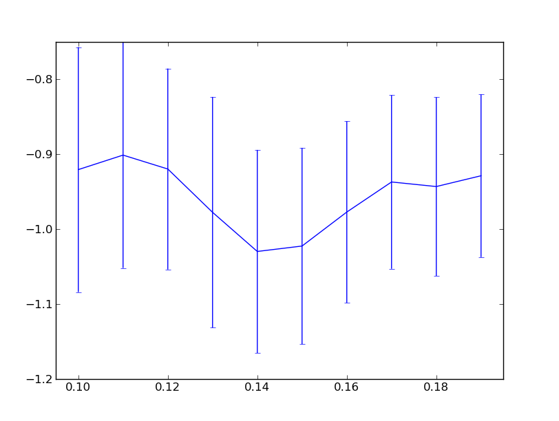
I've tried to play with it again, but I couldn't find a
solution for the problem. For clarity I report an example of
what each of the subplots looks like:
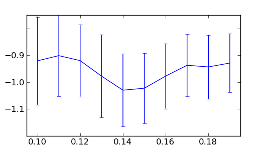
Hi Francesco,
thanks for the clarification, here are two ways to get the look
you want. I added some comments to help you understand what was
going on before. (The resulting figure is attached, just in case).
import numpy as np
import matplotlib.pyplot as plt
mean=np.array([-0.9206394, -0.90127456, -0.91983625, -0.97765539, -1.02991184,
-1.02267017, -0.97730167, -0.93715172, -0.94324653, -0.92884379])
stddev= np.array([0.16351397,0.15075966,0.13413909,0.15404823,0.13559582, 0.13109754,0.12128598,0.11589682,0.11921571,0.10866761])
ax = plt.figure().add_axes([0.1,0.1,0.8,0.8])
ax.errorbar(np.arange(10,20)/100., mean, yerr=stddev)
ax.set_xlim([0.095, 0.195])
lab = ax.get_ymajorticklabels()
plt.draw() # ticks only get text assigned during a call to draw
print lab
for i in lab:
print i # note that \u2212 is a unicode minus sign
# this work for the first draw - relies on l.get_text() returning
# nothing for labels which aren't used/drawn - which isn't the
# case in general after panning and zooming interactively
shown_lab = [l for l in lab if l.get_text()]
shown_lab[0].set_visible(False)
shown_lab[-1].set_visible(False)
## alternative solution without extra draw(). more robust, can be
## used even after initial draw.
#ymin,ymax = ax.get_ylim()
#tl = ax.yaxis.get_majorticklocs()
#lab[(tl<ymin).sum()].set_visible(False)
#lab[-(tl>ymax).sum()-1].set_visible(False)
## hybrid of the two.
#ymin,ymax = ax.get_ylim()
#tl = ax.yaxis.get_majorticklocs()
#shown_lab = [l for l,t in zip(lab,tl) if t>ymin and t<ymax)
#shown_lab[0].set_visible(False)
#shown_lab[-1].set_visible(False)
plt.show()
best,
···
--
Paul Ivanov
314 address only used for lists, off-list direct email at:
http://pirsquared.org | GPG/PGP key id: 0x0F3E28F7