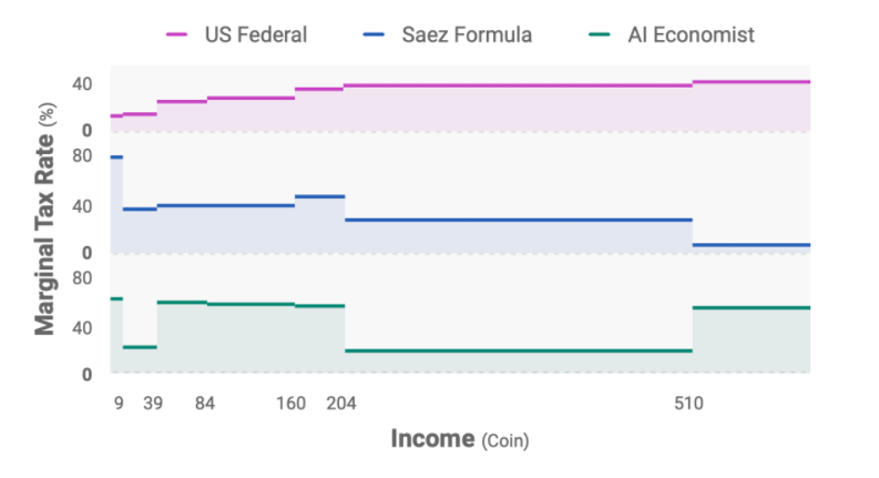
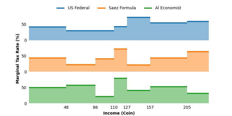
I had a similar problem and wanted to get rid of the vertical lines. Here is a short script to create a figure similar to the one you posted. It is not perfect and slightly messy, but I hope it helps you 
import numpy as np
from matplotlib import pyplot as plt
from matplotlib import legend as mlegend


# fix random seed for reproducibility
np.random.seed(42)

# generate data
nlines = 3
labels = ['US Federal', 'Saez Formula', 'Al Economist']
nevents = 7
x = np.cumsum(
    [0, *np.random.randint(low=10, high=50, size=nevents)]
)
data = np.random.randint(
    low=20,
    high=80,
    size=(nlines, nevents),
)

# plotting data
fig, axs = plt.subplots(
    3,
    1,
    sharey=True,
    sharex=True,
    figsize=(8, 4),
)

for idx, (y, ax, label) in enumerate(zip(data, axs.flatten(), labels)):
    color = f'C{idx}',
    # add horizontal lines
    ax.hlines(
        y,
        xmin=x[:-1],
        xmax=x[1:],
        label=label,
        linewidth=3,
        color=color,
    )
    # fill under line
    ax.fill_between(
        x,
        [*y, y[-1]],  # dublicate last value to draw last step as well
        step='post',
        facecolor=color,
        edgecolor=None,  # hide edge
        alpha=0.5,
    )

    # hide ticks and axes
    ax.tick_params(
        axis='both',
        which='both',
        length=0,  # remove ticks
        pad=6,  # enlarge padding
    )
    ax.set_frame_on(False)


# set limits, this can be achieved as well via rcParams
ax.set_xlim([np.min(x), np.max(x)])
ax.set_ylim([0, ax.get_ylim()[1]])
ax.set_xticks(x[1:-1])

# plot shared legend
axs[0].legend(
    # get handles and labels of multiple axes
    *mlegend._get_legend_handles_labels(axs),
    bbox_to_anchor=(0.5, 1),
    loc='lower center',
    ncol=nlines,
    frameon=False,
)

# add x labels
axs[-1].set_xlabel('Income (Coin)', weight='bold')

# shared y label hack
# add axes of size of whole canvase
ax = fig.add_subplot(111, frameon=False)
ax.set_ylabel('Marginal Tax Rate (%)', weight='bold')
# remove ticks to get no artificial padding
ax.set_yticks([])
ax.set_xticks([])
fig.align_labels()

plt.show()
Which creates