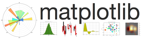
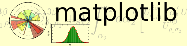
I played around with this a bit this morning -- it may be too busy for
your OS X sensibilities, but let me know if you think think this is an
approach wotrh pursuing. I've added the mathtext background and a few
axes and there are a few more axes to do. In svn as
examples/api/logo2.py
JDH
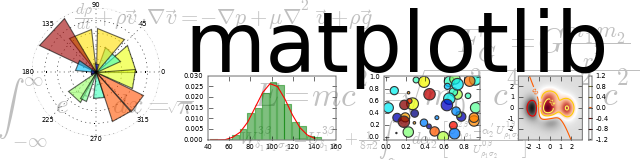
import numpy as np
import matplotlib.pyplot as plt
import matplotlib.cm as cm
import matplotlib.mlab as mlab
axalpha = 0.05
figcolor = '#FFFFCC'
dpi = 80
fig = plt.figure(figsize=(8, 2),dpi=dpi)
fig.figurePatch.set_edgecolor(figcolor)
fig.figurePatch.set_facecolor(figcolor)
# the polar bar plot
ax = fig.add_axes([0.05, 0.05, 0.2, 01], polar=True)
ax.axesPatch.set_alpha(axalpha)
N = 20
theta = np.arange(0.0, 2*np.pi, 2*np.pi/N)
radii = 10*np.random.rand(N)
width = np.pi/4*np.random.rand(N)
bars = ax.bar(theta, radii, width=width, bottom=0.0)
for r,bar in zip(radii, bars):
bar.set_facecolor( cm.jet(r/10.))
bar.set_alpha(0.5)
for label in ax.get_xticklabels() + ax.get_yticklabels():
label.set_visible(False)
# the histogram
axhist = fig.add_axes([0.275, 0.075, 0.2, 0.4])
axhist.axesPatch.set_alpha(axalpha)
mu, sigma = 100, 15
x = mu + sigma*np.random.randn(10000)
# the histogram of the data
n, bins, patches = axhist.hist(x, 50, normed=1, facecolor='green',
edgecolor='green', alpha=0.75)
y = mlab.normpdf( bins, mu, sigma)
l = axhist.plot(bins, y, 'r', lw=1)
axhist.set_title('Density of IQ',fontsize=6)
axhist.set_xlabel('IQ', fontsize=6)
axhist.set_ylabel('P(IQ)', fontsize=6)
ax.set_xlim(-2*sigma, 2*sigma)
for label in axhist.get_xticklabels() + axhist.get_yticklabels():
label.set_visible(False)
axback = fig.add_axes([0., 0., 1., 1.])
#the math background
tex = r"W^\{3\\beta\}\_\{\\delta\_1 \\rho\_1 \\sigma\_2\} = U^\{3\\beta\}\_\{\\delta\_1
\\rho\_1\} \+ \\frac\{1\}\{8 \\pi 2\} \\int^\{\\alpha\_2\}\_\{\\alpha\_2\} d
\\alpha^\\prime\_2 \\left\[\\frac\{ U^\{2\\beta\}\_\{\\delta\_1 \\rho\_1\} \-
\\alpha^\\prime\_2U^\{1\\beta\}\_\{\\rho\_1 \\sigma\_2\} \}\{U^\{0\\beta\}\_\{\\rho\_1
\\sigma\_2\}\}\\right\]"
axback.text(0.5, 0.5, tex,
transform=axback.transAxes, color="0.5", alpha=0.5, fontsize=40,
ha='center', va='center')
axback.set_axis_off()
# the matplotlib title
axback.text(0.3, 0.95, 'matplotlib', color='black', fontsize=75,
ha='left', va='top', alpha=1.0,
transform=axback.transAxes)
fig.savefig('logo2.png', facecolor=figcolor, edgecolor=figcolor, dpi=dpi)
plt.show()
···
On Sun, May 25, 2008 at 8:18 AM, John Hunter <jdh2358@...149...> wrote:
Also, the banner should be generated as a matplotlib figure rather
than put together in inkscape or something like that. How did you
make this -- if is code, please post so we can play along. If not,
see if you can write the logo example by laying out the axes just so.