Hi,
I notice a big difference in quality between the text rendered
by matplotlib and that rendered by the rest of applications.
As an example, see the image attached showing the same font as
shown by firefox and matplotlib respectively.
Is there any config setting I can change to improve the font
rendering or anything?
Cheers.
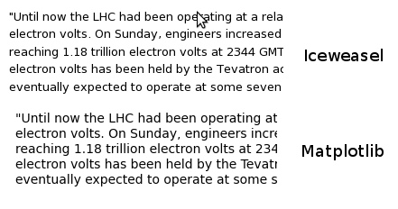
The two examples in the page you link to have different font sizes and
possibly different font weights, which makes it difficult to do
side-by-side comparisons. Could you post an example with
similar/identical settings?
JDH
···
On Mon, Nov 30, 2009 at 6:38 PM, Ernest Adrogué <eadrogue@...361...> wrote:
Hi,
I notice a big difference in quality between the text rendered
by matplotlib and that rendered by the rest of applications.
As an example, see the image attached showing the same font as
shown by firefox and matplotlib respectively.
Is there any config setting I can change to improve the font
rendering or anything?
30/11/09 @ 22:28 (-0600), thus spake John Hunter:
The two examples in the page you link to have different font sizes and
possibly different font weights, which makes it difficult to do
side-by-side comparisons. Could you post an example with
similar/identical settings?
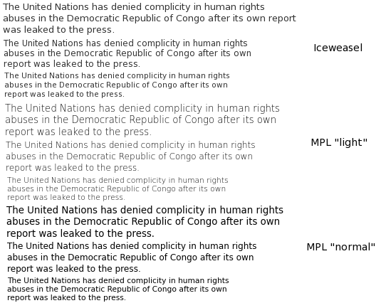
Yes, I have attached another example with different font sizes
(8,9,10). The exact weight is impossible to replicate, I tried with
"light" and "normal".
I think that the problem might be the lack of hinting. In my
fonts.conf file I have both "hinting" and "autohinting" enabled. if
I disable these options then the fonts in other applications resemble
a lot the ones I am getting now with mpl.
Bye.
I am pretty sure the issue here is subpixel rendering. Try comparing
the output of the gtkagg backend, which does not do subpixel
rendering, with that of gtkcairo, which does.
Darren
···
On Tue, Dec 1, 2009 at 6:37 AM, Ernest Adrogué <eadrogue@...361...> wrote:
30/11/09 @ 22:28 (-0600), thus spake John Hunter:
The two examples in the page you link to have different font sizes and
possibly different font weights, which makes it difficult to do
side-by-side comparisons. Could you post an example with
similar/identical settings?
Yes, I have attached another example with different font sizes
(8,9,10). The exact weight is impossible to replicate, I tried with
"light" and "normal".
I think that the problem might be the lack of hinting. In my
fonts.conf file I have both "hinting" and "autohinting" enabled. if
I disable these options then the fonts in other applications resemble
a lot the ones I am getting now with mpl.
Subpixel rendering is almost never what you want when producing a PNG file, since it is likely to be shared on a different machine requiring different subpixel settings. But it looks like your mozilla example is not using subpixel rendering either, though it appears to have very strong hinting.
matplotlib's Agg backends borrows a technique used by Adobe Acrobat which is to use strong hinting in the vertical direction, but more subtle hinting in the horizontal. When we did a comprehensive comparison of various hinting options about two years ago it was the strong winner. See this:
Re: [matplotlib-devel] mathtext examples
(Unfortunately, the linked images are no longer available).
If these settings are not to your liking, I would recommend the Cairo backend (which should pull in the same settings as the rest of your Gnome desktop, I believe), or one of the vector backends and then tweaking the rendering.
Alternatively, we could provide this "stretched hinting" as a configuration option. If you think that's superior to these other options, please file a feature request so it doesn't get lost (and it should be a fairly straightforward patch for someone new to the code base.)
Mike
Darren Dale wrote:
···
On Tue, Dec 1, 2009 at 6:37 AM, Ernest Adrogué <eadrogue@...361...> wrote:
30/11/09 @ 22:28 (-0600), thus spake John Hunter:
The two examples in the page you link to have different font sizes and
possibly different font weights, which makes it difficult to do
side-by-side comparisons. Could you post an example with
similar/identical settings?
Yes, I have attached another example with different font sizes
(8,9,10). The exact weight is impossible to replicate, I tried with
"light" and "normal".
I think that the problem might be the lack of hinting. In my
fonts.conf file I have both "hinting" and "autohinting" enabled. if
I disable these options then the fonts in other applications resemble
a lot the ones I am getting now with mpl.
I am pretty sure the issue here is subpixel rendering. Try comparing
the output of the gtkagg backend, which does not do subpixel
rendering, with that of gtkcairo, which does.
Darren
------------------------------------------------------------------------------
Join us December 9, 2009 for the Red Hat Virtual Experience,
a free event focused on virtualization and cloud computing. Attend in-depth sessions from your desk. Your couch. Anywhere.
http://p.sf.net/sfu/redhat-sfdev2dev
_______________________________________________
Matplotlib-users mailing list
Matplotlib-users@lists.sourceforge.net
matplotlib-users List Signup and Options
--
Michael Droettboom
Science Software Branch
Operations and Engineering Division
Space Telescope Science Institute
Operated by AURA for NASA
1/12/09 @ 09:16 (-0500), thus spake Michael Droettboom:
Subpixel rendering is almost never what you want when producing a
PNG file, since it is likely to be shared on a different machine
requiring different subpixel settings. But it looks like your
mozilla example is not using subpixel rendering either, though it
appears to have very strong hinting.
Yes, it's not a subpixel rendering problem. I can tell that
subpixel rendering is not enabled because I'm not seeing "rainbows",
which I always see when it's enabled. It's definitely a hinting issue.
matplotlib's Agg backends borrows a technique used by Adobe Acrobat
which is to use strong hinting in the vertical direction, but more
subtle hinting in the horizontal. When we did a comprehensive
comparison of various hinting options about two years ago it was the
strong winner. See this:
Re: [matplotlib-devel] mathtext examples
(Unfortunately, the linked images are no longer available).
If these settings are not to your liking, I would recommend the
Cairo backend (which should pull in the same settings as the rest of
your Gnome desktop, I believe), or one of the vector backends and
then tweaking the rendering.
Confirmed. The GTK backend -haven't tried Cairo yet- honours the
system settings for font rendering. It looks much better now, in my
opinion.
Alternatively, we could provide this "stretched hinting" as a
configuration option. If you think that's superior to these other
options, please file a feature request so it doesn't get lost (and
it should be a fairly straightforward patch for someone new to the
code base.)
Ok. I will open a feature request, if you think it's okay.
I think I'll be sticking with the GTK backend for now, anyway.
Thanks.
Ernest