Hello, Everyone!
I am wondering can we use Matplotlib to draw heat map? Thanks.
I am working on the eye movement data of our driving experiment. It would be interesting to look at the spatial distribution, and most frequent visited AOIs.
I have produced eye movement data for one subject (please check the attachment).
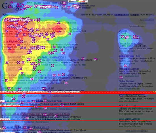
Besides spatial distribution of fixation, I also would like to look at the frequency of fixation at each spatial location, with different color denoting the frequency of fixation, just like the fixation heat map in the attachment.
Could you please bother to let me know how can I draw the heat map of fixation?Thanks!
He Jibo
hejibo@…287…
jibohe2@…1875…
driving-fixation_plot.xls (1010 KB)
···
He Jibo
Department of Psychology,
Beckman Institute for Advanced Science and Technology
University of Illinois, Urbana Champaign,
603 East Daniel St.,
Champaign, IL 61820
Tel: 217-244-4461(office)
217-244-6763(lab)
Email: hejibo@…287…
Robert Benchley - “Drawing on my fine command of the English language, I said nothing.”
Please take a look at our gallery to see what you can do with matplotlib.
http://matplotlib.sourceforge.net/gallery.html
I am working on the eye movement data of our driving experiment. It would be
interesting to look at the spatial distribution, and most frequent visited
AOIs.
You'd better tell us how you want to look at the spatial distribution,
more specifically. A simple 2d-scatter plot as in your excel file is
quite easy with matplotlib. Take a look at the tutorial
(http://matplotlib.sourceforge.net/users/pyplot_tutorial.html)
I have produced eye movement data for one subject (please check the
attachment).
Besides spatial distribution of fixation, I also would like to look at the
frequency of fixation at each spatial location, with different color
denoting the frequency of fixation, just like the fixation heat map in the
attachment.
Your question is more about how to process your data, rather than how
to plot. You need to process your data somehow to produce a 2d array,
and after that you can show that image with matplotlib. Matplotlib
itself does not support much of such processing as far as I know.
What I usually do is to bin the data in a regular 2d image (you may
use histogram2d function in numpy), and do some smoothing (with
adaptive smoothing size if preferred). Then plot the resulting image
with matplotlib. Unfortunately, I don't know of any good adaptive
smoothing tool for python. I do this with other standalone program,
and use matplotlib just to plot. Of course there are other ways. As
far as you process your data into 2d image, you can plot it with
matplotlib.
Regards,
-JJ
···
Could you please bother to let me know how can I draw the heat map of
fixation?Thanks!
He Jibo
hejibo@...287...
jibohe2@...1875...
---------------------------
He Jibo
Department of Psychology,
Beckman Institute for Advanced Science and Technology
University of Illinois, Urbana Champaign,
603 East Daniel St.,
Champaign, IL 61820
Tel: 217-244-4461(office)
217-244-6763(lab)
Email: hejibo@...287...
Robert Benchley - "Drawing on my fine command of the English language, I
said nothing."
------------------------------------------------------------------------------
Open Source Business Conference (OSBC), March 24-25, 2009, San Francisco, CA
-OSBC tackles the biggest issue in open source: Open Sourcing the Enterprise
-Strategies to boost innovation and cut costs with open source participation
-Receive a $600 discount off the registration fee with the source code: SFAD
http://p.sf.net/sfu/XcvMzF8H
_______________________________________________
Matplotlib-users mailing list
Matplotlib-users@lists.sourceforge.net
matplotlib-users List Signup and Options