I'm trying to make a 2D color plot where the z-axis values show
up as different colors for each (x,y) point. I tried to
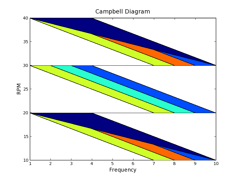
plot the list a+b+c+d using the code snipped below.
I don't understand why this regular grid of points is giving
me the weird color plot attached. Any help would be greatly
appreciated.
WHY DON't I SEE **SQUARES** OF COLORS IN ATTACHED PLOT???
a = [(1, 10, 1), (2, 10, 2), (3, 10, 3), (4, 10, 4), (5, 10, 5),
(6, 10, 4), (7, 10, 3), (8, 10, 2), (9, 10, 1), (10, 10, 0)]
b = [(1, 20, 1), (2, 20, 2), (3, 20, 3), (4, 20, 4), (5, 20, 5),
(6, 20, 4), (7, 20, 3), (8, 20, 2), (9, 20, 1), (10, 20, 0)]
c = [(1, 30, 1), (2, 30, 2), (3, 30, 3), (4, 30, 4), (5, 30, 5),
(6, 30, 4), (7, 30, 3), (8, 30, 2), (9, 30, 1), (10, 30, 0)]
d = [(1, 40, 1), (2, 40, 2), (3, 40, 3), (4, 40, 4), (5, 40, 5),
(6, 40, 4), (7, 40, 3), (8, 40, 2), (9, 40, 1), (10, 40, 0)]
# Extracts arrays of values for each axis.
xarray, yarray, zarray = zip(*plotdata)
xarray = matplotlib.matlab.array(xarray)
yarray = matplotlib.matlab.array(yarray)
zarray = matplotlib.matlab.array(zarray)
# Finds and sets shapes of arrays.
ysize = len(sets.Set(yarray))
xsize = len(yarray) / ysize
xarray.shape = yarray.shape = zarray.shape = xsize, ysize
# Create plot.
matplotlib.matlab.pcolor(xarray, yarray, zarray)
Chris
···
--
_______________________________________
Christian Seberino, Ph.D.
SPAWAR Systems Center San Diego
Code 2872
49258 Mills Street, Room 158
San Diego, CA 92152-5385
U.S.A.
Phone: (619) 553-9973
Fax : (619) 553-6521
Email: seberino@...391...
_______________________________________