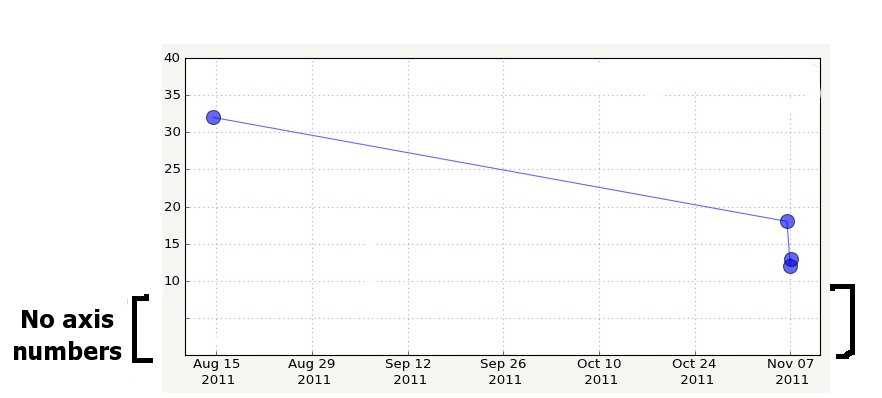
What’s the best way in Matplotlib to have a y axis that doesn’t have ticks/axis numbers near the bottom of the graph? I don’t know if it would be specified as the bottom 1/10th of the graph or x amount of pixels or inches or whatever…just need a bit of extra “y-less” space there to plot values that have an x value but no y value. I’m assuming this would be done with a Formatter or Locator, but wasn’t sure how to go about it.
import matplotlib.pyplot as plt
plt.plot(np.arange(10), np.arange(10))
plt.ylim(0,10)
plt.yticks(np.linspace(3,10,8))
plt.show()
Ticks but no labels:
import matplotlib.pyplot as plt
plt.plot(np.arange(10), np.arange(10))
plt.ylim(0,10)
plt.yticks(np.linspace(0,10,11), ['']*3 + ['%d' % i for i in linspace(3,10,8)])
plt.show()
Nicolas
···
On Nov 22, 2011, at 20:13 , C M wrote:
What's the best way in Matplotlib to have a y axis that doesn't have ticks/axis numbers near the bottom of the graph? I don't know if it would be specified as the bottom 1/10th of the graph or x amount of pixels or inches or whatever...just need a bit of extra "y-less" space there to plot values that have an x value but no y value. I'm assuming this would be done with a Formatter or Locator, but wasn't sure how to go about it.
See attached image....
Thanks,
Che
<y_axis_lower_margin.jpg>------------------------------------------------------------------------------
All the data continuously generated in your IT infrastructure
contains a definitive record of customers, application performance,
security threats, fraudulent activity, and more. Splunk takes this
data and makes sense of it. IT sense. And common sense. http://p.sf.net/sfu/splunk-novd2d_______________________________________________
Matplotlib-users mailing list
Matplotlib-users@lists.sourceforge.net matplotlib-users List Signup and Options
Thanks. That works in your example, but in my actual code, it seems to override my custom formatter, and therefore messes up the axis formatting, which isn’t going to work.
Maybe I can integrate it into the formatter somehow. If anyone has related tips, please let me know.
Che
···
On Tue, Nov 22, 2011 at 3:09 PM, Nicolas Rougier <Nicolas.Rougier@…3782…> wrote:
I don't know if this will work for you, but in your situation I would probably just make another axis for the data with no y value. Like, a short squat axis directly below the main axis.
-Jeff
···
On Nov 23, 2011, at 4:09 PM, C M wrote:
On Tue, Nov 22, 2011 at 3:09 PM, Nicolas Rougier > <Nicolas.Rougier@...3782...> wrote:
Is that what you want ?
No ticks, no labels:
import matplotlib.pyplot as plt
plt.plot(np.arange(10), np.arange(10))
plt.ylim(0,10)
plt.yticks(np.linspace(3,10,8))
plt.show()
Thanks. That works in your example, but in my actual code, it seems to override my custom formatter, and therefore messes up the axis formatting, which isn't going to work.
Maybe I can integrate it into the formatter somehow. If anyone has related tips, please let me know.
I don’t know if this will work for you, but in your situation I would probably just make another axis for the data with no y value. Like, a short squat axis directly below the main axis.
-Jeff
Thanks. That crossed my mind, but I never tried it yet. I thought it would take up too much vertical room in the display to have another axis just for what would likely be 1-2 data points worth of y-less data. I’d really want to not display the x axis for that one and just align it with the x axis of the main plot, but then the data points would be below the axis, and that would seem visually odd.
I’ll play with it in a sample app and see if I can get it to look good this way.