Hi all,
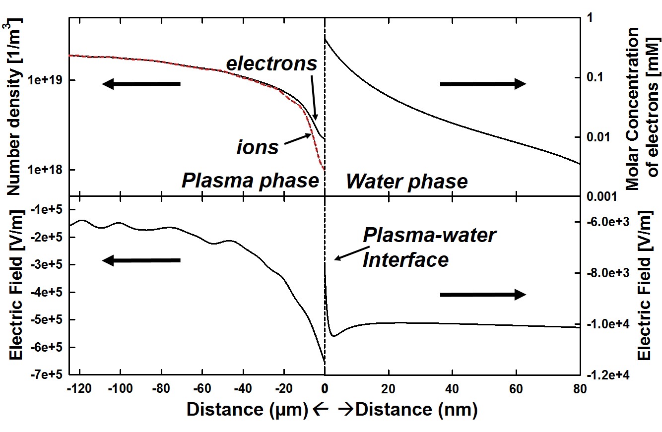
Attached is a figure showing what I hope to achieve. I have two domains
that are connected but which have dramatically different scaling on
either side of their interface. I would like the x axis to be in
micrometers on one side of the interface and nanometers on the other
side. I also want to be able to use a different y-axis on both sides
(e.g. range 0 - 1e19 on one side and and range 0 - 1e23 on the other
side). Yet I would like to juxtapose the two plots together as shown in
the attached figure. Is this possible with matplotlib? If so, what's the
best way to go about doing this?
Alex
-------------- next part --------------
A non-text attachment was scrubbed...
Name: Plasma-water interface e_conc n E field.jpg
Type: image/jpeg
Size: 172781 bytes
Desc: not available
URL: <http://mail.python.org/pipermail/matplotlib-users/attachments/20151221/1defc9f3/attachment-0001.jpg>
Yes, it is possible. We call them "ganged plots". Here is an example where
it was done in the y-axis:
http://matplotlib.org/examples/pylab_examples/ganged_plots.html
There are also other examples that show how to put the axis labels in
different places than usual.
Another way to go about this is to use twinx() to get the y-axis labeling
to be easy, but then have a specially crafted scale for the x-axis. In the
end, that might be more straight-forward, but probably a bit harder to code
up at first if you haven't played around with axis locators and formatters.
I hope that helps. Let us know if you have any questions.
Cheers!
Ben Root
···
On Mon, Dec 21, 2015 at 3:01 PM, Alexander Lindsay <adlinds3 at ncsu.edu> wrote:
Hi all,
Attached is a figure showing what I hope to achieve. I have two domains
that are connected but which have dramatically different scaling on either
side of their interface. I would like the x axis to be in micrometers on
one side of the interface and nanometers on the other side. I also want to
be able to use a different y-axis on both sides (e.g. range 0 - 1e19 on one
side and and range 0 - 1e23 on the other side). Yet I would like to
juxtapose the two plots together as shown in the attached figure. Is this
possible with matplotlib? If so, what's the best way to go about doing this?
Alex
_______________________________________________
Matplotlib-users mailing list
Matplotlib-users at python.org
Matplotlib-users Info Page
-------------- next part --------------
An HTML attachment was scrubbed...
URL: <http://mail.python.org/pipermail/matplotlib-users/attachments/20151221/93aee4e9/attachment.html>